|

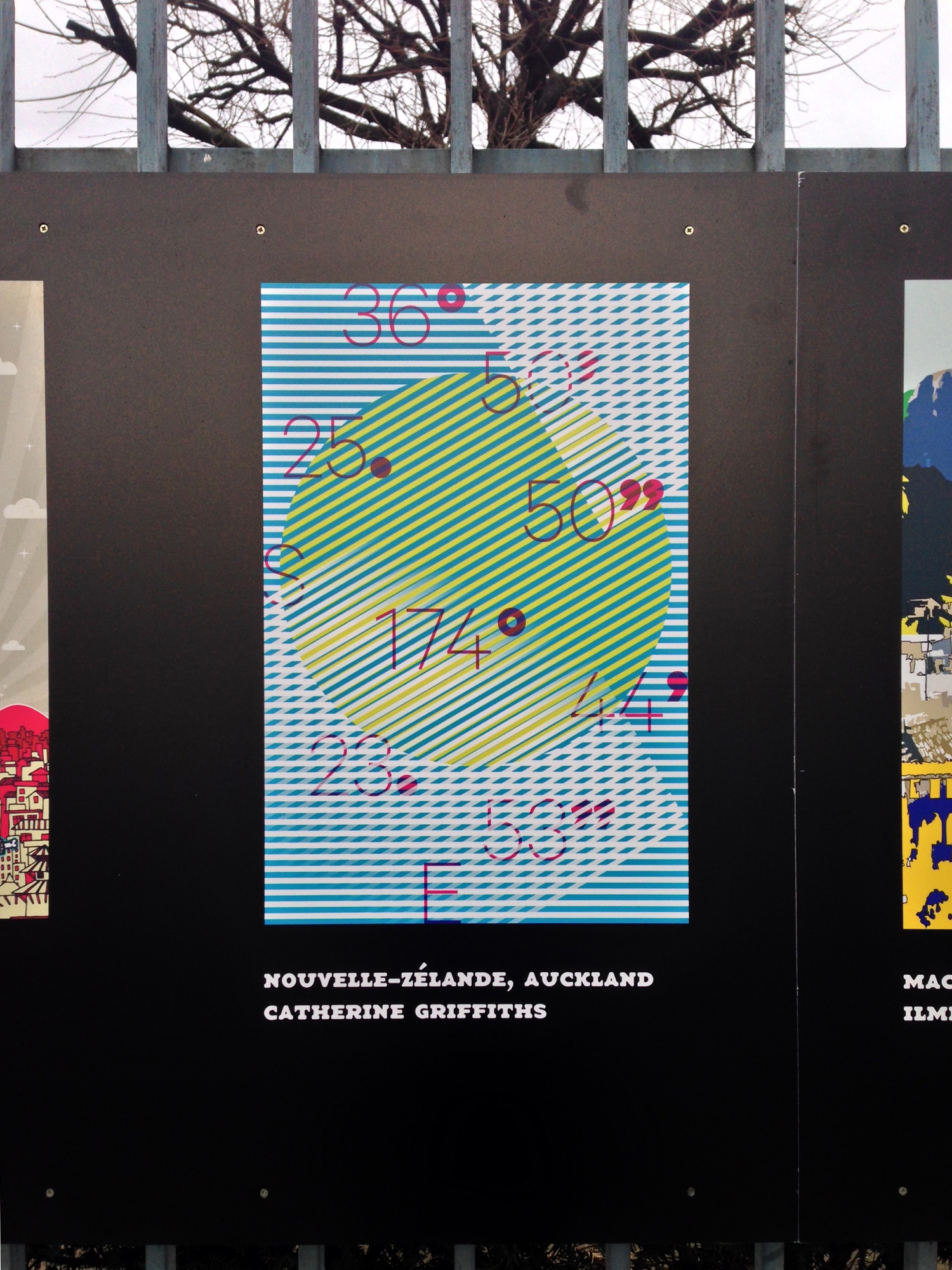
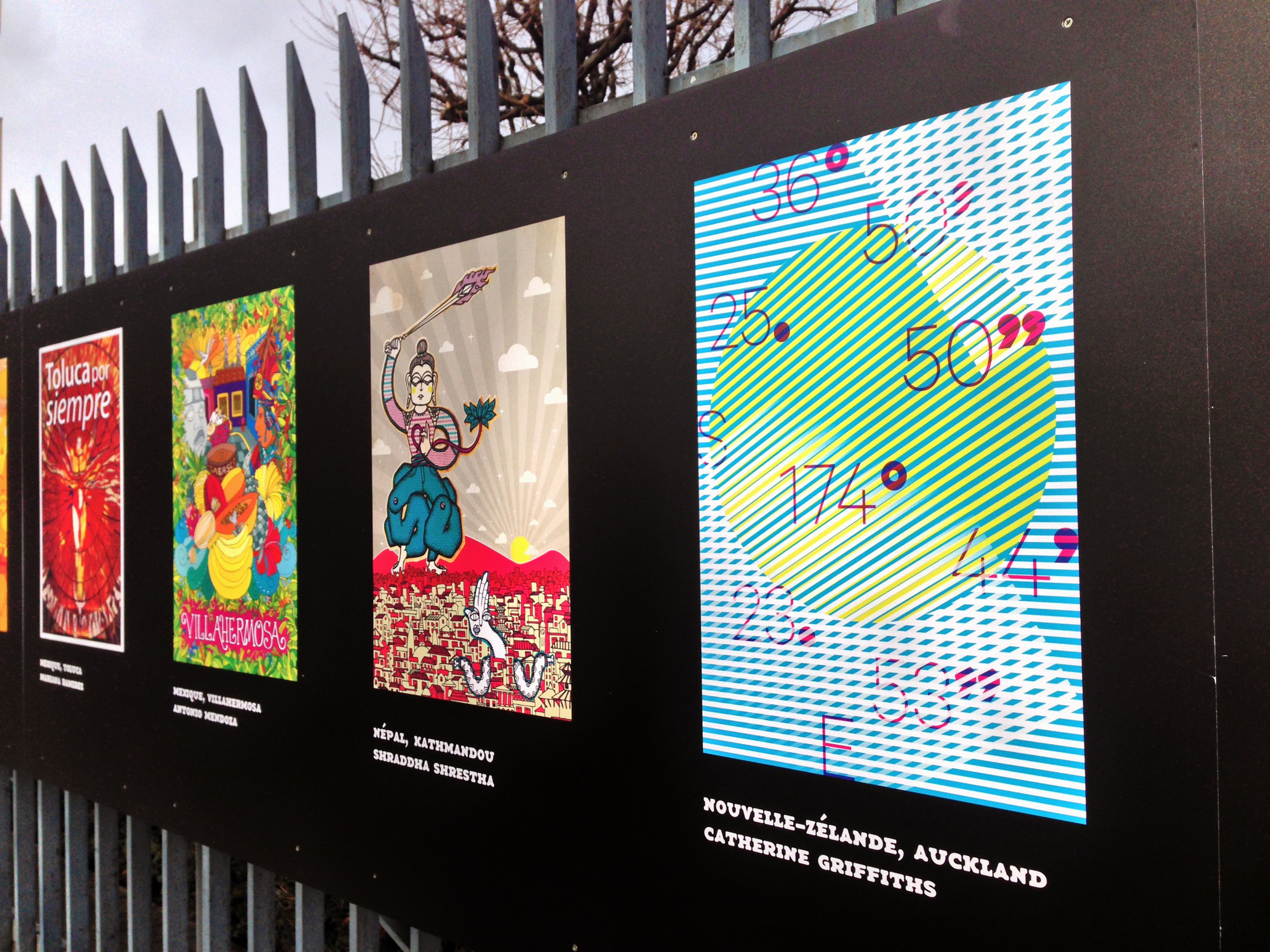
36°50′25.50″S 174°44′23.53″E / 50 Volcanoes / Auckland


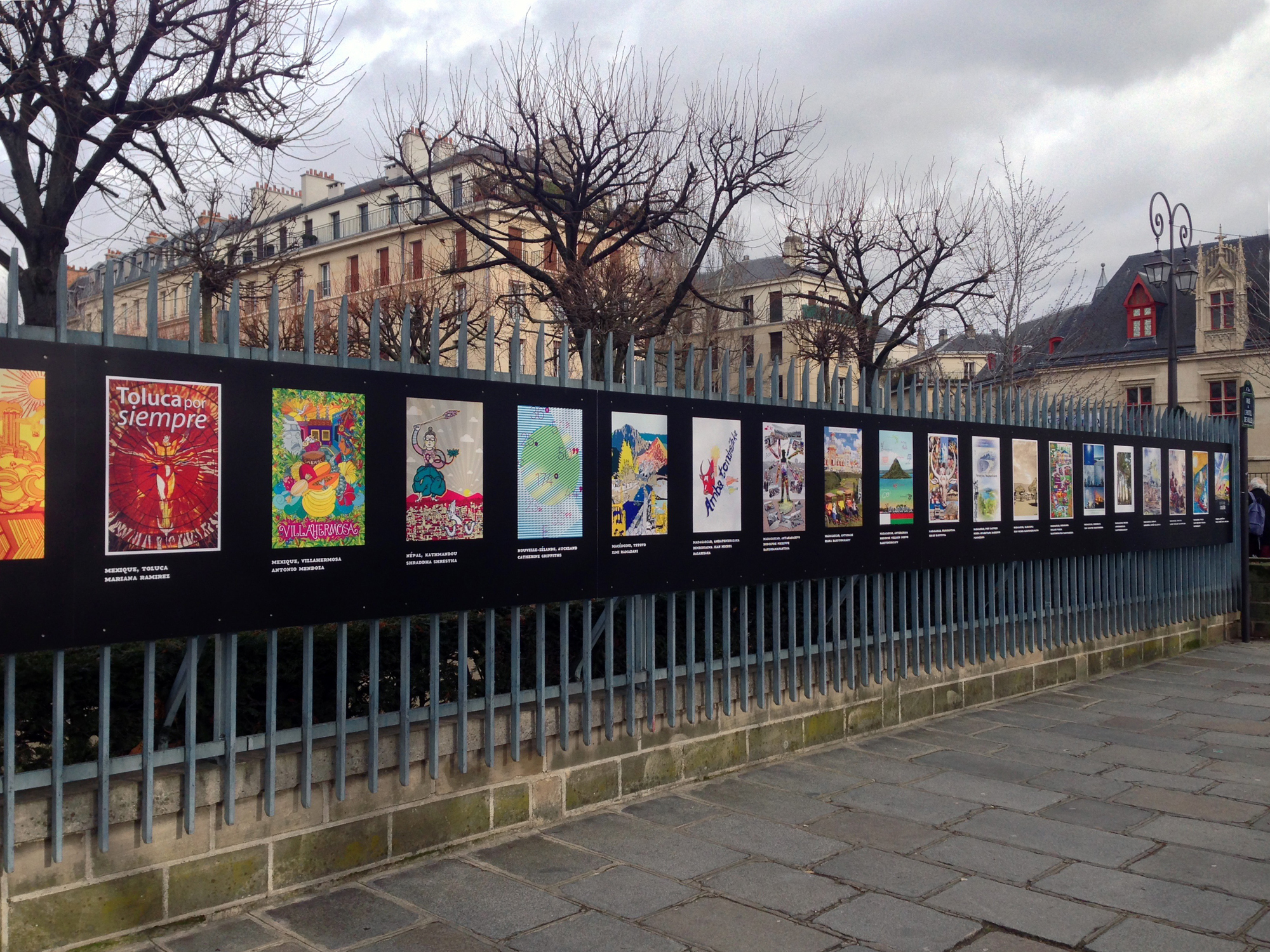
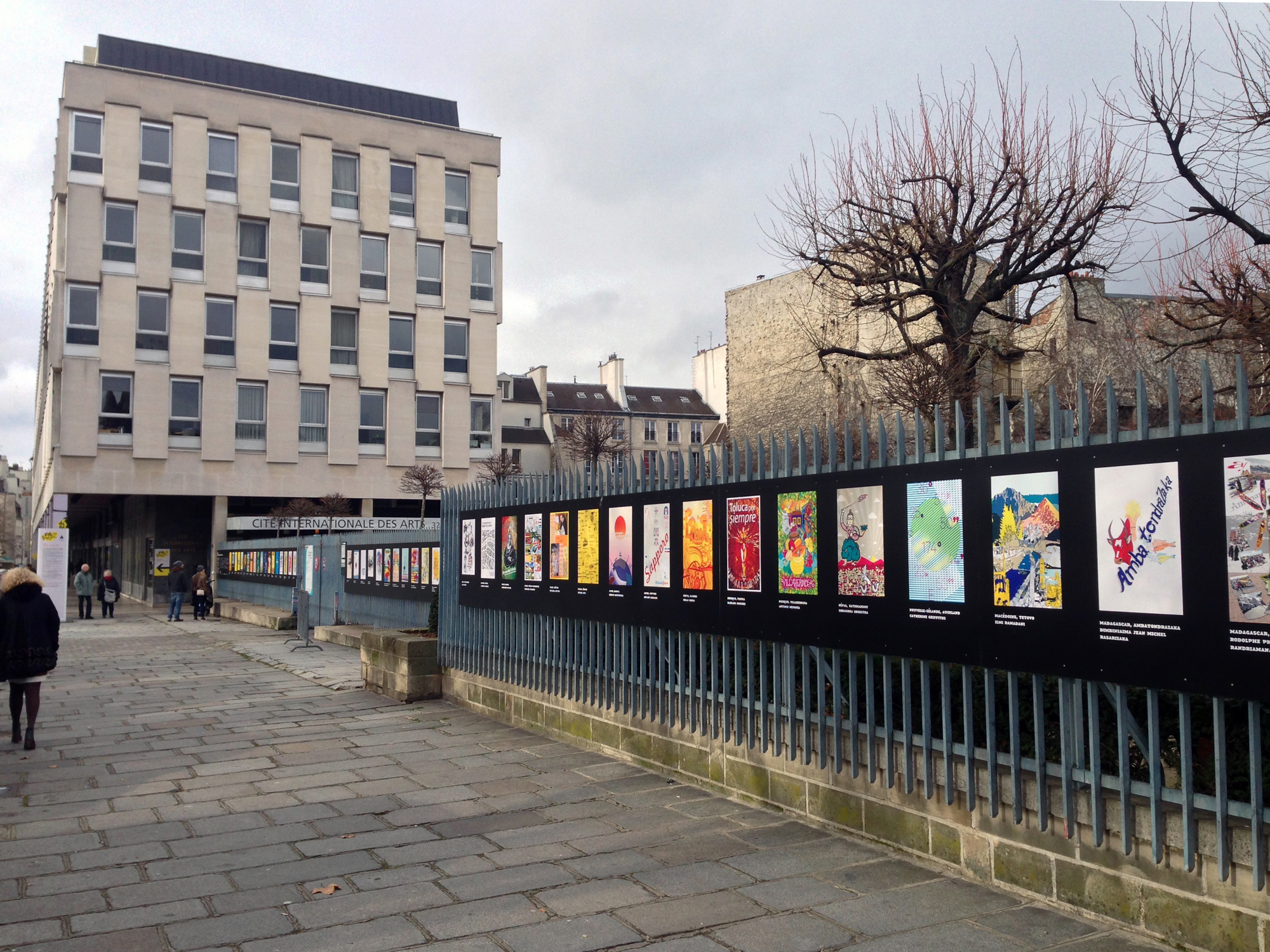
/ photographs in situ, Mark Harfield, January 2015
|
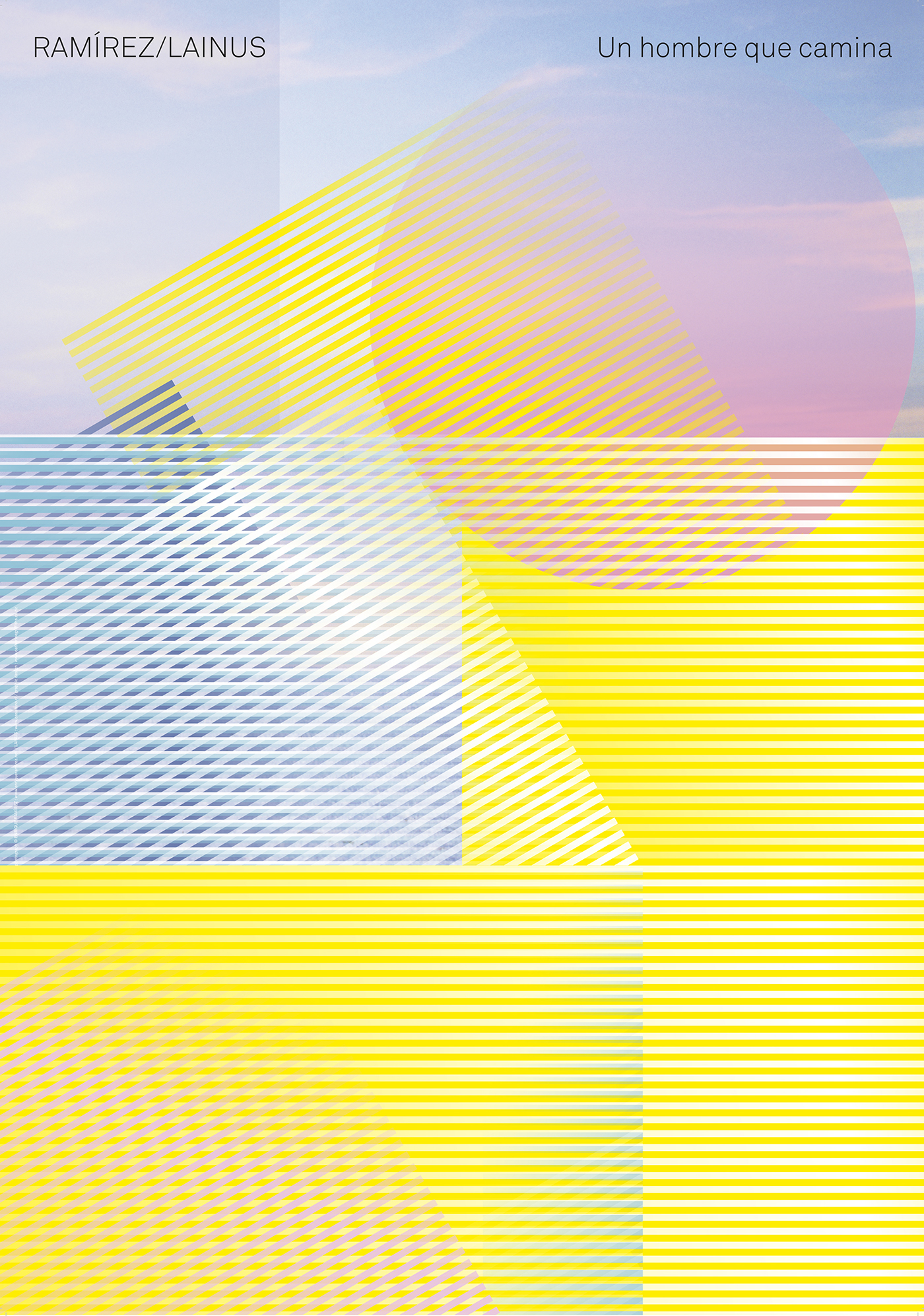
Towards the end of August 2014, while attending the screen-printing of the Hone Tuwhare Trust poem project, and having only just said “yes!” to designing the November cover for Japan’s advertising and design magazine, BRAIN (thank you, Masayoshi Kodaira), I received a phone call from the Alliance Française here, asking if I would design a poster representing the city of Auckland for the 2015 Fête du Graphisme, Paris. It was type designer Kris Sowersby who put my name forward, in their last minute call under an extended deadline. Three weeks on, after mountains of drawings and many hours (on top of a park design, a small book, and the Japanese cover), I settled on this design. I love the feeling of it — the atmosphere — and the way it shifts and changes with scale.


A note on the design
As if seen from high above, through a passing long white cloud, or mists of spray drift, the scattered coordinates reference the city’s position between a gulf and a sea, and the narrow isthmus on which it lies. Auckland — Tāmaki Makaurau — is built on a volcanic field. The myriad cones, visible as small mountains and islands including the iconic and symmetrical Rangitoto, are described by the circular marks and forms, also symbolic of the land, rain-forest, and the people. Our tiny pin-point location in the vast Pacific Ocean. The marks read as punctuation — speech marks, commas, fullstops — and acknowledge the many voices of our multi-cultural city, represented in the simple geometry of colour, texture and woven pattern.
#50
#volcanoes
#isthmus
#sea
#pacific
#ocean
#cloud
#mist
#topography
#typography
#scattered
#coordinates
#time
#distance
#geometric
#pattern
#speech
#punctuation
#voices
#māori
#european
#polynesian
#asian
#cosmopolitan
#auckland
#newzealand
#aotearoa

With thanks to Jean-Marc Dépierre and colleagues at the Alliance Française in Auckland, and to Kris for his typeface, Calibre. And to Mark Harfield for the photographs, merci!
/ Catherine Griffiths, September, 2014
|
|
05 a corporate world
selected
exhibition: A bespoke display system for New Zealand Institute of Architects
exhibition: Point of Distance
Venice Architecture Biennale 2014 submission
exhibition: Diverse Practice
School of Architecture, VUW
exhibition: ParlourLIVE!
Venice Architecture Biennale 2016 submission
film: Making Waves with 20...
id: Athfield Architects
id: KAREN Network
id: KTA
id: Logan Studio
id: The Oxygen Group
id: Parlour
id: REANNZ
id: Sharon Jansen Architect
id: Stevens Lawson Architects
id: TRANSFORM
id: TŪMANAKO : HOPE
online: Interstices Journal
print: A+W•NZ
print: BRAIN magazine, JP
print: Desktop magazine, AU
print: Adam Art Gallery
print: Kristy Gorman
print: Creative New Zealand
print: TypeSHED11
print: RAMIREZ/LAINUS
poster: A+W•NZ
poster: A Cadavre Exquis, TS11
poster: Fête du Graphisme 2015
poster: Blue Oyster Art Space
poster: Like This, Like Us
poster: Man-Made
poster: Salted:Singlet
poster: Things That Move Me
poster: Wonder-Land
poster: Window
wayfinding: Athfield Architect
wayfinding: Distance Markers
wayfinding: Fran Wilde Walk
Poster for 2015 Fête du Graphisme, Paris
2014
commission: Alliance Française, Auckland
New Zealand
related links
Fête du Graphisme
Alliance Francaise
Klim Type Foundry
Fonts in Use
2000s selected
Athfield Architects
REANNZ Research & Education Advanced Network New Zealand
The Oxygen Group
1990s selected/archived
Creative New Zealand
Victoria University
Wools of New Zealand
|

