|

above: 98 Flags / October 9th, 2015 / download the jpeg or high-res pdf

above: A Statement / August 18th, 2015

Flag suggestion: perspective sketch (submitted into the main referendum, July 16th, 2015)

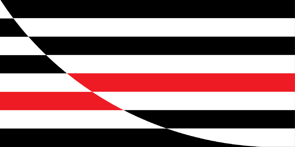
Flag suggestion: curve asymmetrical

Flag suggestion: curve

Flag suggestion: curve askew

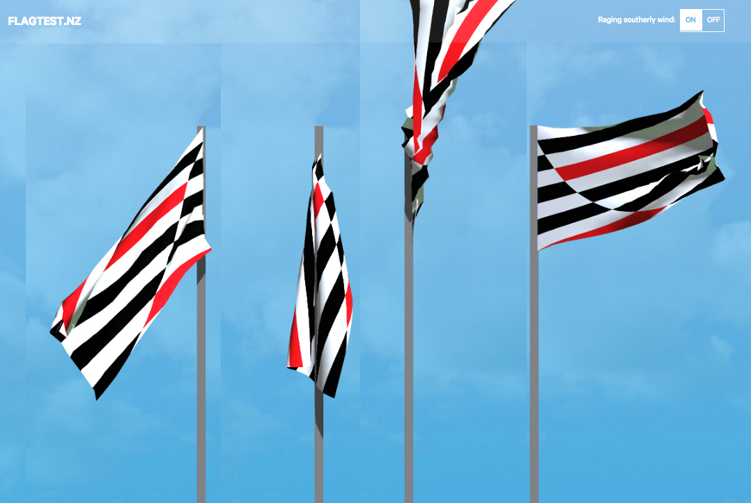
Flag flying and drape test: curve askew in colour
Raising the flag
These drawings emerged over months of background contemplation while observing the flag debate, amidst scepticism about political agendas, and the spectacular omission of designers (and artists) in a costly process that appears to exclude participation and critique by the profession. After being encouraged to join the design jury, with Desna Whaanga-Schollum and Mark Pennington, on Gareth Morgan’s design my flag competition, I saw an opportunity to help raise awareness, and give extended voice to design ... (further reading: Gareth’s views / judges’ comments).
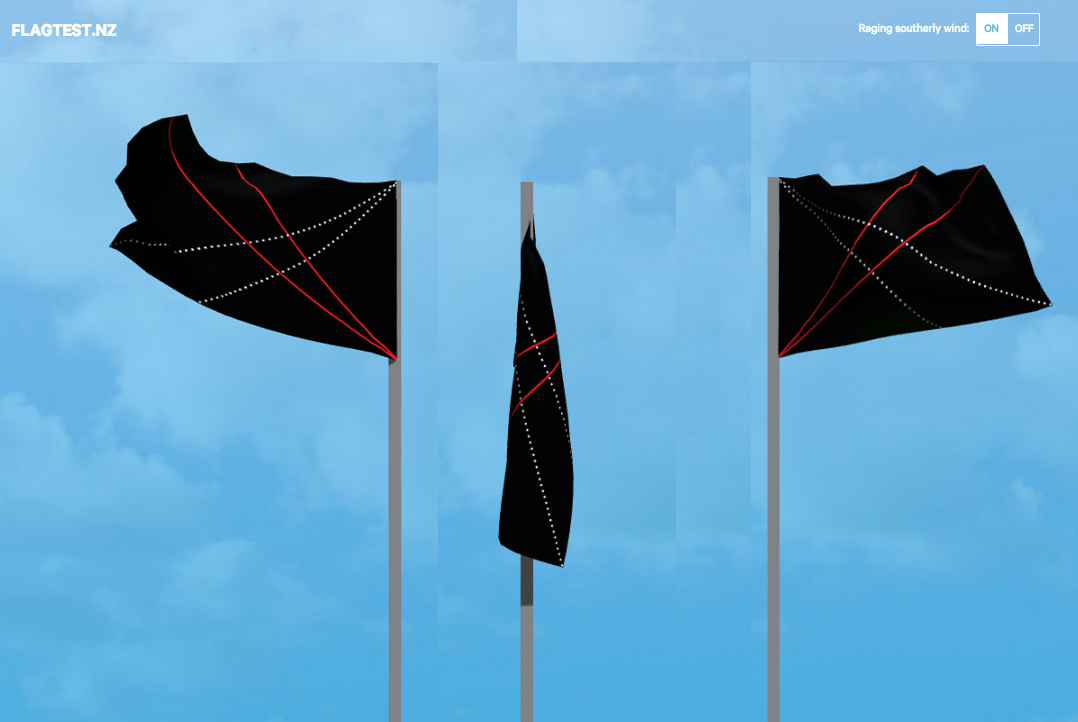
But back to the sketches. For what it was worth, and at the last minute, I entered a flag design into the government referendum with A Perspective (top drawing). Intended for interpretation by the viewer, this and the Curve variations are my attempts to elicit a feeling, an atmosphere, rather than prescribe the impossible “all things to all”. References can be made to Sound Tracks, the second in the vowel series, and among other work, this poster, 36°50′25.50″S 174°44′23.53″E / 50 Volcanoes.
But back to the referendum, caught between ambivalence and wanting to kick-ass, both a form of protest against smoke and mirrors, meant it was a casual comment out of left field that pushed me into the final hours. What the heck. Bruce waved his four long pennants’ worth — any one of the four can be merged, but only with each other, into the government referendum, and I sent in the perspective drawing, just before the deadline. I’m happy for the curve to have wound up sitting on the sidelines, where it can watch and still be seen. After sleeping on it, the following morning I drew up the curve askew version. It will never be merged, and that’s plenty enough for me.
/ CG, July 2015
A note on the drawings:
How the curve began and shifted, with colour variations (below), is touched on, but require more time to develop. The smallest shift in proportion, composition and colour can alter legibility, context and meaning significantly — no easy task, and especially where symbolism is concerned. The movement and stillness when flown and draped was tested on www.flagtest.nz. Colour tests made in black and white; and black, white and red.
That a child can draw a flag from memory is too simplistic a criteria: America’s stars and stripes would rarely be drawn accurately, yet it is recognisable in the hand of most who know this flag. Here, it would be the concept of stripes with a curved line drawn through, then coloured-in, in opposites, making the pattern. A useful test would be to take the flag designs, such as those in the referendum, and see what happens when interpreted by hand. Another test is to place the flag design into a sea of world flags, and see how how we might look — and stand apart. |

Curve, centred — starting point which led to the following variations:
 
Curve, asymmetrical

 
Curve

 
Curve, askew

 
A perspective

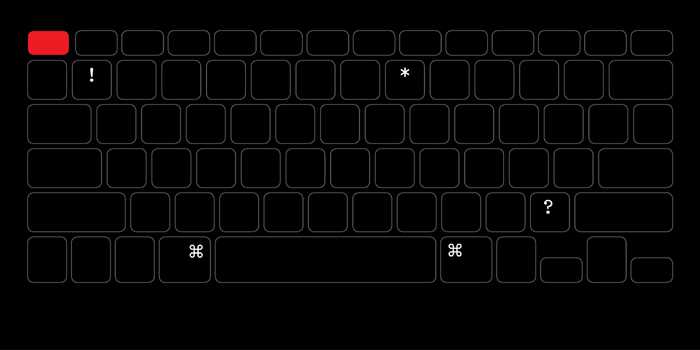
... a tad hard to resist, the Keyboard flag


Game over? Not quite.
|
|
03 other in(ter)ventions
TypeSHED11
an international typography symposium, Wellington, NZ
typ gr ph c
a series of compact workshops, Karekare, NZ
installations, exhibitions
Catherine Griffiths: Out of Line
Griffith University Art Museum, Meanjin Brisbane, Australia
24 February — 16 May 2026
Catherine Griffiths: Walk With Me
Te Wai Ngutu Kākā Gallery, Auckland University of Technology, Tāmaki Makaurau, Aotearoa NZ
30 July — 24 October 2025
Catherine Griffiths: Out of Line
The Design Gallery, University of Melbourne, Naarm, Australia
19 May — 27 June 2025
Iterations/Alterations
Enjoy Contemporary Art Space, Chapter 1, Aotearoa NZ
15 February — 29 March 2025 [extended to Chapter 2]
What is my threshold now?
Manifesto vs Manifest, PLATES #1, 2024, New York, USA
7/7, 14 views
Te Tuhi Project Wall, Aotearoa NZ
20 August – 22 October 2023
Self-preservation
Offering It Up, Adam Art Gallery, Aotearoa NZ
24 August —
29 October 2023
The Phone Book: Club de Conversation (2012): deconstructed (2019), suspended (2022)
Counterparts // Part one: Where To From Here?, No Vacancy, Naarm Melbourne, AUSTRALIA
12 – 31 July 2022
catherine griffiths : SOLO IN [ ] SPACE
The Space Gallery, Shanghai, CHINA
13 October – 1 December 2019
Work/Space
Shanghai Art and Design Exhibition, CHINA
3 – 13 December 2017
A whakapapa, two lines of women, an installation drawing
All Lines Converge, Govett-Brewster Art Gallery Aotearoa NZ
2016
Installation with mirror and line
transitionalfieldwork, an exhibition, Aotearoa NZ
2016
only U know ...
collaboration, Lela Jacobs AW17 Auckland, and SS17 Paris collection, Aotearoa NZ + FR
Constructed/Projected
installation, Typojanchi 2015, 4th International Typography Biennale, Seoul, KR
November 2015
The Tuwhare Poster Project
fund-raiser for the Hone Tuwhare Trust Writers Residency, Aotearoa NZ
2014
memento :: motif
Proyecto de Arte Contemporáneo Alzheimer, Valparaíso, Chile
23 September — 23 August 2012
The Phone Book
a maquette, for the Club de Conversation project, Aotearoa NZ
2012
Club de Conversation at S/F with Dino Chai, Auckland, Aotearoa NZ
14 July – 18 August 2012
Club de Conversation: Keyhole Series and Dials
rug series, Dilana Workshop, Aotearoa NZ
June — July 2012
Sound Tracks
installation, The Dowse Art Museum, Lower Hutt, Aotearoa NZ
2011
The Jets
short film, Paris, France
2010
posters, protest, statements
SHREDDED
[LUXON QUOTES] RUBBISH COLLECTION, six [type specimen] posters, 2026, Aotearoa NZ
The Best Design Awards
three [type specimen] posters, 2018, Aotearoa NZ
Labour of Love
another word-play poster, 2018, Aotearoa NZ
W in black
drawings in progress, 2017, Aotearoa NZ/FR
The Alphabet
front page takeover of the Sentinel & Enterprise newspaper for 26 days, Fitchburg, USA
The Brexit Series
a word-play [type specimen] poster series in response to Brexit, Aotearoa NZ
Raising the Flag
contemplative, suggestive — design unravelled, Aotearoa NZ
Protest Vessel
1/2 PRICE
a collaboration with ceramic artist Raewyn Atkinson, Aotearoa NZ
Raising the flag, Aotearoa New Zealand
2015
98 FLAGS: 12 designers and artists select from 10,000+ flags.
This is not a solution, but a visual statement.
In the wake of the announcements by the Flag Consideration Panel of the Government Referendum, Sarah Maxey (graphic artist) and Catherine Griffiths (designer and typographer) put a call out to designers and artists to make their own selection as individuals, based on a criteria of their own wishes, independently, as people of Aotearoa New Zealand. The result identified flags that were worth considering had political agendas been put aside, and representatives from the design, art and vexillology disciplines had been included.
Arch McDonnell & Toby Curnow (designers, joint) / Matthew Galloway (graphic designer & lecturer) / Sarah Maxey (graphic artist) / Neil Pardington (artist & designer, Kāi Tahu, Kāti Mamoe, Kāti Waewae, Pākeha) / Dan Newman (designer) / Bruce Connew (photographer) / Desna Whaanga-Schollum (designer & artist) / Catherine Griffiths (designer & typographer) / Lisa Reihana (artist) / Thomas Le Bas (designer & vexillologist) / Dr Johnson Witehira (designer & academic) / Kelvin Soh (graphic designer & publisher).
There were no rules, no prescription (vexillology, graphic design, or otherwise) and no pre-determined number. Those who accepted the call are represented in this poster across the 12 columns in a chronological sequence (first submission through to last received, left to right). This is a raw selection, unedited, openly presented. The most common flags are displayed top-most, move vertically downwards to a cross-section of single choices across the myriad designs. There is no other hierarchy or intervention. The resulting selection is intended as an alternative view—grouped thematically, roughly in such a way that the information fits together, and remains simple. All but two presented were eliminated by the FCP from their longlist, and none made the first shortlist. One design has been nominated from outside the referendum.
Catherine and Sarah would like to acknowledge and thank the people who designed the flags presented in this poster.
/ October 2015
download the jpeg or high-res pdf / view on FaceBook
posted October 9th, 2015
A Statement, prompted by the shortlist of 40 designs presented by the Flag Consideration Panel.
posted August 18th, 2015
Flag suggestions. A Perspective (top sketch) in black and white was submitted into the referendum. The Curve variations were not submitted (and nor was the Keyboard). Copyright and IP remain with SCG.
posted July 16th, 2015
related links
flag.govt.nz
flagtest.nz
flagpost.nz
flagdesign.nz
Figures of Speech
|


