|
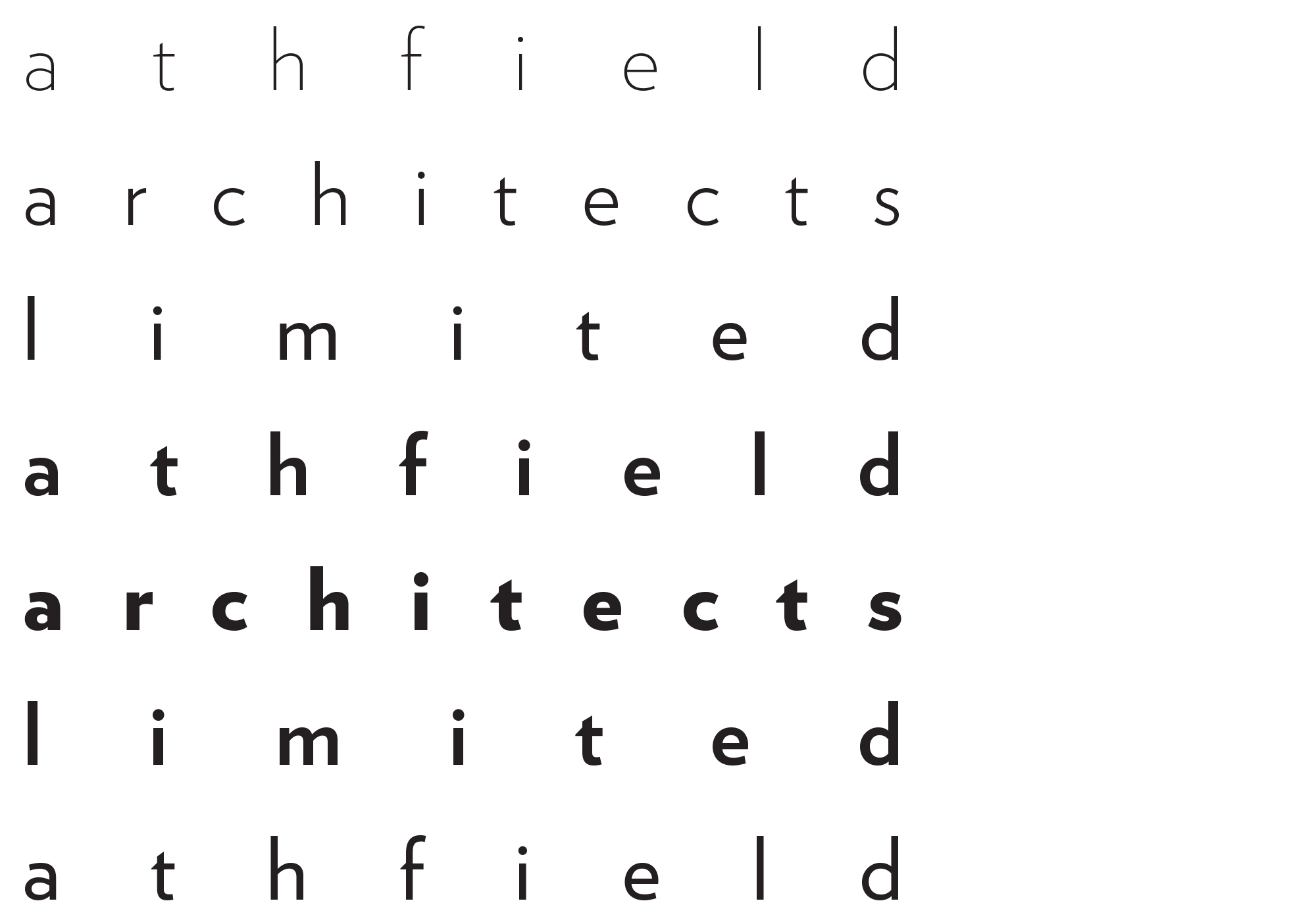
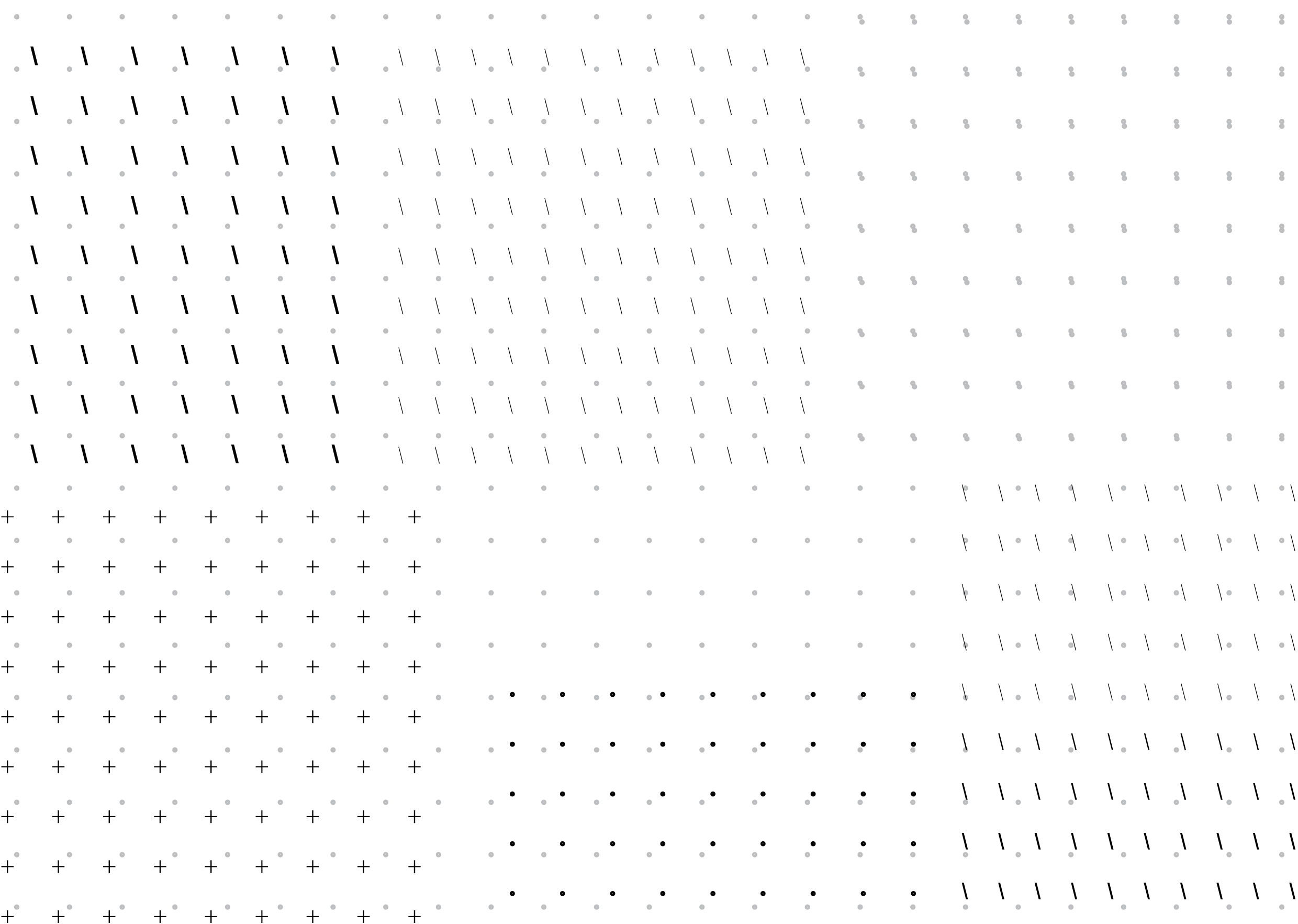
above: the corporate identity, a field of letters
below: wayfinding, on- and off- site, 2010/11
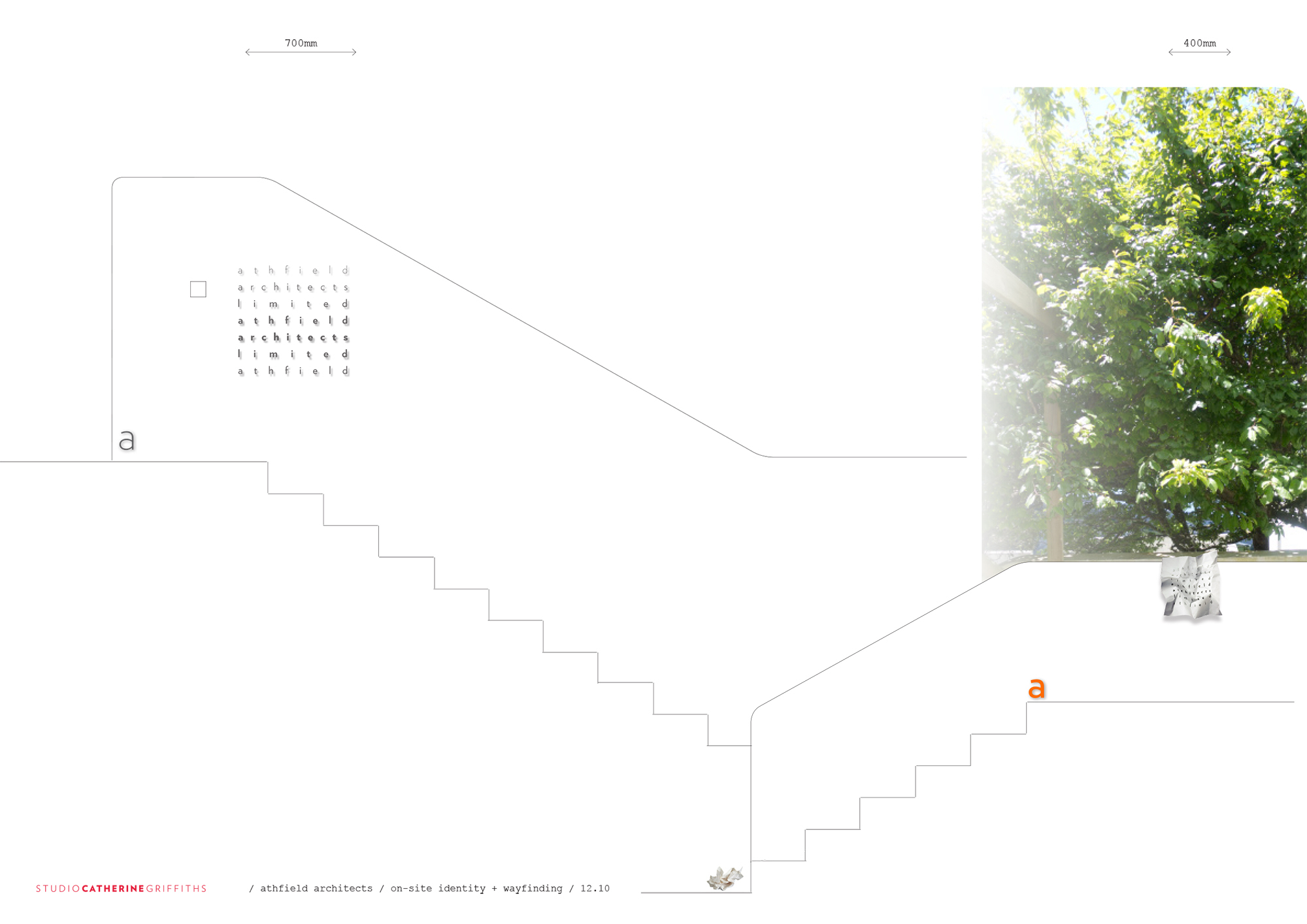
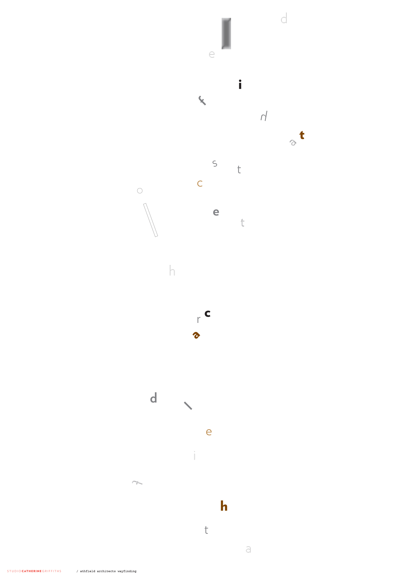
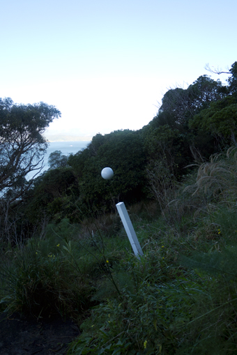
above: wayfinding signage on the hillside, concept and finished objects below: doodles articulate the AAL brand towards a new site ...
new site, launched 2016 — athfieldarchitects.co.nz — designed and developed by Sons & Co
|
05 a corporate world selected exhibition: A bespoke display system for New Zealand Institute of Architects exhibition: ParlourLIVE! film: Making Waves with 20... id: Athfield Architects online: Interstices Journal print: A+W•NZprint: BRAIN magazine, JP print: Desktop magazine, AU print: Adam Art Gallery print: Kristy Gorman print: Creative New Zealand print: TypeSHED11 print: RAMIREZ/LAINUS poster: A+W•NZ wayfinding: Athfield Architect
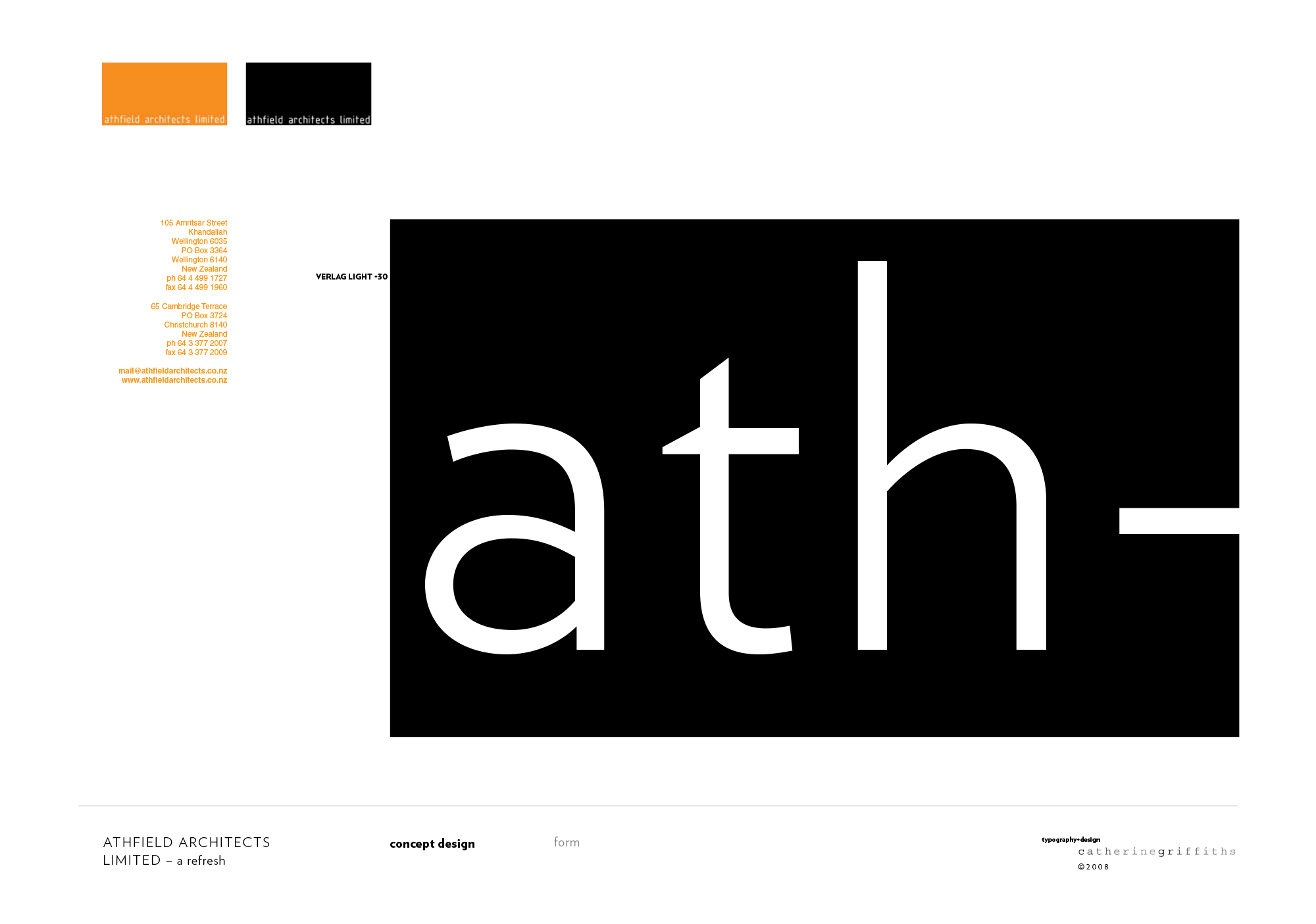
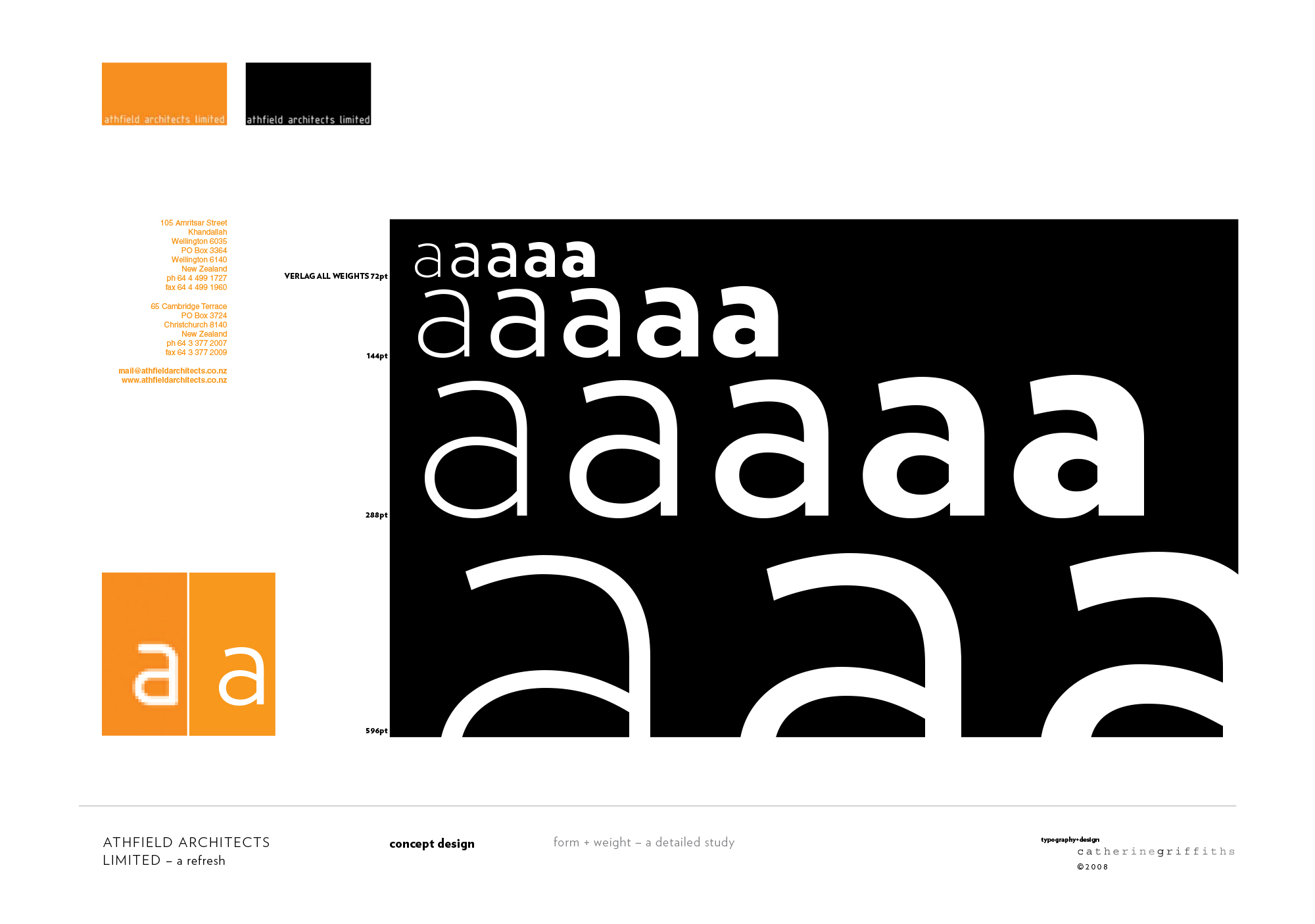
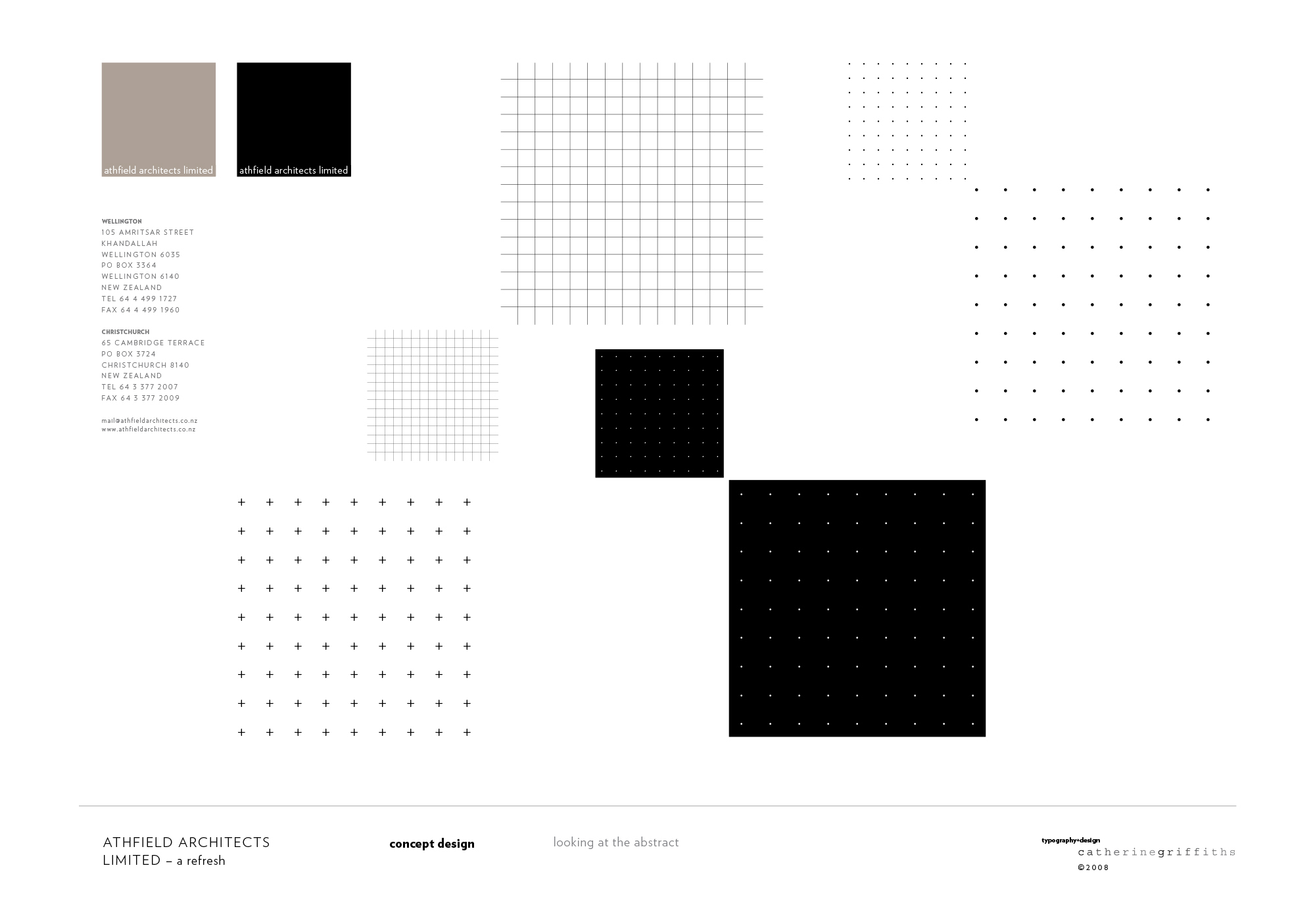
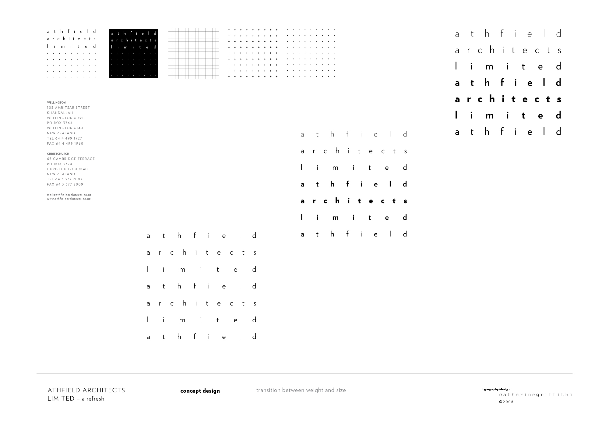
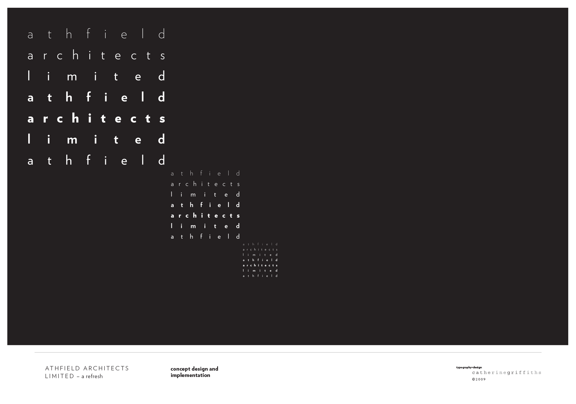
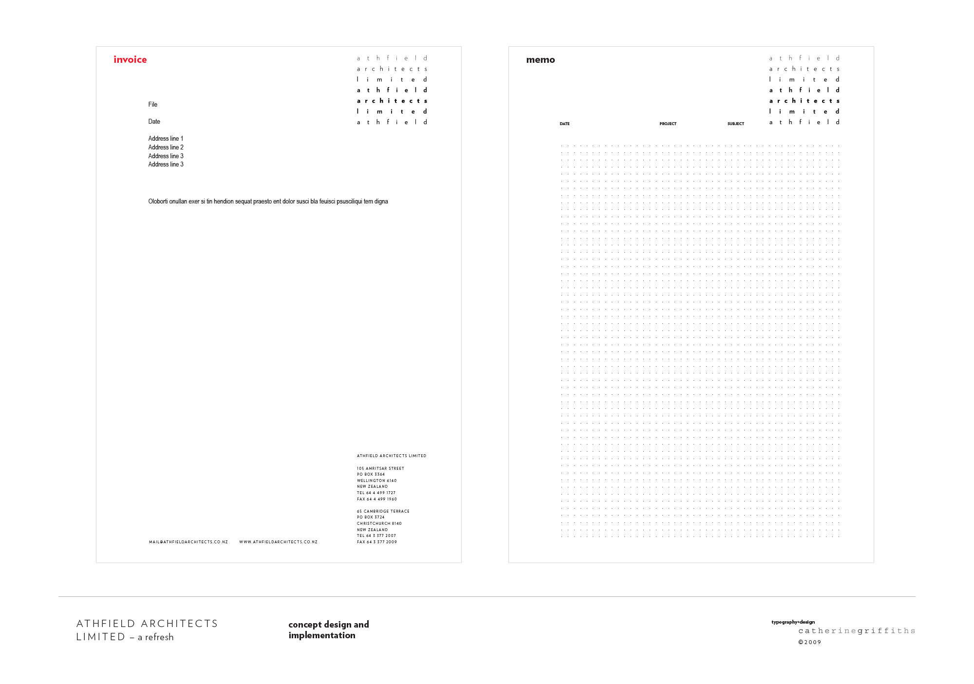
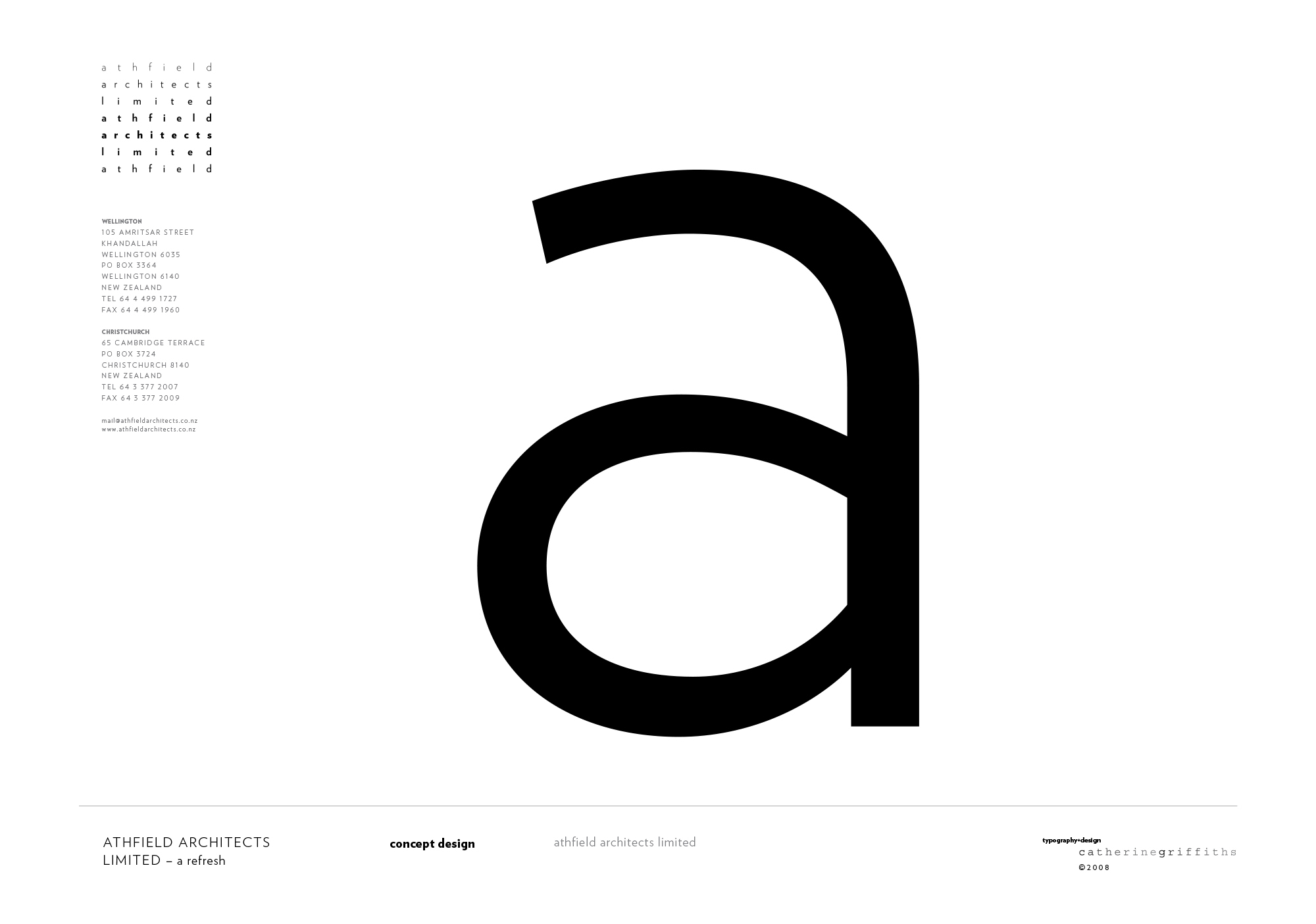
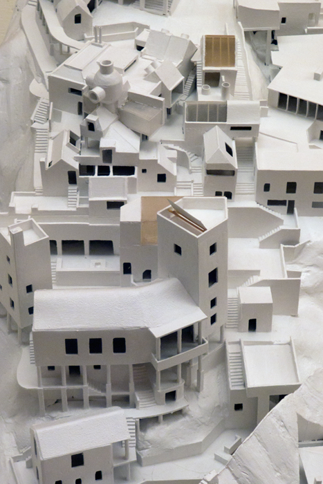
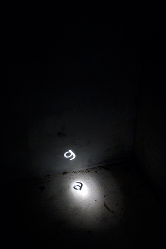
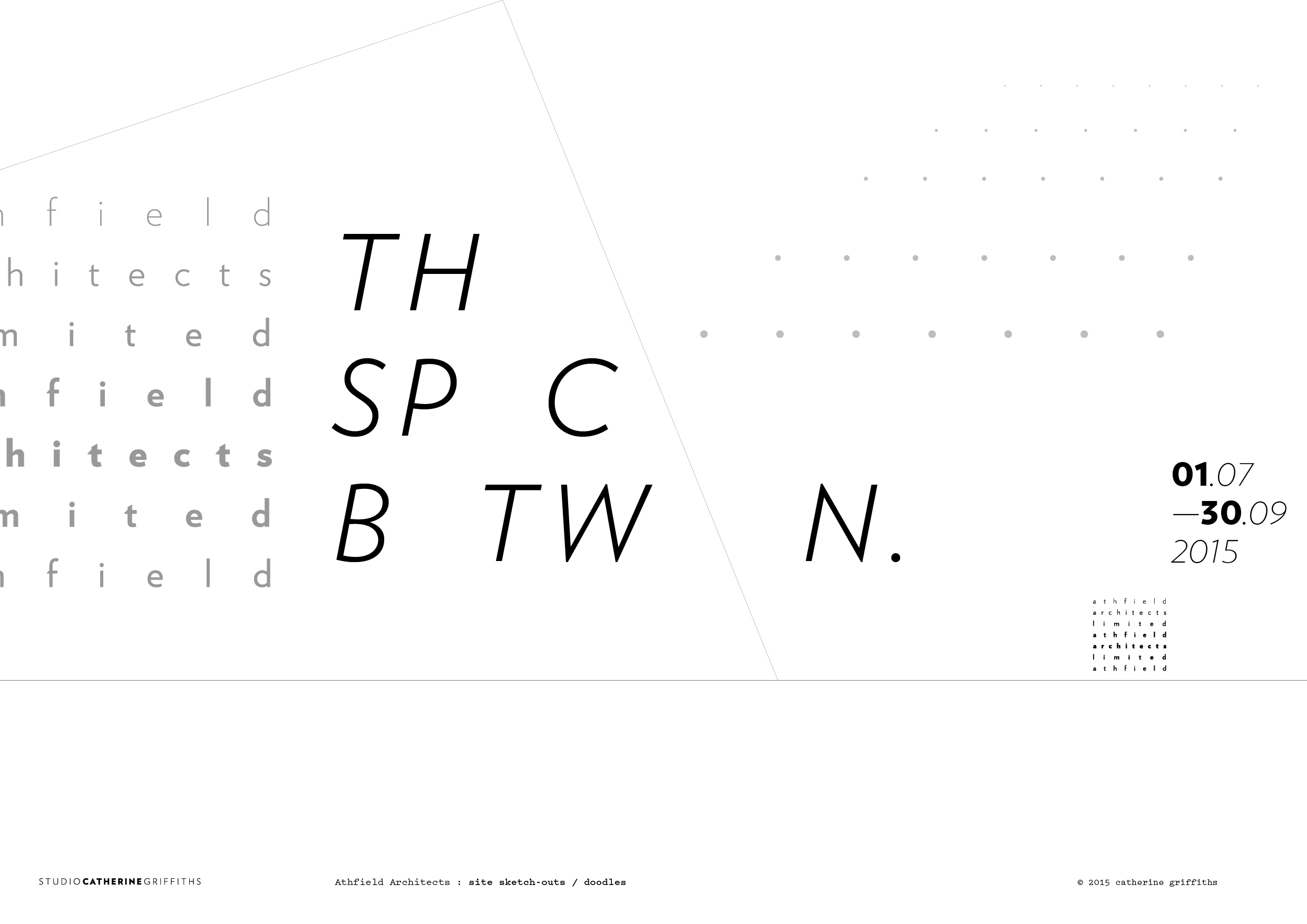
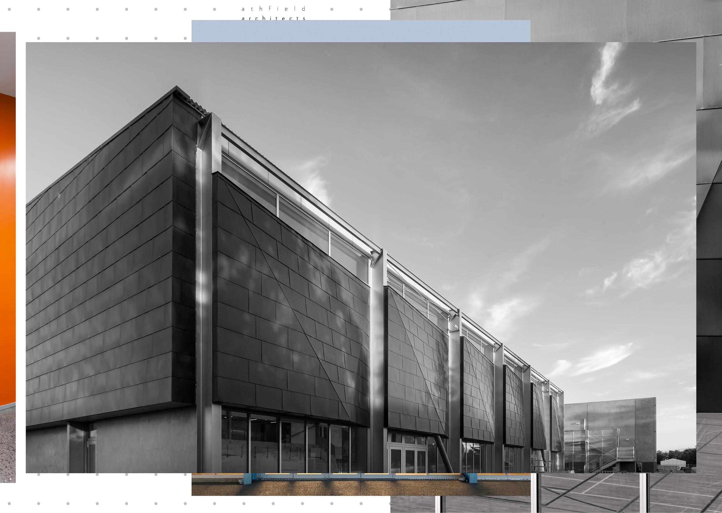
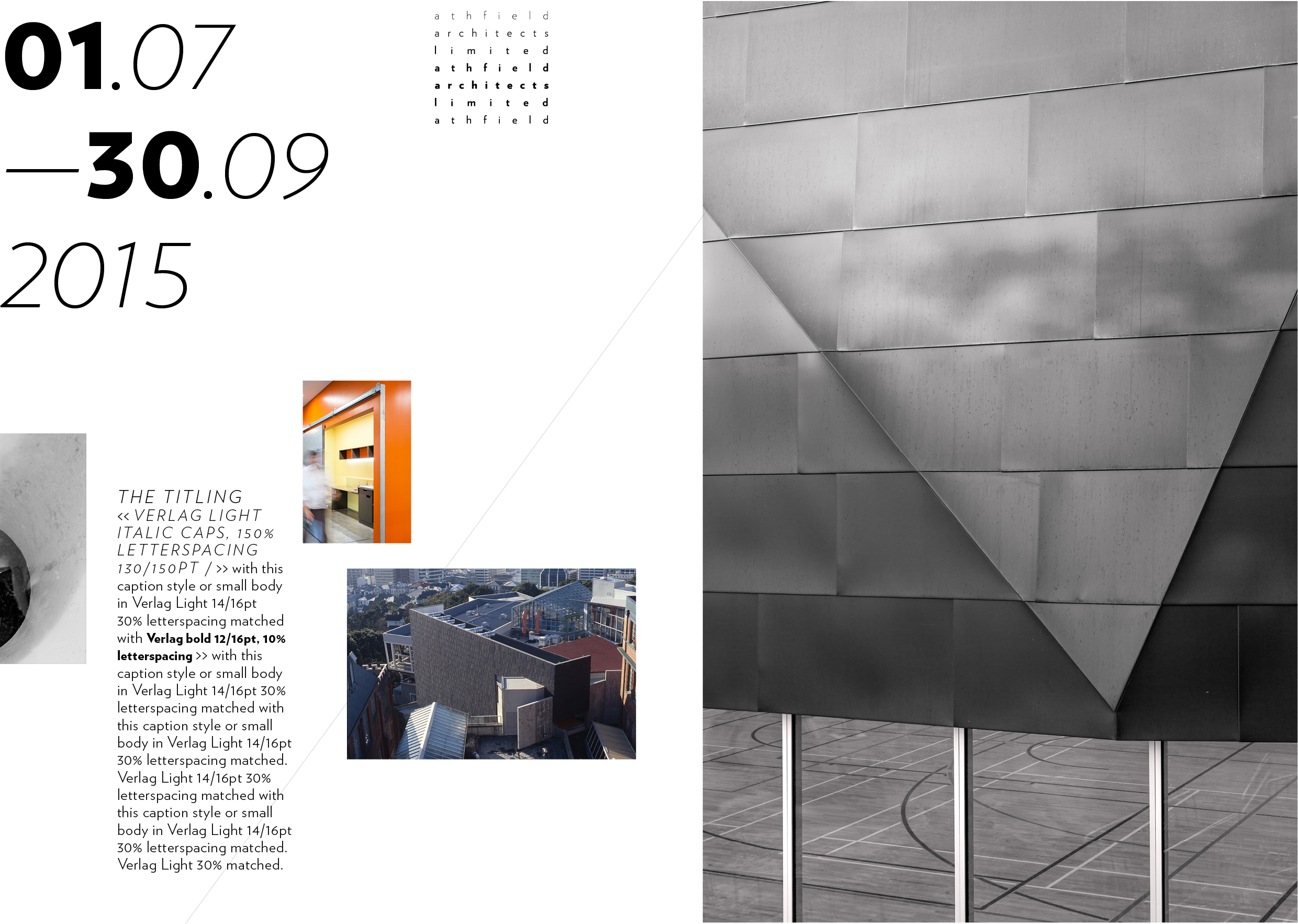
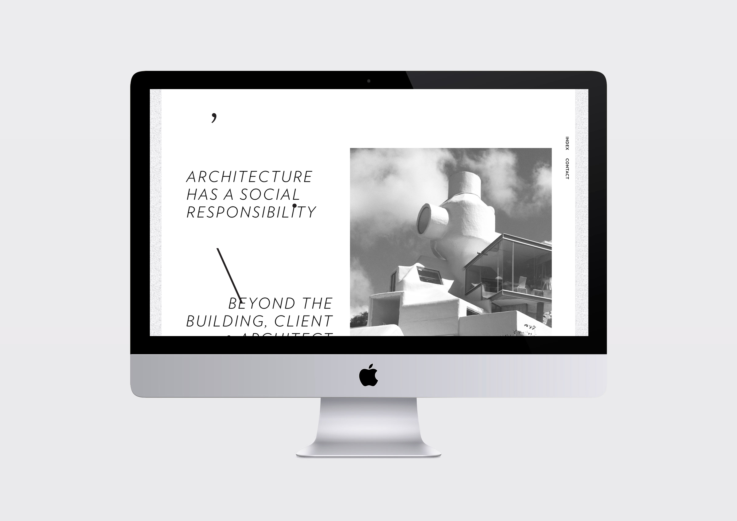
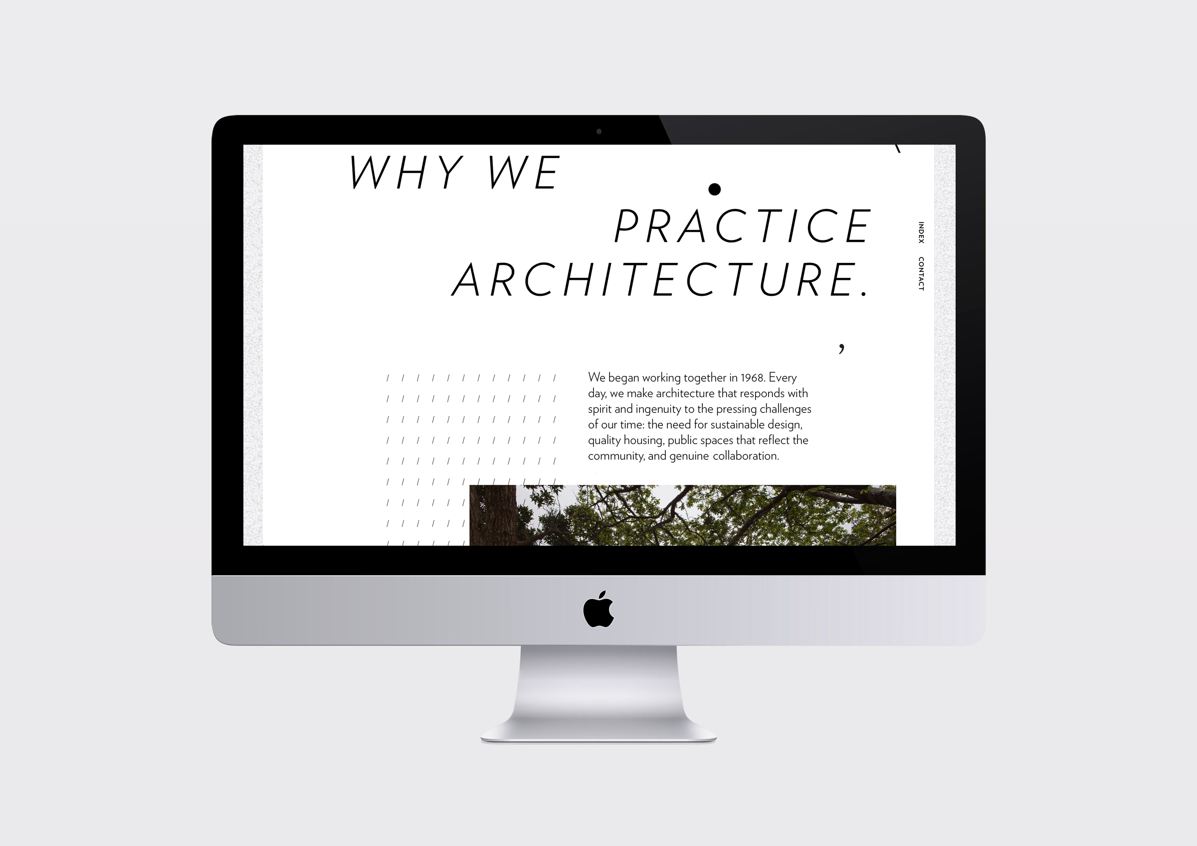
Logo and visual identity for Athfield Architects Limited client: Athfield Architects The field of letterforms on white space is a typographic response to the architecture practice, both physically and philosophically. Shown here are drawings of the thought process during concept and development back in 2008, a working drawing for the wayfinding signage system, an installation of letters, A Hillside Intervention, and the latest development, a new site by Sons & Co, launched July 2016. Set in five weights of Verlag, by Hoefler and Frere-Jones related links A Hillside Intervention 2000s selected Athfield ArchitectsREANNZ Research & Education Advanced Network New Zealand The Oxygen Group 1990s selected/archived Creative New Zealand |
||||||||||