|
1.
2.
3.
4.
5.
A note on the series
In the few days before the Brexit referendum result, I had been in conversation with London-based designer and educator Hamish Muir (MuirMcNeil). When I saw his type Tweet “The past, or the Futura?”, I straightaway had my response — in Akzidenz Grotesk. A brief back-and-forth by email brought out a Univers witticism from Hamish, but as the shock and dismay at an EU exit took hold, it overwhelmed our humour. The speed and nature of events, and where this majority had come from, and what it might mean, wiped the smile from many.
As a Remain voter (I have a British passport), and in an attempt to somehow grasp the scale and consequence of Brexit, along with millions of others, to deal with the concept emotionally, I continued to respond in my studio, from afar, offline, to this “blundering beast” reshaping by the hour, with word-play and relevant typeface names from my library. Some worked, others didn’t. I persevered, and slowly accumulated typeface names to match these galloping events. Out of sensitivity and respect to friends in the midst of the maelstrom, I hesitated a few days before sharing the first poster on social media.
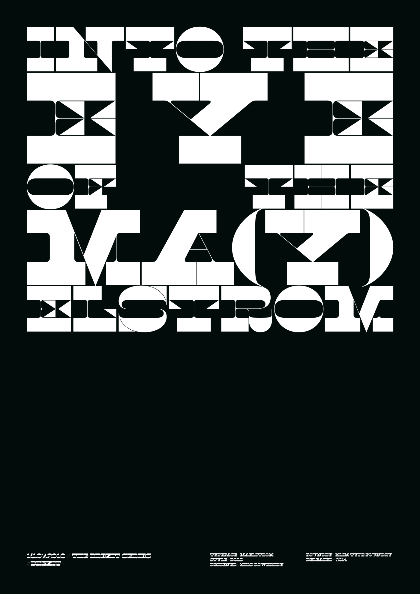
Five posters ... while tempted at times to move the compositions a step up, I was encouraged to remain focused on the “word-play” idea, and not deviate into compositional meaning, although there are one or two minor digressions. Eurostile is set in lowercase italics — an emphatic voice, and the fifth poster, INTO THE EYE OF THE MA(Y)ELSTROM began as a fully justified layout ... the negative spaces of the word E Y E forming an eye ... but, after some discussion (one suggested I flip a coin), I decided to pull back, and go for left alignment, in the style of the others (although Georgia breaks out into a wayward nursery rhyme). I then reverted! Legibility could be argued over, and this is where Maelstrom pushes the boundaries, and rightly so.
Over the last 15 years, thanks to the advent of desktop publishing, we have watched design become more democratic, and now, in the everyday, we see decisions on type and typefaces made by almost everyone — anyone with a device. We hear the word “font” and the names of typefaces in conversation outside of the design discipline. That never used to happen. Words and type are tools for expression: they are a combined force, and, in this case, a democratic protest tool.
— CG / July 2016
*born mid-sixties in England, to New Zealand parents during their O.E.
|
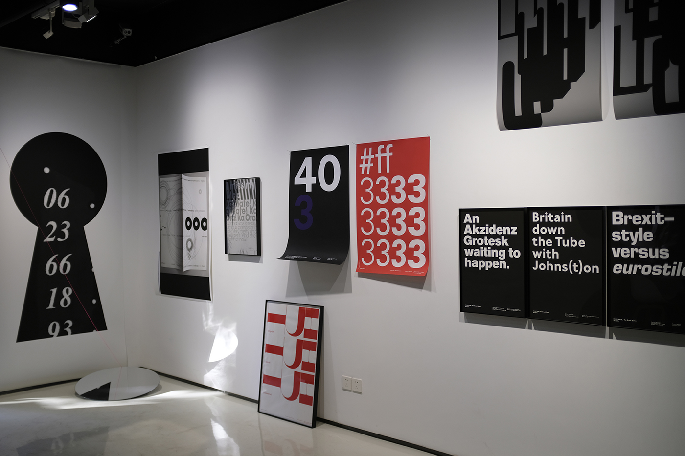
installation / activation wall, catherine griffiths : SOLO IN [ ] SPACE, Shanghai, 2019
|
03 other in(ter)ventions
TypeSHED11
an international typography symposium, Wellington, NZ
typ gr ph c
a series of compact workshops, Karekare, NZ
installations, exhibitions
Catherine Griffiths: Out of Line
Griffith University Art Museum, Meanjin Brisbane, Australia
24 February — 16 May 2026
Catherine Griffiths: Walk With Me
Te Wai Ngutu Kākā Gallery, Auckland University of Technology, Tāmaki Makaurau, Aotearoa NZ
30 July — 24 October 2025
Catherine Griffiths: Out of Line
The Design Gallery, University of Melbourne, Naarm, Australia
19 May — 27 June 2025
Iterations/Alterations
Enjoy Contemporary Art Space, Chapter 1, Aotearoa NZ
15 February — 29 March 2025 [extended to Chapter 2]
What is my threshold now?
Manifesto vs Manifest, PLATES #1, 2024, New York, USA
7/7, 14 views
Te Tuhi Project Wall, Aotearoa NZ
20 August – 22 October 2023
Self-preservation
Offering It Up, Adam Art Gallery, Aotearoa NZ
24 August —
29 October 2023
The Phone Book: Club de Conversation (2012): deconstructed (2019), suspended (2022)
Counterparts // Part one: Where To From Here?, No Vacancy, Naarm Melbourne, AUSTRALIA
12 – 31 July 2022
catherine griffiths : SOLO IN [ ] SPACE
The Space Gallery, Shanghai, CHINA
13 October – 1 December 2019
Work/Space
Shanghai Art and Design Exhibition, CHINA
3 – 13 December 2017
A whakapapa, two lines of women, an installation drawing
All Lines Converge, Govett-Brewster Art Gallery Aotearoa NZ
2016
Installation with mirror and line
transitionalfieldwork, an exhibition, Aotearoa NZ
2016
only U know ...
collaboration, Lela Jacobs AW17 Auckland, and SS17 Paris collection, Aotearoa NZ + FR
Constructed/Projected
installation, Typojanchi 2015, 4th International Typography Biennale, Seoul, KR
November 2015
The Tuwhare Poster Project
fund-raiser for the Hone Tuwhare Trust Writers Residency, Aotearoa NZ
2014
memento :: motif
Proyecto de Arte Contemporáneo Alzheimer, Valparaíso, Chile
23 September — 23 August 2012
The Phone Book
a maquette, for the Club de Conversation project, Aotearoa NZ
2012
Club de Conversation at S/F with Dino Chai, Auckland, Aotearoa NZ
14 July – 18 August 2012
Club de Conversation: Keyhole Series and Dials
rug series, Dilana Workshop, Aotearoa NZ
June — July 2012
Sound Tracks
installation, The Dowse Art Museum, Lower Hutt, Aotearoa NZ
2011
The Jets
short film, Paris, France
2010
posters, protest, statements
SHREDDED
[LUXON QUOTES] RUBBISH COLLECTION, six [type specimen] posters, 2026, Aotearoa NZ
The Best Design Awards
three [type specimen] posters, 2018, Aotearoa NZ
Labour of Love
another word-play poster, 2018, Aotearoa NZ
W in black
drawings in progress, 2017, Aotearoa NZ/FR
The Alphabet
front page takeover of the Sentinel & Enterprise newspaper for 26 days, Fitchburg, USA
The Brexit Series
a word-play [type specimen] poster series in response to Brexit, Aotearoa NZ
Raising the Flag
contemplative, suggestive — design unravelled, Aotearoa NZ
Protest Vessel
1/2 PRICE
a collaboration with ceramic artist Raewyn Atkinson, Aotearoa NZ
The Brexit Series
2015
A political poster series, posing as type specimens, on the blundering beast of Brexit, a riff off a Twitter post by London-based designer and educator Hamish Muir, “The past, or the Futura?” the day before voting in the Referendum closed. A brief back-and-forth by email brought out a Univers witticism from Hamish, but as the shock and dismay at an EU exit took hold, it overwhelmed our humour. The speed and nature of events, and where this majority had come from, and what it might mean, wiped the smile from many ...
>> read on, beneath posters
Each poster is notated with the date made, and information on the typeface used:
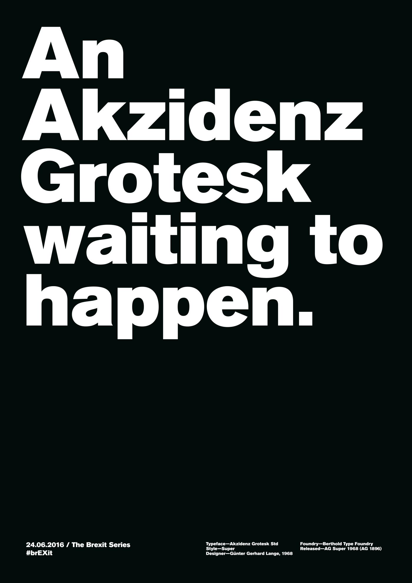
1) 24.06.2016
National declaration of the referendum result to exit the EU. Akzidenz Grotesk Std Super / Gunter Gerhard Lange, 1968 / Berthold Type Foundry, AG Super 1968, (AG 1896)
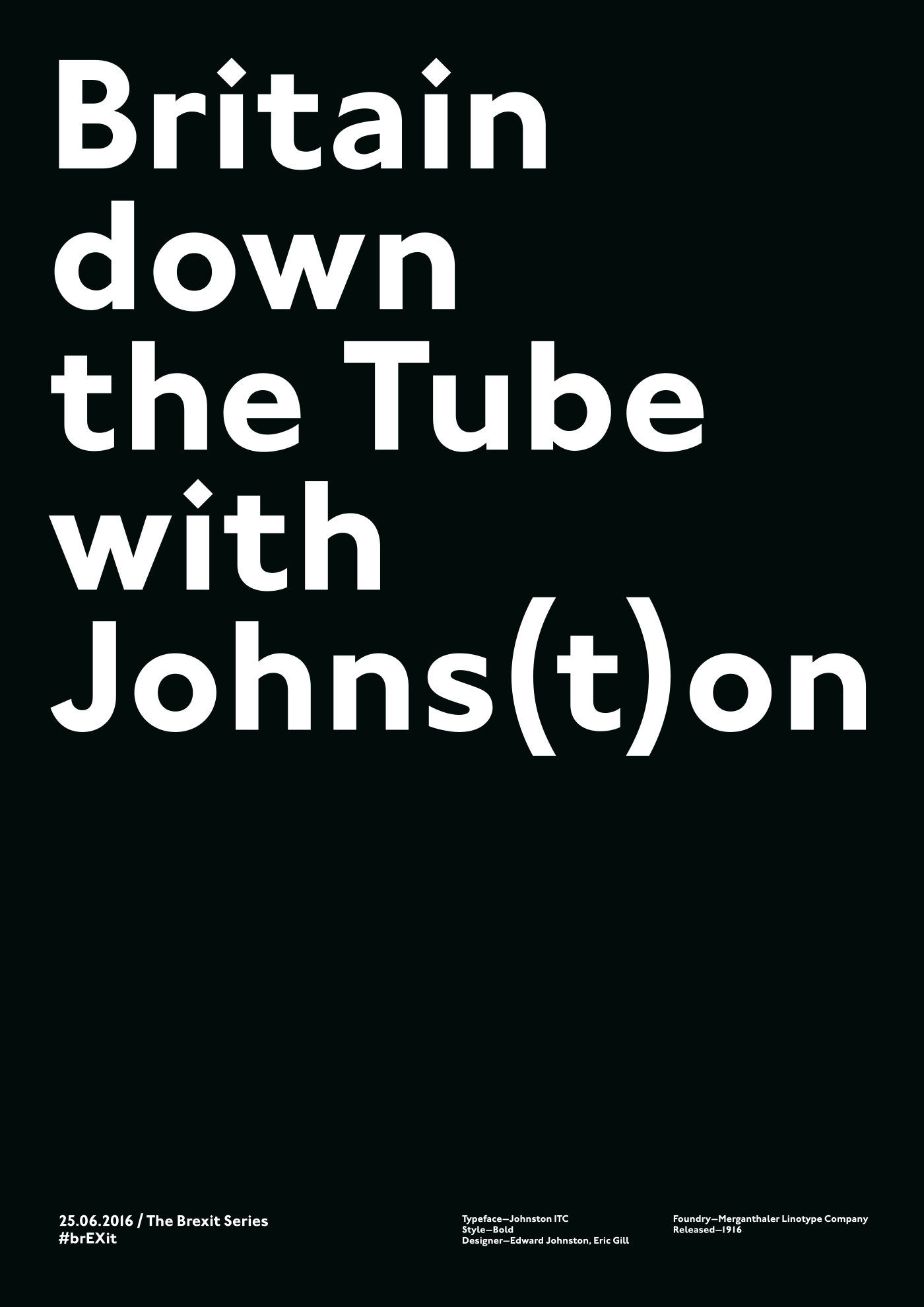
2) 25.06.2016
UK’s senior EU officials resign, pound hits 30 year low ... Johnston ITC Std Bold / Edward Johnston, Eric Gill / Mergenthaler
Linotype Company, 1916. Johnston, the iconic typeface of the London Underground,
celebrates 100 years, London Letters
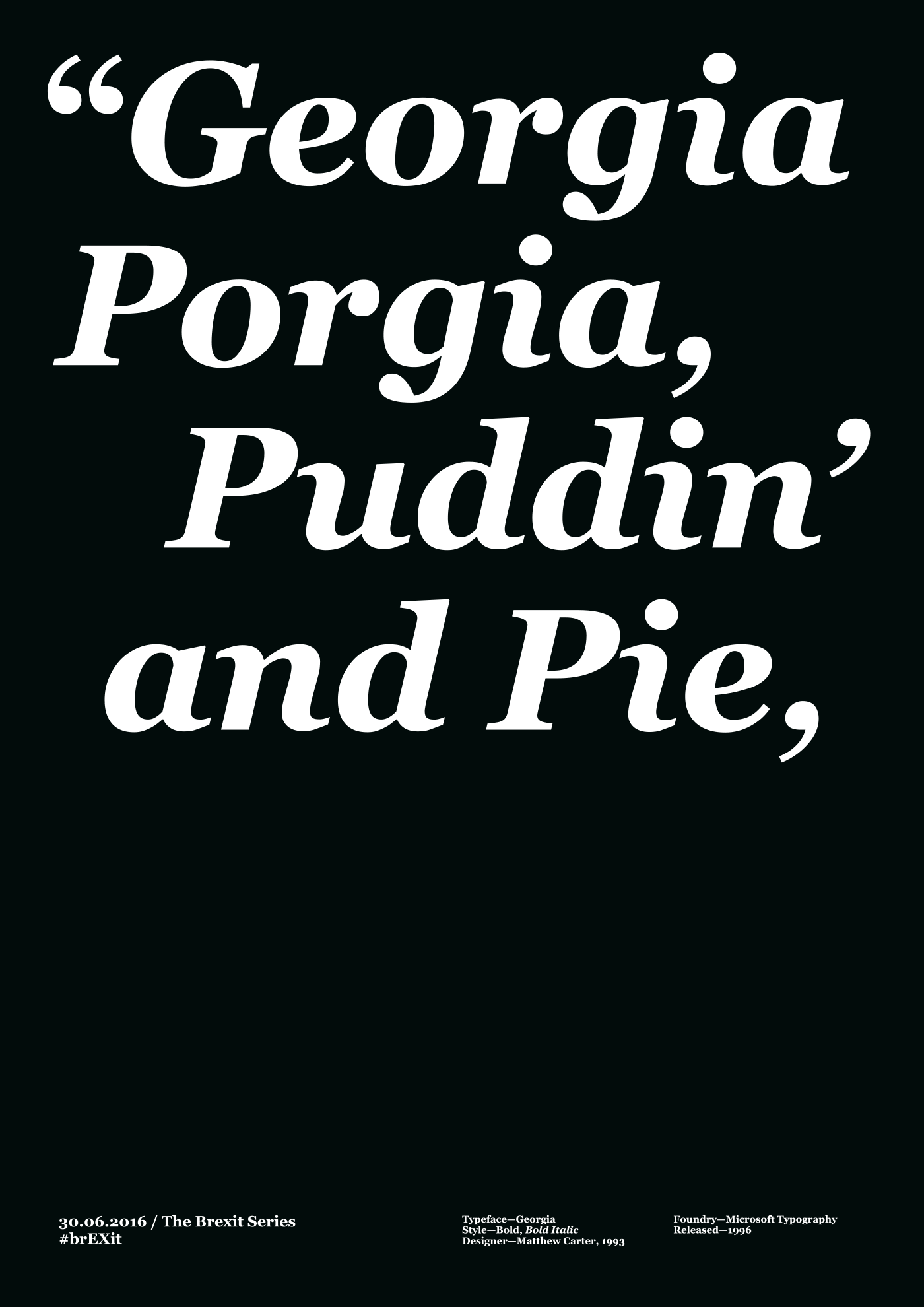
3) 30.06.2016
Boris Johnson exits leadership race after ambush by Michael Gove. Georgia Bold, Bold Italic / Matthew Carter, 1993 / Microsoft Typography, 1996
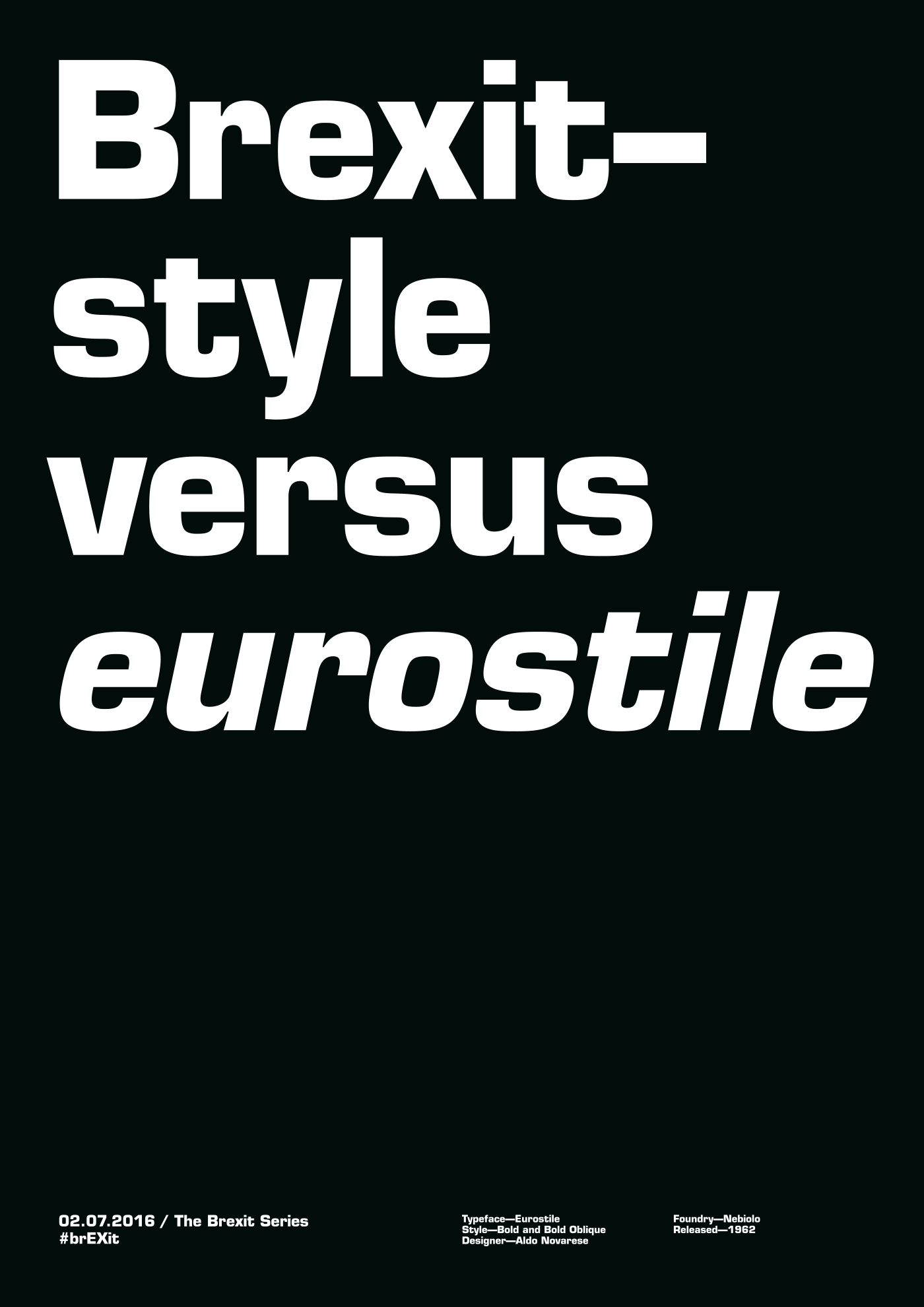
4) 02.07.2016
Brexit-style versus Eurostile.
Eurostile Bold, Bold Oblique / Aldo Novarese / Nebiolo 1962 *promotional film Eurostile: La Forma Del Futuro (played at TypeSHED11, 2009)
5) 15.07.2016
INTO THE EYE OF THE MA(Y)ELSTROM. Maelstrom Bold / Kris Sowersby / Klim Type Foundry, 2014
MuirMcNeil
Berthold Type Foundry
Johnston 100 years
Microsoft Typography
Eurostile: La Forma Del Futuro
Klim Type Foundry
|