|


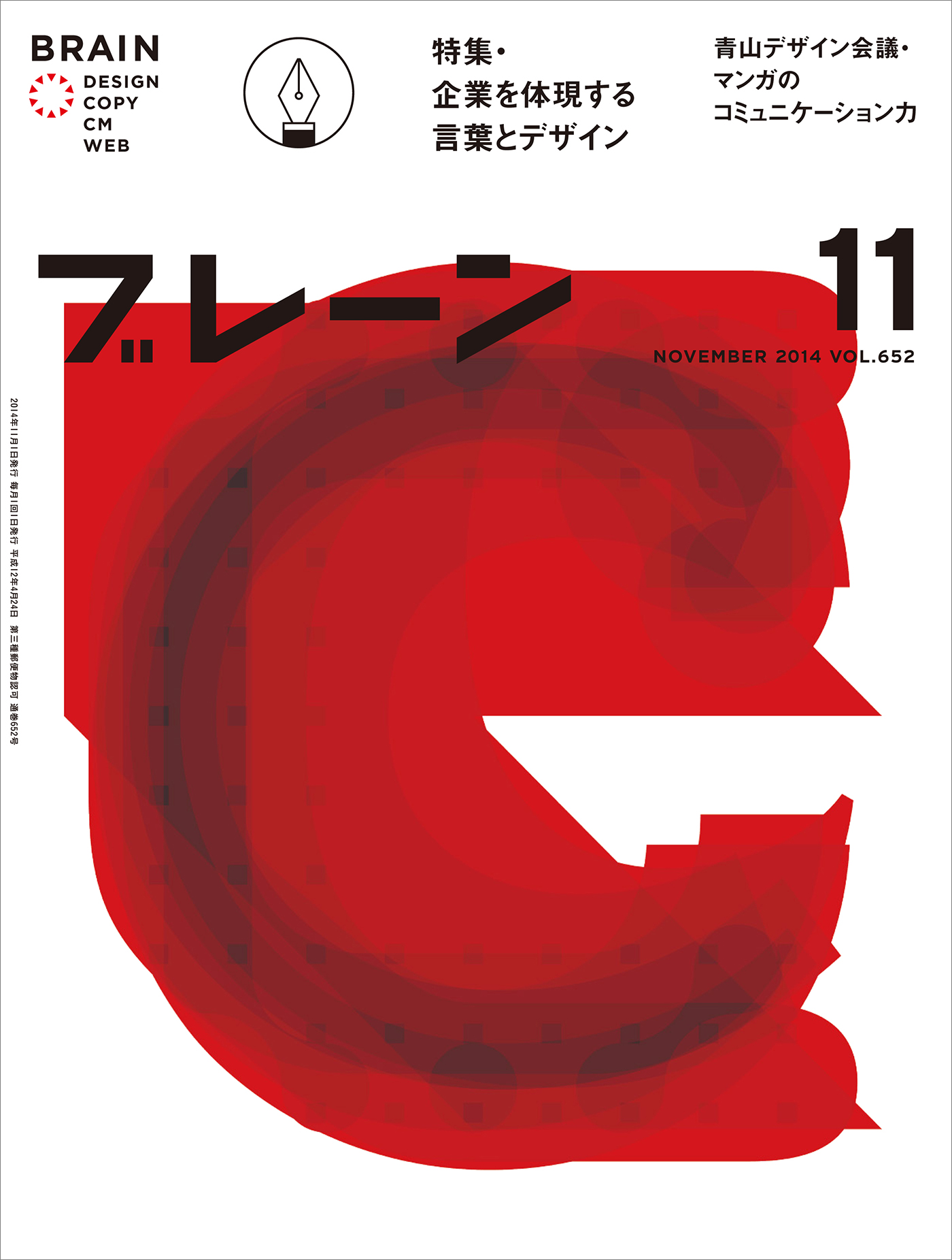
Self-portrait in ‘c’, 2014
|
BRAIN’S BRAIN
今月のカバーストーリー / Cover story of the month
ブレーンのカバーを飾るのは、世界の先端を行くクリエイターたちの作品。「BRAIN’S BRAIN」では、「HAPPY CREATION」をテーマに彼らが制作したビジュアルとオフィスや仕事を紹介していきます。11月号の表紙を制作してくれたのは、ニュージーランドのタ イポグラファー Catherine Griffiths さんです
Q+A with Hinako Shinozaki, BRAIN magazine #11, 2014
HS: What is the idea for this cover?
CG: A self-portrait. The letter ‘c’, I covet. Being a synesthete, ‘c’ is always red. Expressive, strong, radiant, and for the theme of this issue, happy. Yellow is a colour I love, that exudes happiness (and, I was reading today, cowardice and jealousy!), but ‘c’ is not yellow! Against my mind, I made a yellow version, and in the layering up, red appeared. The amorphous form is a typographic nod to Japanese artists and designers. In the red version, I am reminded of Yohji Yamamoto’s iconic colour silhouettes (by Nick Knight) which I first saw in the mid ’80s.
And how did you make it?
Rummaging through my library of typefaces, I tested the letter ‘c’ in lower-case. Picked out 10 favourites (no rules applied) then layered them up. No manipulation, or shift in point size, I let the shape become itself. The brain-like form was a surprise. Then I saw it would be released in October, so the idea just grew!
What made you come up with the idea?
Thinking about the theme “Happy Creation”, and about Japan — a country that has had a profound influence on me personally, yet continues to enrich me across the disciplines (the photo book and photography, film, architecture, music, objects I use, clothes I wear, and of course graphic design) — I wanted to reply with something personal.
What do you think of Japanese advertisement and design?
I have utmost respect for a number of Japan’s artists and designers — their capture and appreciation of form and composition, light and dark, space and materiality is poignant, with feeling and sensitivity.
表紙のアイデアについて教えてください。
これは自画像です。だから、「C」の文字を使いたかったのです。共感覚者にとって、「C」はいつも赤色。表現力があり、力強く、それに表紙のテーマ である“Happy”も意味します。私の好きな黄色は、幸福、臆病、嫉妬を感じさせます。しかし、「C」は黄色ではありません。気乗りはしませんでした が、黄色のバージョンも作りました。重ね塗りをするうちに、赤色が現れました。形があいまいなのは、日本人の芸術家やデザイナーへのタイポグラフィックな 敬意です。赤色のバージョンは、80年代に見たニック・ナイトが撮影した山本耀司の象徴的なカラーシルエットを思い出させます。
どうやってつくったか。
たくさんの書体が入っているライブラリーをかきまわしていると、小文字の「C」を試してみたくなりました。特に規則は設けず に「C」の文字をいくつか作り、その中から気に入った10個の文字を選び出し、それを重ねました。文字の大きさを変えたり、いじったりせずに、自然に形が 定まるのを待ちました。脳に似た形になったのには驚きました。それから、本誌が10月発売であることに気づき、アイデアがさらに膨らみました。
当初は、テーマである「HAPPY CREATION」や日本について考えていました。日本は個人的に大きな影響を受けた国です。さまざまなジャンルで学ぶところがたくさんあります。ですので、そんな個人的なことでブレーンからのリクエストに応えたかった。
2014年11月号 ブレーン

|
|
05 a corporate world
selected
exhibition: A bespoke display system for New Zealand Institute of Architects
exhibition: Point of Distance
Venice Architecture Biennale 2014 submission
exhibition: Diverse Practice
School of Architecture, VUW
exhibition: ParlourLIVE!
Venice Architecture Biennale 2016 submission
film: Making Waves with 20...
id: Athfield Architects
id: KAREN Network
id: KTA
id: Logan Studio
id: The Oxygen Group
id: Parlour
id: REANNZ
id: Sharon Jansen Architect
id: Stevens Lawson Architects
id: TRANSFORM
id: TŪMANAKO : HOPE
online: Interstices Journal
print: A+W•NZ
print: BRAIN magazine, JP
print: Desktop magazine, AU
print: Adam Art Gallery
print: Kristy Gorman
print: Creative New Zealand
print: TypeSHED11
print: RAMIREZ/LAINUS
poster: A+W•NZ
poster: A Cadavre Exquis, TS11
poster: Fête du Graphisme 2015
poster: Blue Oyster Art Space
poster: Like This, Like Us
poster: Man-Made
poster: Salted:Singlet
poster: Things That Move Me
poster: Wonder-Land
poster: Window
wayfinding: Athfield Architect
wayfinding: Distance Markers
wayfinding: Fran Wilde Walk
Self-portrait in ‘c’: a cover for BRAIN magazine
commission: cover design for BRAIN advertising + design magazine, Japan
Late August, I received an unexpected request from Hinako Shinozaki of BRAIN magazine, inviting me to design the cover for the November issue. It turned out that it was Tokyo-based designer Masayoshi Kodaira (also a speaker at TypeSHED11 in 2009) who had proposed me to the art director. The theme for this issue is Happy Creation. My response: a self-portrait, the letter ‘c’ in red (with a version in yellow).
............................
17 September 2014
Dear Catherine
We decided the letter ‘c’, to select red color. It’s autumn-like color in Japan! When a wonderful cover is completed we are very happy. Thank you. Best Regards.
Hinako Shinozaki
............................
(Thank you, Masayoshi)

01. Self-portrait in ‘c’
02. My studio. Set up for
typ gr ph c ........ #1 ........ A Type of Improvisation, with Skype presentation from Leonardo Sonnoli in Italy. Bruce Connew and I designed a small timber house and two studios here in the forest. He built his, I built mine. / photo: Amy Yalland
03. AEIOU, a typo/sound installation, the first in the vowel series / NZ / photo: Paul McCredie
04. memento :: motif comprises five Keyhole rugs, a short film and a phone book placed on a table. Proyecto de Arte Contemporáneo Alzheimer, Valparaíso / Chile
05. Titling typeface and typography for Bruce Connew’s next photo-book, ‘Body of Work’
06. A Hillside Intervention, one of the letter-crumbs from the way-finding system at Athfield Architects. The letter ‘a’ reflected by torchlight makes a ‘g’ on the wall / NZ
07. Poster for the August onsite/online exhibition at Window, University of Auckland / NZ
08. typ gr ph c flyer displaying the 8 logo-mark for a workshop series, testing out MuirMcNeil’s Panopticon in a half-tone dot / NZ / photo: Amy Yalland
09. Logo for Parlour: women, equity, architecture. online resource for women in architecture / Australia
10. I Must Behave, by artist and photographer Bruce Connew / published by Vapour Momenta Books / NZ / photo: David Read
............................

Included in the Annual of the Type Directors Club, Typography 36, and shown at the 61st Awards Exhibition (TDC61) in New York City.
related links
BRAIN magazine
Masayoshi Kodaira
Commercial Type
Klim Type Foundry
Lineto
MuirMcNeil
Process Type Foundry
2000s selected
Athfield Architects
REANNZ Research & Education Advanced Network New Zealand
The Oxygen Group
1990s selected/archived
Creative New Zealand
Victoria University
Wools of New Zealand
|


