|


above: the logo, a field of letters / the model © Athfield Architects Limited
 
drawings, photographs /
Catherine Griffiths © 2011
|
Notes on A Hillside Intervention
These ‘letter-crumbs’ form part of wayfinding (or losing) signage at Athfield Architects in Wellington, New Zealand. They are a quietly whimsical response to a magnificent site made prominent over 40 years by the visionary actions of eminent architect Ian Athfield, channelled through an eccentric cascade of buildings, perched high above the city and harbour, aimed directly at the Antarctic.
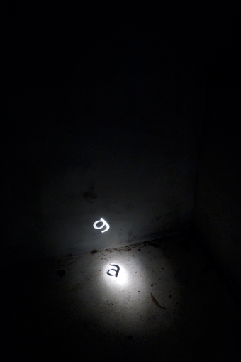
A post and floating sphere staked into the hillside mimics the letter ‘i’ in Verlag Extra Light; a brass ‘c’ is strung on a chain about the bough of a Ngaio tree; in torchlight a fallen 'a' projects itself as ‘g’; a light weight ‘h’ leans against the inside of a dusty glass window to the archives; a bold weight ‘l’ is a hole in the architecture mirroring the sky, until a figure approaches and fills the space.
Cut out of corten steel, brass, rubber, acrylic, zinc, aluminium, the materiality of these letters is a response to their weight and shape, and how and where they might be found.
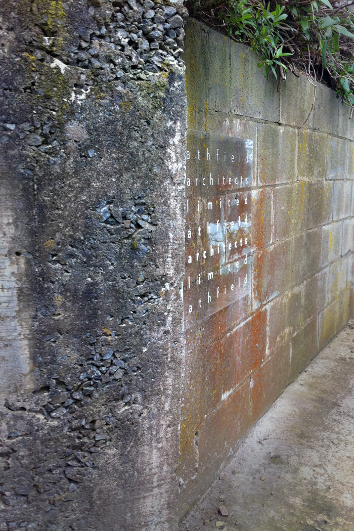
More conventionally in the wayfinding system is the field of letters, floating off the wall at each of the three entry points, accompanied by a directional arrow or two to steer visitors away from private spaces into communal places.
Catherine Griffiths, June 2011
|
 |
 |
|
 |
 |
 |
 |
 |
 |
| Ath, 1940 — 2015 |
a t h f i e l d |
c for Clare |
 |
|
| |
|
|
| |
|
|
| |
|
|
|
01 typography in the landscape
Light Weight O
O’Connell Street, Auckland, NZ
2012 / installed 2018
Kihi/Kiss
Wellington Airport domestic terminal, NZ
2015 / installation tba
Collidescape
Te Kei, Ara Institute of Canterbury, Christchurch, NZ
2016
Zion Hill Park
Auckland, NZ
2014 construction 2015/16
Fifth Movement
Takapuna Beach House, NZ
2012
The Trestle Leg Series
Auckland Harbour Bridge, NZ
2012
A Hillside Intervention Athfield Architects, Wellington, NZ
2011/12
AEIOU
A typo/sound sculpture, Wellington, NZ
2009
Wellington
Writers Walk
A series of 15 concrete text sculptures, Wellington, NZ
2002 and 2004
Ponatahi House
A house wrapped in literature, Wairarapa, NZ
2003
Distance Markers
A series of cast-iron, number discs, Wellington, NZ
2004
A Hillside Intervention
2011/2012
Commissioned
by Athfield Architects, Wellington, NZ
As a system of wayfinding, A Hillside Intervention proposes an alternative site-specific experience.
The typographic logo for Athfield Architects is a field of letters set in the five weights Verlag, a typeface by Hoefler & Frere Jones.
Imagine then, this field of letters exploding high in the air, falling about a steep hillside, then rearranged to give some sense of direction up the 300+ step climb to New Zealand’s iconic architecture practice, Athfield Architects.
26 letters in mixed media: steel, fibreglass, acrylic mirror, corten, brass, zinc, aluminium, rubber
related
reading
The Big Idea Q&A
‘Typographic 69’, ISTD
|