|

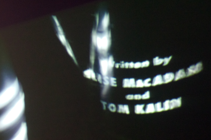


photographs: Patrick Shepherd, Scott Savage, Leonardo Sonnoli, Troy Leinster, David Bennewith, Catherine Griffiths / Want to share? All we ask is for images used elsewhere to be credited and/or linked.
Opening address
TypeSHED11, 12 February 2009, Wellington, New Zealand
by Gregory O’Brien
A SHORT HISTORY OF TYPOGRAPHY or THE TYPOGRAPHY IN MY LIFE
in 1,308 words, laid out before me in 14pt Times New Roman, of four pages (approximately 7 minutes duration)
My first real job was as a reporter on the daily newspaper, The Northland Times, in Dargaville, Northland. 1979. The paper went to press every afternoon at about 2.30. The proofing was non-existent and, daily, I would scan the first papers off the press for mistakes too horrendous or libellous to let pass. More often than I care to recall, I would be sent running from my desk to the linotype room, where two heavily-tattooed compositors worked at their hot lead machines. I would get them to shoot out a line of corrected type to replace the offending one. The lead would be piping hot and I had to juggle it from hand to hand or nurse it in crumpled paper as I rushed out the back door and across to the printery. The press would be stopped, the chase removed, the screws loosened, the replacement line dropped hopefully into the right place and then production resumed.
The typeface was Times Roman — an appropriate face for The Northland Times, the newspaper for which it was specifically designed — in my dreams. (As many of you know, Times was, in fact, designed by Stanley Morison in 1931 for the English, as opposed to the Dargaville, Times.)
My office at the newspaper had an internal window which opened onto the typesetters’ workroom so, as well as a rich array of swear words, I was constantly on the receiving end of heavy, toxic lead fumes. A health inspector once visited and I remember him refusing point blank to go into my office, let alone into the machine-room itself. He was last seen fleeing in the direction of Whangarei; sometime later I imagine the Health Department must have written a letter to the Times management, but nothing was ever done to improve the situation.
After a year and a half of that, I myself fled, southwards to Auckland—although I returned to visit The Northland Times office in the mid-1980s. On that occasion I was surprised to find the old press and the hot lead machinery had gone. The newspaper was now being produced using what struck me as an absolutely futuristic technology: that of cut and paste, hot wax roller, scalpel and set-square. The brave new ultra-modern era of paste-up had arrived.
~
There was, however, an even earlier encounter with lettering and typography which was at least as important for me. While at journalism school, aged 17, I encountered the very wordy paintings of Colin McCahon at the Auckland Art Gallery, on show at the same time as a major exhibition by the Californian Ed Rucsha. The expressionist handwriting of McCahon contrasted dramatically with Ruscha’s commercial process lettering, his ironic yet affectionate sampling of modern American type-culture. I loved both McCahon and Ruscha — and, with those two poles in mind, I strode confidently forward into the world of art and language.
Typography and the fine arts have often kept close company. There’s a much retold tale of how the 17 year old Colin McCahon took early inspiration from the handlettering on the window of a tobacconist. (In the past couple of years, McCahon’s painterly handwriting has been made into an actual typeface, seen lately on bottles of Charlie’s real lemonade.) There is an ebb and flow, both ways, between type-design and art — and long may this continue.
In an ideal world, to coincide with this seminar, in my role as curator at City Gallery Wellington, I would have reconvened past exhibitions such as HOTERE — OUT THE BLACK WINDOW, ROSALIE GASCOIGNE — PLAIN AIR and COLIN MCCAHON — A QUESTION OF FAITH. All of those exhibitions were grand meditations on different kinds of lettering, on the expressive potential of the alphabet — the shapes of letters, with their arabesques and columns, their visual rhythms. Hotere, Gascoigne and McCahon are all handlers of language, although in a manner slightly different from the young journalist juggling the slug of hot type.
Poetry, too, has always been very close to the typographer’s art, concerned as it is with the arrangement of words on a page. In late 19th century Paris, Stephane Mallarme and other writers were getting aesthetic replenishment looking at billboards, signage and newspaper headlines — as were the visual artists of the time. While prose writers are largely confined to the rectangle of the folio; for poets, as for typographers, a page is a field of possibility — it can be imbued with visual prosody, nuance, balance and movement.
We arrive at the conclusion, then, that we’re all in adjoining rooms — type designers, poets, artists — all of us are handlers, in our various, overlapping ways, of type. Again I’m reminded of The Northland Times office, only in this case the toxic lead fumes that permeated all of our respective offices have been replaced by a breath of shared, inspirational wind.
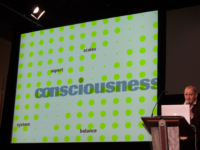
TypeSHED11 offers a intriguing glimpse of the breadth and utter unpredictability of type in the contemporary world. I get the sense, reading the programme, that typography has its evangelists, its mystics, its theorists and philosophers, its hard men, its cult figures, its lyricists, its epic-poets, its subversives, its hangers on and maybe even its groupies.
One of the great outcomes of a seminar like TypeSHED11 will be the flow-on effect — I am sure the revelations and discussions will ripple on and outwards, moving through the world of book and magazine publishing, the art world and into the wider culture... Good typography is worth discussing and debating as indeed it is worth fighting for.
I’m reminded of the English printer-artist, Eric Gill and his belief that the typeset page was the scene of an ongoing battle — on one side moral goodness and civilisation, on the other the barbarism of bad design — which he equated with bad thinking and bad living.
We don’t need Gill to tell us that typography is extraordinarily pervasive and influential. The alphabet shapes our thinking. And, if you hold with that, then the people who shape the alphabet are involved in human consciousness at a fundamental level.
I will conclude with two pleas:
Firstly: A plea for legibility in the body-type of books and out in the world generally. If under-designing or doggedly sticking with existent designs was once a national characteristic, more recently over-design has become the great villain. The 1990s were the heyday of unreadable type — fonts were too faint, too small, too groovy for their own good. Not that type always has to be legible — in certain contexts (some of which will be discussed at TypeSHED11), typography manages, like poetry, to be obscure and articulate at the same time.
A plea for legibility then most of the time. And for those suffering too many options, too many drop-down menus, too much digital trickery, I would prescribe a periodic return to letterpress and woodblock printing to clear the head, and revitalise the creative faculties.
The second plea I make concerns my own surname, O’Brien. This plea is on behalf of the apostrophe so often left out by copywriters and overlooked by designers, particularly in the digital sphere. This might be a small detail, but what I love about typography is that it is an art of the small detail, the minute adjustment. Keep the apostrophe in mind, this flicker of typographical possibility, this highest flying of devices in the typesetter’s cabinet. This precious thing which might quite possibly be a pearl earring, a flag flapping in the wind, or a small bird flying.
Finally, I commend Catherine and Simone, organisers of TypeSHED11, for their devotion, their industry and their intelligence. How lucky are those handlers of hot and cold type who are here for the next few days ...
/ Gregory O’Brien, 2009
|
|
03 other in(ter)ventions
TypeSHED11
an international typography symposium, Wellington, NZ
typ gr ph c
a series of compact workshops, Karekare, NZ
installations, exhibitions
Catherine Griffiths: Out of Line
Griffith University Art Museum, Meanjin Brisbane, Australia
24 February — 16 May 2026
Catherine Griffiths: Walk With Me
Te Wai Ngutu Kākā Gallery, Auckland University of Technology, Tāmaki Makaurau, Aotearoa NZ
30 July — 24 October 2025
Catherine Griffiths: Out of Line
The Design Gallery, University of Melbourne, Naarm, Australia
19 May — 27 June 2025
Iterations/Alterations
Enjoy Contemporary Art Space, Chapter 1, Aotearoa NZ
15 February — 29 March 2025 [extended to Chapter 2]
What is my threshold now?
Manifesto vs Manifest, PLATES #1, 2024, New York, USA
7/7, 14 views
Te Tuhi Project Wall, Aotearoa NZ
20 August – 22 October 2023
Self-preservation
Offering It Up, Adam Art Gallery, Aotearoa NZ
24 August —
29 October 2023
The Phone Book: Club de Conversation (2012): deconstructed (2019), suspended (2022)
Counterparts // Part one: Where To From Here?, No Vacancy, Naarm Melbourne, AUSTRALIA
12 – 31 July 2022
catherine griffiths : SOLO IN [ ] SPACE
The Space Gallery, Shanghai, CHINA
13 October – 1 December 2019
Work/Space
Shanghai Art and Design Exhibition, CHINA
3 – 13 December 2017
A whakapapa, two lines of women, an installation drawing
All Lines Converge, Govett-Brewster Art Gallery Aotearoa NZ
2016
Installation with mirror and line
transitionalfieldwork, an exhibition, Aotearoa NZ
2016
only U know ...
collaboration, Lela Jacobs AW17 Auckland, and SS17 Paris collection, Aotearoa NZ + FR
Constructed/Projected
installation, Typojanchi 2015, 4th International Typography Biennale, Seoul, KR
November 2015
The Tuwhare Poster Project
fund-raiser for the Hone Tuwhare Trust Writers Residency, Aotearoa NZ
2014
memento :: motif
Proyecto de Arte Contemporáneo Alzheimer, Valparaíso, Chile
23 September — 23 August 2012
The Phone Book
a maquette, for the Club de Conversation project, Aotearoa NZ
2012
Club de Conversation at S/F with Dino Chai, Auckland, Aotearoa NZ
14 July – 18 August 2012
Club de Conversation: Keyhole Series and Dials
rug series, Dilana Workshop, Aotearoa NZ
June — July 2012
Sound Tracks
installation, The Dowse Art Museum, Lower Hutt, Aotearoa NZ
2011
The Jets
short film, Paris, France
2010
posters, protest, statements
SHREDDED
[LUXON QUOTES] RUBBISH COLLECTION, six [type specimen] posters, 2026, Aotearoa NZ
The Best Design Awards
three [type specimen] posters, 2018, Aotearoa NZ
Labour of Love
another word-play poster, 2018, Aotearoa NZ
W in black
drawings in progress, 2017, Aotearoa NZ/FR
The Alphabet
front page takeover of the Sentinel & Enterprise newspaper for 26 days, Fitchburg, USA
The Brexit Series
a word-play [type specimen] poster series in response to Brexit, Aotearoa NZ
Raising the Flag
contemplative, suggestive — design unravelled, Aotearoa NZ
Protest Vessel
1/2 PRICE
a collaboration with ceramic artist Raewyn Atkinson, Aotearoa NZ
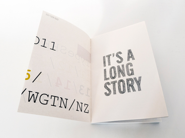
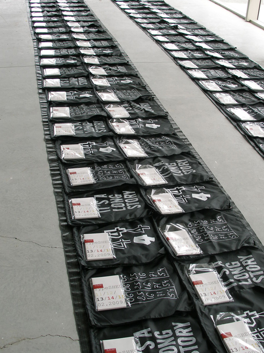
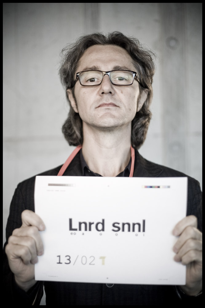
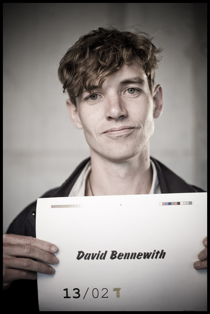
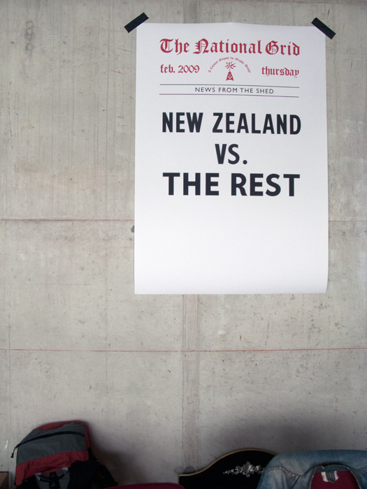
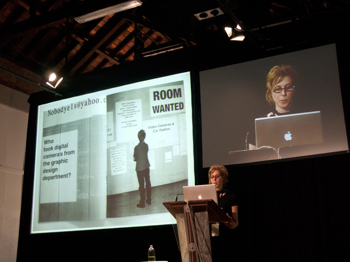
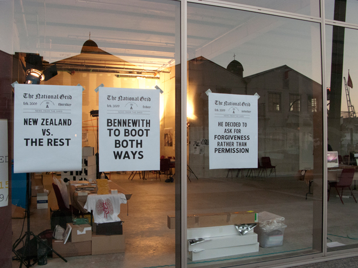
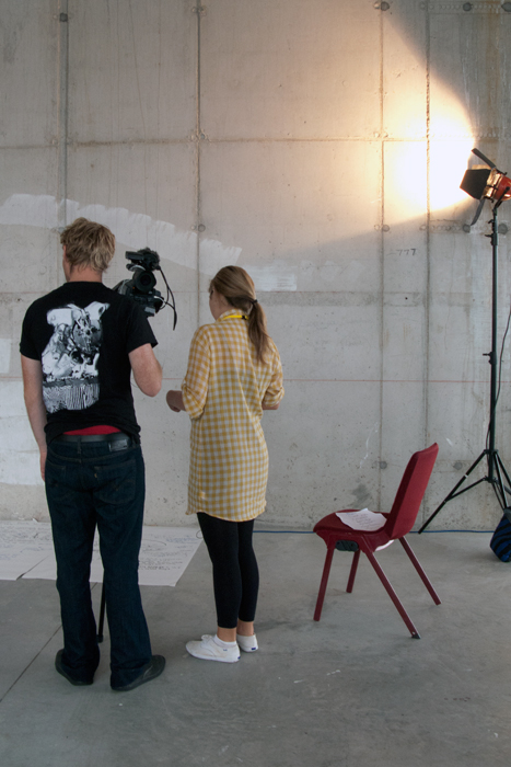
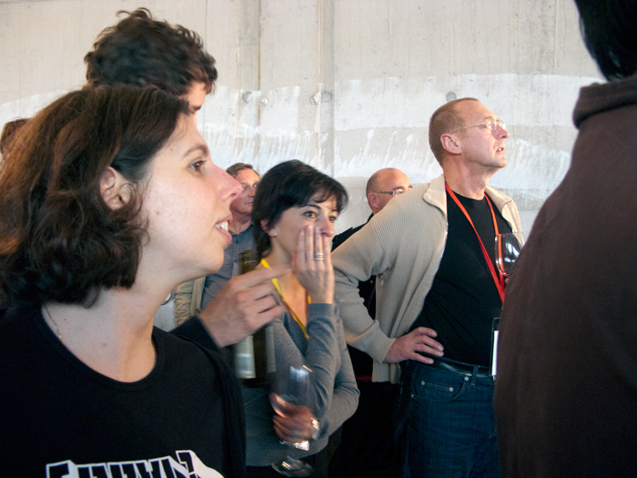
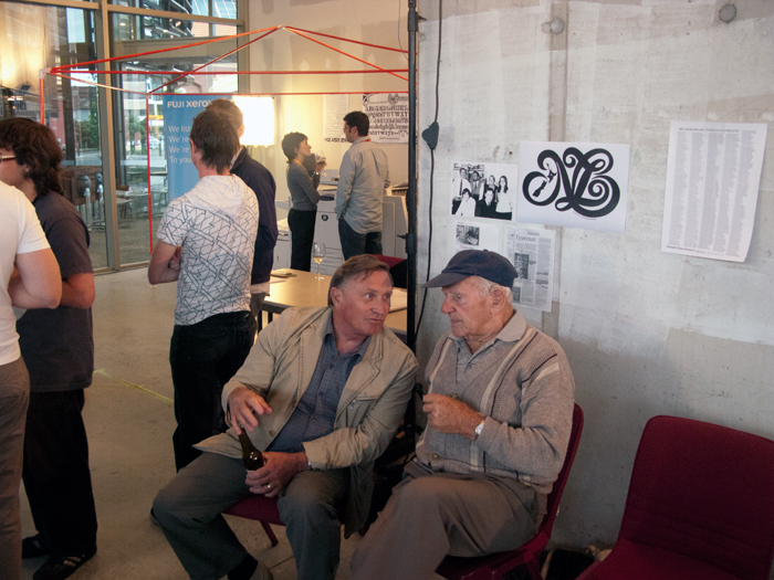
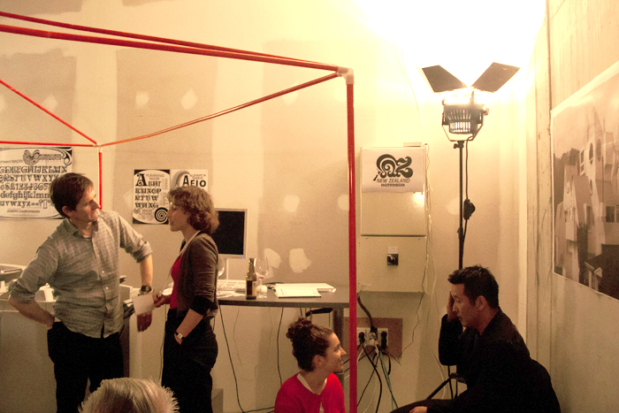
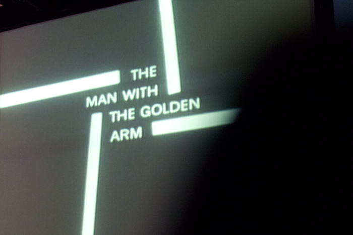
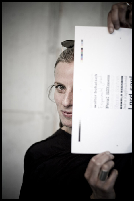
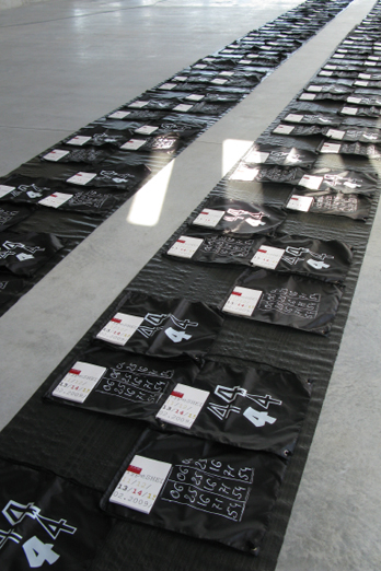
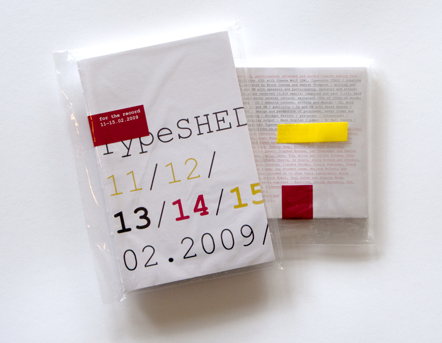
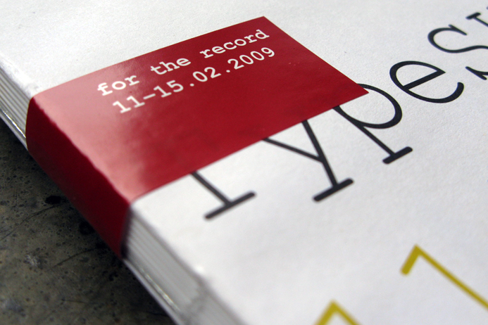
TypeSHED11, 11—15.02.2009 Wellington, New Zealand
2009
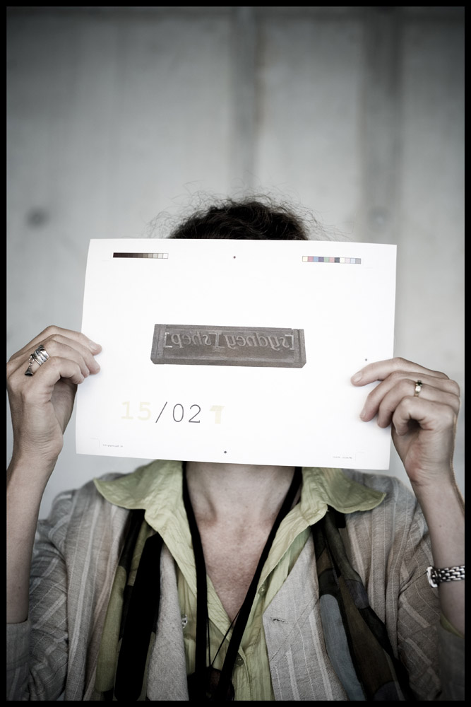
TypeSHED11: conceived, curated, designed and organised by Catherine
Griffiths and Simone Wolf, Typevents Italy
Welcome! Now that the TypeSHED11 symposium website is no longer active, we will be adding to this set of images over the next while. Our intention is to have some type of recollection and acknowledgment present online. Worth a read, below the images, is artist, poet, curator Gregory O’Brien’s magnificent opening address which set the tone for the next few days. Listed also, are links to radio, TV and Typeradio interviews, articles and other gems. Enjoy the wander! / CG
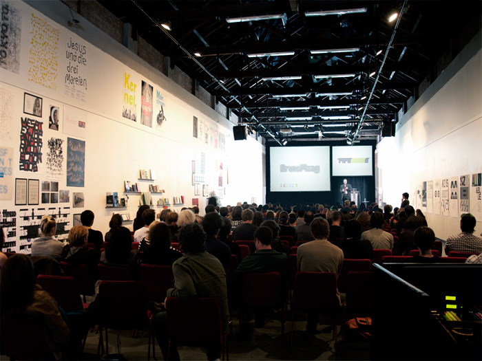
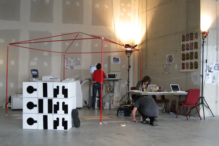
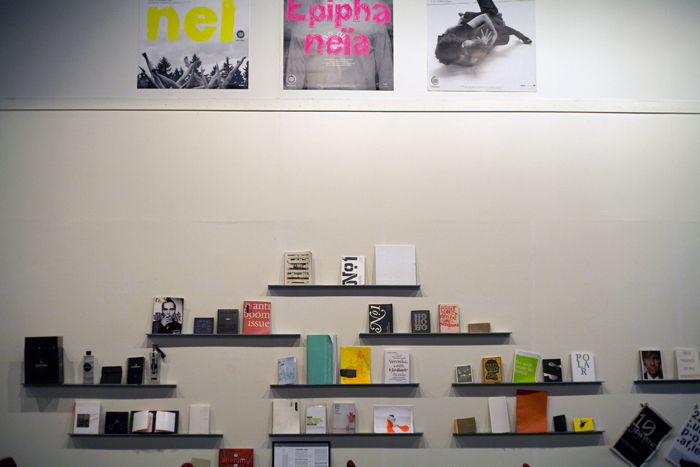
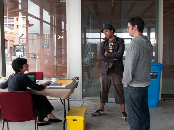
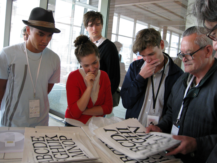
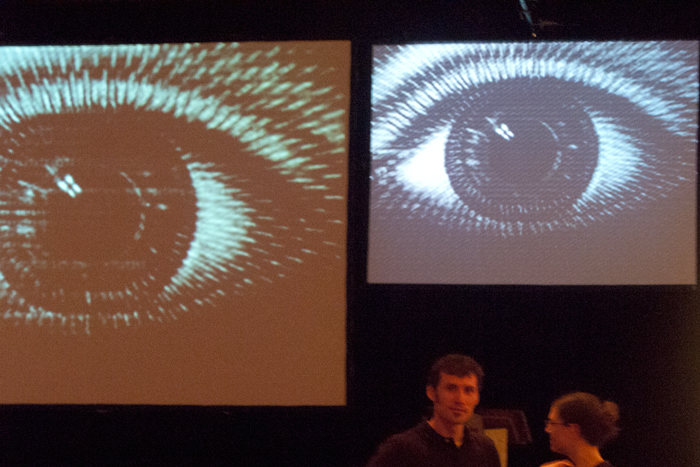
TypeSHED11 was
a boutique, five-day international typography symposium held
in Wellington, New Zealand, 11–15th February 2009. TypeSHED11
was designed to explore the notions and the voices of typography across
the disciplines of graphic design and advertising, photography, film,
literature, architecture, music and the visual arts. A major project
that spanned 18 months out of this studio, TypeSHED11 was our creative
initiative and vision.
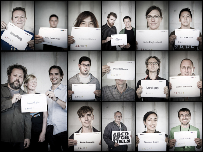
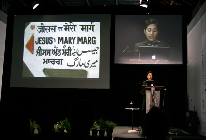
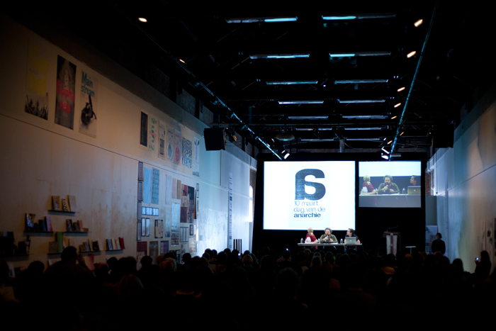
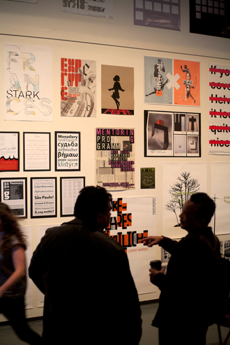
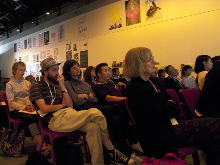
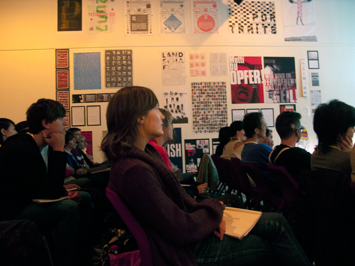
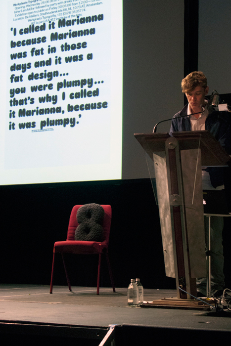
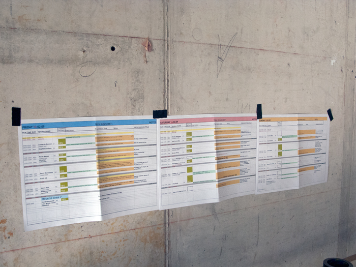
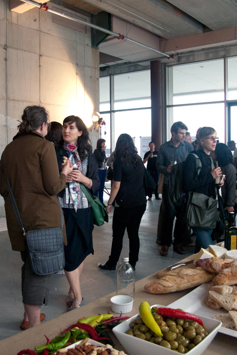
Two workshop days; three speaker days; 17 international
guests and 17 NZ speakers; 250 attendees ...
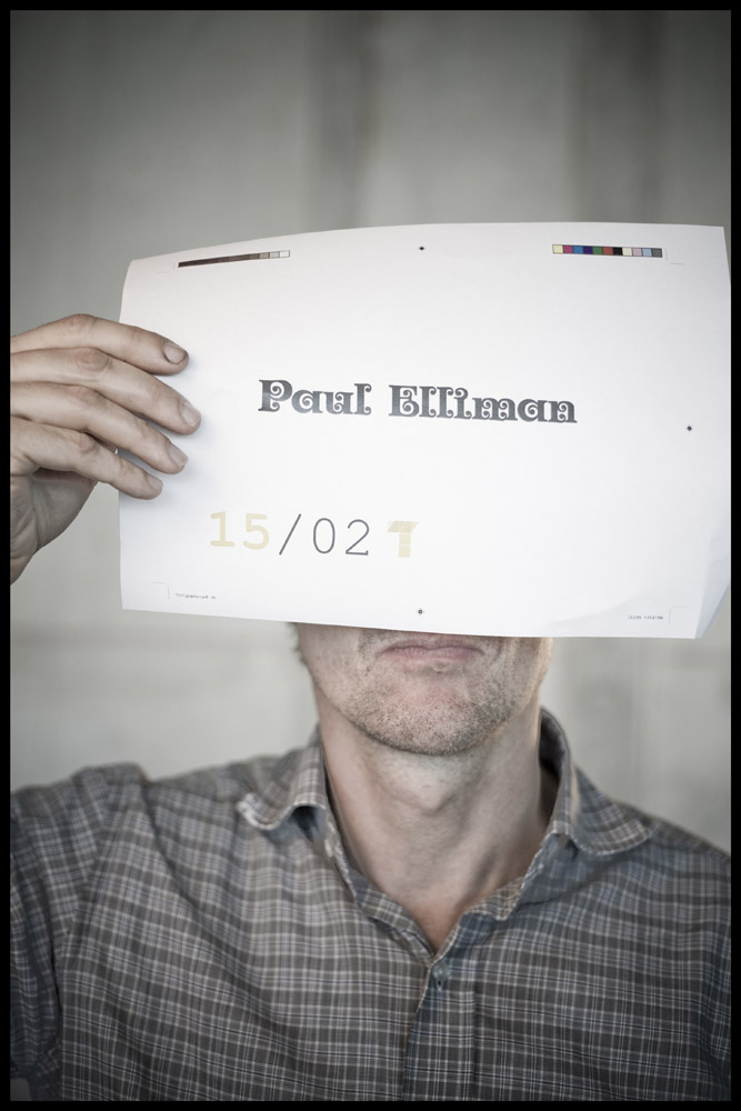
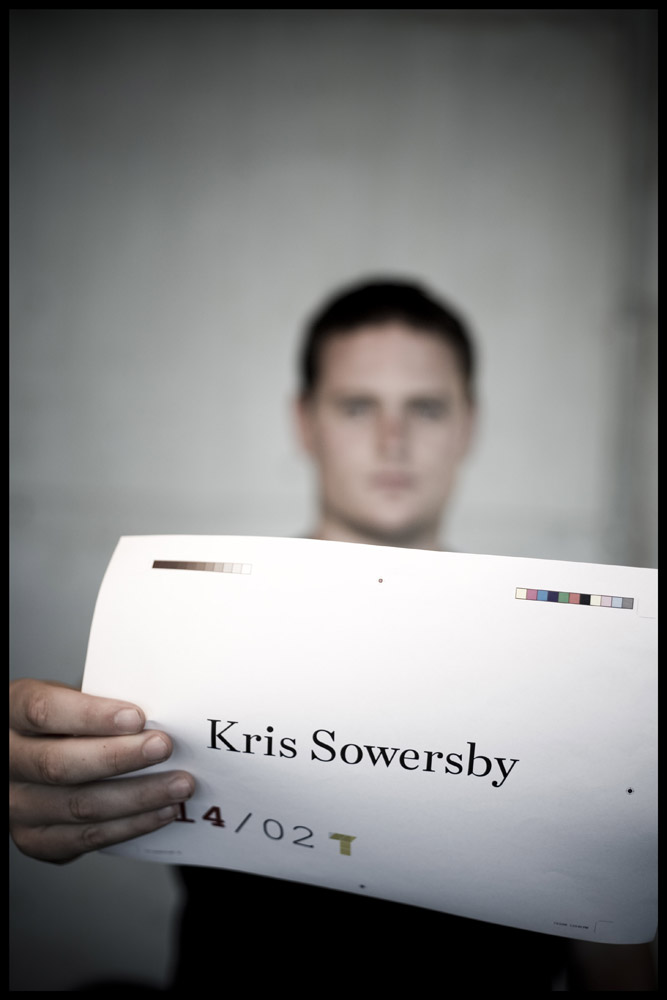
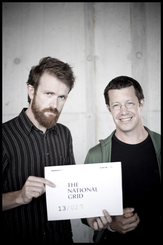
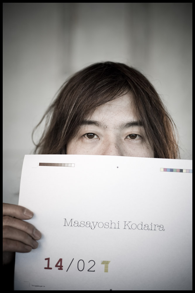
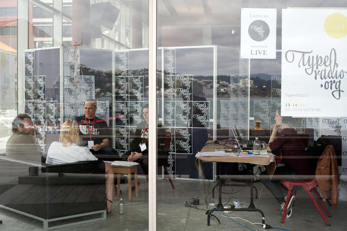
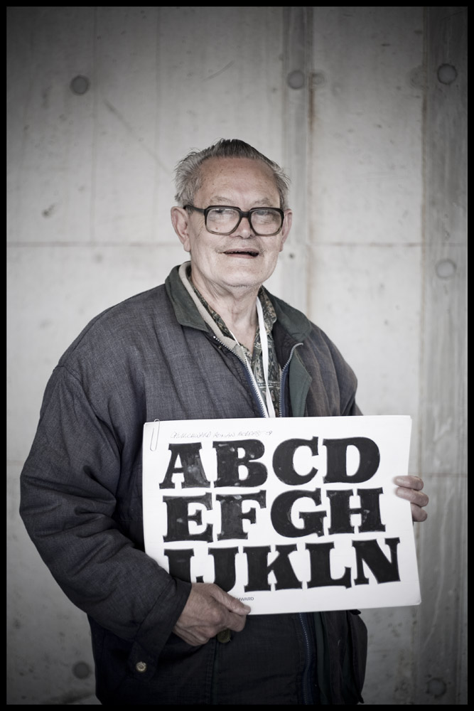
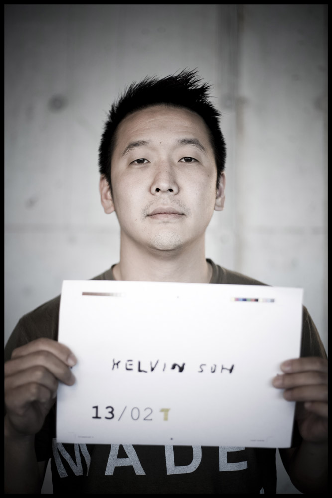
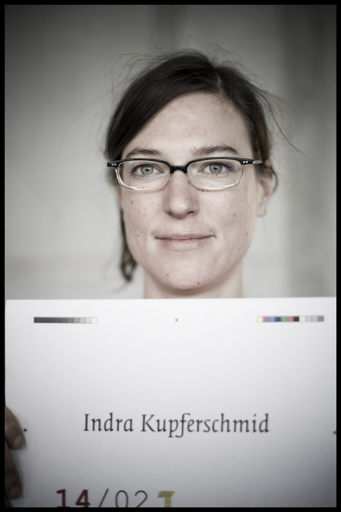
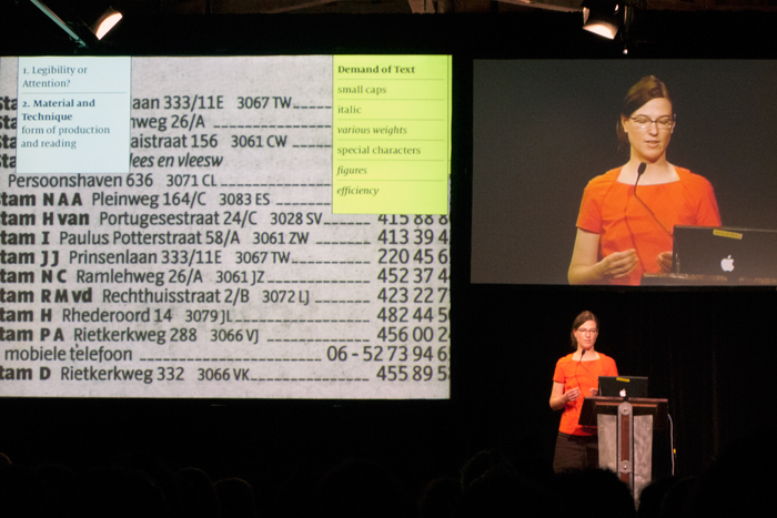
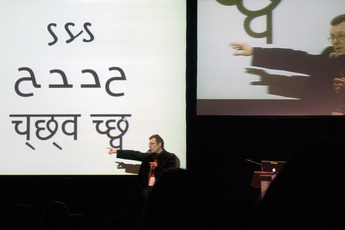
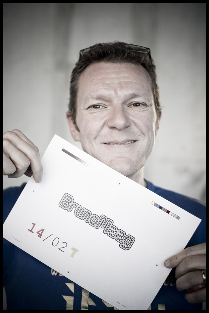
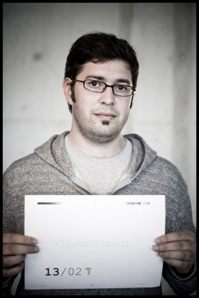
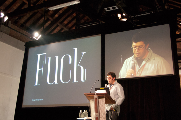
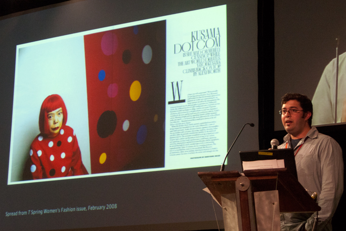
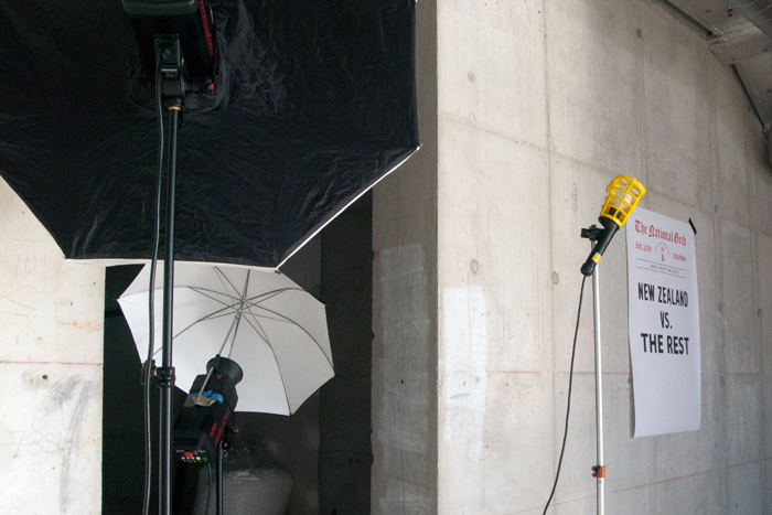
Typeradio (NL), Erich Alb (CH), Stephen Banham (AUS), Donald Beekman (NL), Ed Benguiat (USA vc), David Bennewith (NL), Walter Bohatsch (AU), Paul Elliman (UK), Experimental Jetset (NL), Masayoshi Kodaira (JP), Indra Kupferschmid (GER), Karen Larsen (USA), LoveLiza (NL), Bruno Maag (UK), Christian Schwartz (USA) and Leonardo Sonnoli (IT); with New Zealanders — Experimenta (The International Office), Narrow Gauge, Meena Kadri, Sarah Maxey, Aaron McKirdy, Tana Mitchell, Guy Pask, Sydney Shep, Kelvin Soh, Kris Sowersby, The National Grid, Gerbrand van Melle and Noel Waite
With funding assistance by
Creative New Zealand
Mondriaan Foundation
Netherlands Embassy
and generous sponsorship by
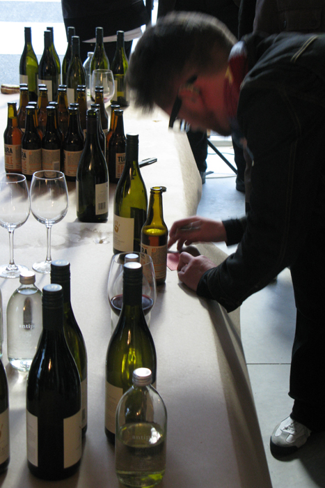
Athfield Architects, Clemenger BBDO, College of Creative Arts Massey University, Colourcraft, Dalton Maag, Fontlab, Fuji Xerox, Freestyle, Jan Van Eyck, Mesh Digital, Prodesign, Seresin Winemakers, Strategy, Springload, The Church, Tuatara, Wellington City Council, Whittakers ...
related looking and reading
photos: TypeSHED11 on Flickr
print: TypeSHED11 programme
Locating Our Feet
in the diary:
11.02.10 / One-year anniversary of TypeSHED11
24.10.09 / Read Prodesign blog for NZ type news
16.10.09 / Read Joseph Churchward wins Britten Award
08.06.09 / Buy Cover Up by Hamish Thompson
04.06.09 / View Joseph Churchward by David Bennewith
07.05.09 / See TypeSHED11 on Flickr
07.05.09 / Re:TS11 view by Stephen Banham
14.04.09 / Le cadavre exquis at s/f
28.03.09 / Listen to Typeradio interview Bruce Connew
26.03.09 / Listen to Typeradio interview Masayoshi Kodaira
25.03.09 / See Maxey in The New York Times magazine
24.03.09 / Listen to Typeradio interview Kris Sowersby
23.03.09 / Listen to Typeradio interview Noel Waite
16.03.09 / View posters by Sandra Kassenaar at s/f
12.03.09 / Listen to Typeradio interview Karen Larsen
10.03.09 / Listen to Typeradio interview Sarah Maxey
10.03.09 / We Love interview with Ed Benguiat
10.03.09 / We Love interview with Experimental Jetset
10.03.09 / TypeSHED11 photo-essay by Cheese on Toast
09.03.09 / Listen to Typeradio interview Stephen Banham
04.03.09 / Listen to Typeradio interview Joseph Churchward
28.02.09 / Listen to Bruno Maag on This Way Up
24.02.09 / Listen to Typeradio interview The National Grid
20.02.09 / Read a review of TypeSHED11 on design.nl
14.02.09 / Listen to Typeradio interview Experimental Jetset
14.02.09 / Listen to Typeradio interview Bruno Maag
21.02.09 / Listen to Noel Waite on This Way Up
12.02.09 / Watch and listen to TypeSHED11 on Nightline, TV3
12.02.09 / Listen to Stephen Banham on Nights
10.02.09 / Listen to Christian Schwartz on Upbeat
08.02.09 / Listen to Lynn Freeman interview Typeradio
07.02.09 / Listen to Kim Hill interview Joseph Churchward
20.01.09 / Read Children of the kern by Stephen Banham
20.01.09 / Artful Words by Helen Walters, Prodesign magazine
20.12.08 / Type at the Edge of the Universe by Hamish Thompson, Prodesign magazine
20.08.08 / Capital Lady of Letters by Anna Dean, Prodesign magazine
20.08.08 / Read Locating Our Feet by Catherine Griffiths
photos: TypeSHED11 on Flickr
|