|
A meditation
Sir Ian Athfield (1940 — 2015)
For me, architecture and typography share and explore similar concerns and territories. Each contributes to the complexity of the human condition. Both investigate principles of space, volume, shape, composition, light, dark, positive, negative, tone and pitch, context, meaning, materiality and, atmosphere. Both are constructed as a response to something, and both prompt a response: an opinion, emotion, a feeling, sense of place and being, metaphysical, physical.
Looking back over the years of encounters with Ath — and Clare, and the practice, and the extended family — I see a serendipitous sequence of projects, realised and unrealised, as is the nature of our worlds, a zigzag exchange of architecture and typography, where the two disciplines have come to know each other.
At an early stage, Ath encouraged me during a council meeting for the Wellington Writers Walk project to “go bigger” with works I thought already were large-scale. That day I felt the the door open wide.

One of fifteen concrete text sculptures (Denis Glover, an excerpt from Wellington Harbour is a Laundry), Wellington Writers Walk, 2002 / photograph: Bruce Connew
Years later, during a brief sojourn lodging on the hill, and in another exchange, this time about way-finding signage, I invited Athfield Architects to imagine their logo, a field of letters that I had designed in response to Ath wanting the focus to shift from him, exploding high in the air, falling about the steep hillside, then rearranged to give some sense of direction up the 300+ step climb to the practice. These ‘letter-crumbs’ are my response — and in a sense, a thank you, a small gesture — to a visionary idea of community, channeled through a cascade of buildings high above the city and harbour, aimed directly at the Antarctic.
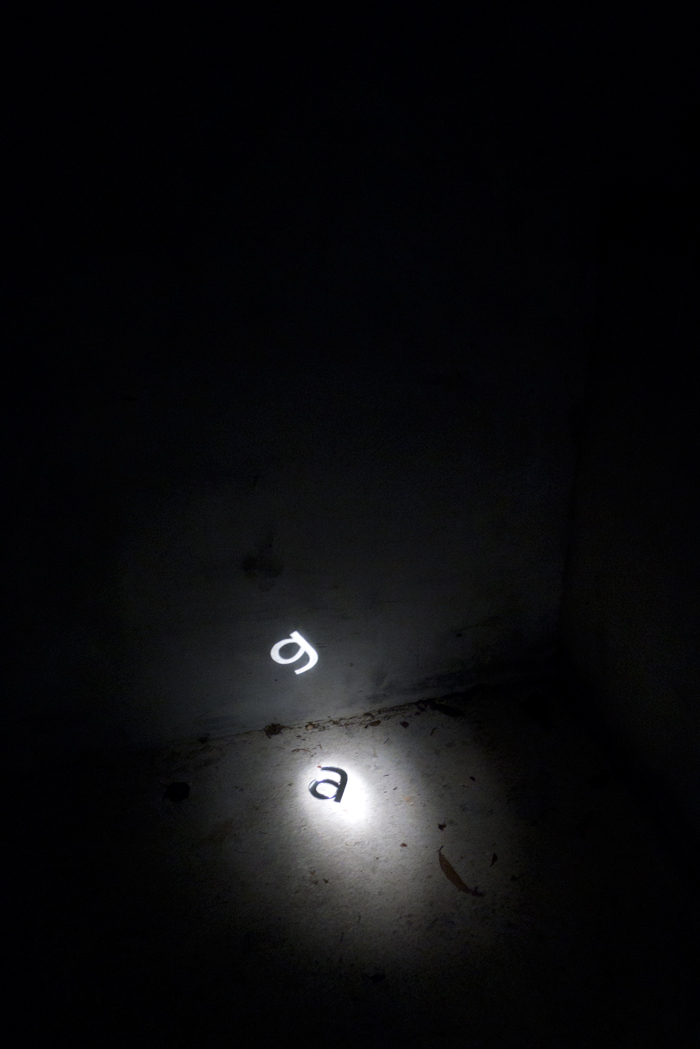
The letter ‘a’ from A Hillside Intervention, Athfield Architects, 2011 / photograph: Catherine Griffiths
A post and floating sphere staked into the hillside mimics the letter ‘i’ in Verlag Extra Light; a brass ‘c’ is strung on a chain about the bough of a Ngaio tree; in torchlight a fallen ‘a’ projects itself as ‘g’; a light weight ‘h’ leans against the inside of a dusty glass window to the archives; a bold weight ‘l’ is a hole in the architecture mirroring the sky, until a figure approaches and fills the space.
Catherine Griffiths / April 2015
|
|
04 writing & critique
Walk With Me
by Stephen Cleland
curatorial essay, »Catherine Griffiths: Walk With Me«, Te Wai Ngutu Kākā Gallery, Aotearoa NZ, July 2025
Blood lines
by John Warwicker
exhibition review, »Catherine Griffiths: Out of Line«, Eye Blog, UK, June 2025
On the Expanded
by Megan Patty
curatorial essay, »Catherine Griffiths: Out of Line«, The Design Gallery, University of Melbourne, Australia, May 2025
The Shapes of Sound
by Ela Egidy
curatorial essay, »Catherine Griffiths: Out of Line«, The Design Gallery, University of Melbourne, Australia, May 2025
Read this space
by John L. Walters
book review, »catherine griffiths : SOLO IN [ ] SPACE«, Eye, UK, Spring 2023
A meditation
by Catherine Griffiths
published in the Architectural Centre newsletter, an issue dedicated in honour of Sir Ian Athfield
In 2015 I was invited by the Architectural Centre to contribute a piece on the late Sir Ian Athfield (1940 – 2015). I chose to write on the encounters between architecture and typography, our two respective practices, in the context of getting to know Ath over the years.
related links
Athfield Architects
Athfield Architects Identity
Wellington Writers Walk
A Hillside Intervention
Fifth Movement
Fran Wilde Walk
Making Noise
by Catherine Griffiths
contribution, Alphabettes Soup: 2015–2025, Bikini Books, Portugal, March 2026
Walk With: A Survey Exhibition by Catherine Griffiths
by Catharina van Bohemen
exhibition review, Art New Zealand #196, Aotearoa NZ, November 2025
A paper record
by Catherine Griffiths introduction, Present Tense : Wāhine Toi Aotearoa — a paper record., Aotearoa NZ, May 2023
An installation on an installation on an installation ...
by Catherine Griffiths
artist statement, »catherine griffiths : SOLO IN [ ] SPACE« A documentation, Pocca, China
September 2021
A Paper Vehicle
by Catherine Griffiths and
Bruce Connew
Dwelling in the Margins, Gloria Books, 2020
Figures that don’t add up
by Catherine Griffiths
Eye Blog, UK, March 2019
1997–2017, 43 Black Pins, 40 men, 3 women
by Catherine Griffiths
The Spinoff, Aotearoa NZ, August 2018
Power in the Poster
by Catherine Griffiths
Designers Speak (Up), Aotearoa NZ, August 2018
Peace
by Catherine Griffiths
Word—Form, Australia, 2018
Porto Design Summer School 2017
by Catherine Griffiths
review, looking back on the fifth edition, Portugal, April 2018
Notes from ‘Designing the perfect photobook’
notes from a short talk as part of a panel discussion, PhotobookNZ, Aotearoa NZ, March 2016
A meditation
Sir Ian Athfield, 1940 — 2015
by Catherine Griffiths
Architectural Centre, Aotearoa NZ,
April 2015
The Design Kids interview
interview with The Design Kids, Australia, July 2015
A Playlist : CG >> CG
by Catherine Griffiths
DPAG Late Breakfast Show, Aotearoa NZ, August 2014
Body, Mind, Somehow: The Text Art of Catherine Griffiths
by Gregory O’Brien
Art New Zealand #150, Aotearoa NZ, 2014
Nothing in Mind
by Chloe Geoghegan
typ gr ph c, Aotearoa NZ, August 2014
typ gr ph c in Strips Club
by Catherine Griffiths
Strips Club journal, Aotearoa NZ, March 2014
In the Neighbourhood
by Catherine Griffiths
Desktop #294, Australia, 2013
Interview
by Heath Killen
interview for Desktop #294, Australia, 2013
FF ThreeSix
by Catherine Griffiths
Typographica, March 2013
A note on the D-card
by Catherine Griffiths
Aotearoa NZ, April 2013
She’s Got Legs
by Lee Suckling
Urbis, Aotearoa NZ, January 2013
Truly, No Idea
by Catherine Griffiths
for Flash Forward, Desktop, Australia, November 2012
Look for the purple lining
by Catherine Griffiths
Eye Blog, UK, March 2012
Q&A TBI
interview with The Big Idea, Aotearoa NZ, June 2011
Shots in the air
by Catherine Griffiths
Eye Blog, UK, January 2011
John & Eye
by Catherine Griffiths
ProDesign 110, Aotearoa NZ, January 2011
Quite a Blast
by Catherine Griffiths
ProDesign, Aotearoa NZ, January 2011
Inner-City Modality
by Mercedes Vicente
ProDesign, Aotearoa NZ, August 2010
Beautiful World of Typography
by Catherine Griffiths
excerpt from a talk, Govett-Brewster Gallery, Aotearoa NZ, June 2009
For the record
by Catherine Griffiths
Introduction to For the record, TypeSHED11 11–15/2009, Aotearoa NZ, February 2009
Locating Our Feet
by Catherine Griffiths
Threaded, Aotearoa NZ, October 2008
Notes
on Feijoa
by Catherine Griffiths
ProDesign, Aotearoa NZ, April 2007
Life in Italics
by Helen Walters
Print, New York,
USA, September-October 2006
Writing by
Types
by Justine Clark
Artichoke, Australia, April 2003
|