|
Notes from a short talk given as part of a panel discussion entitled ‘Designing the perfect photobook’
CG with Neil Pardington and Jonty Valentine, chaired by Libby Jeffries of Momento Pro at the inaugural Photobook NZ, Wellington, 2016.
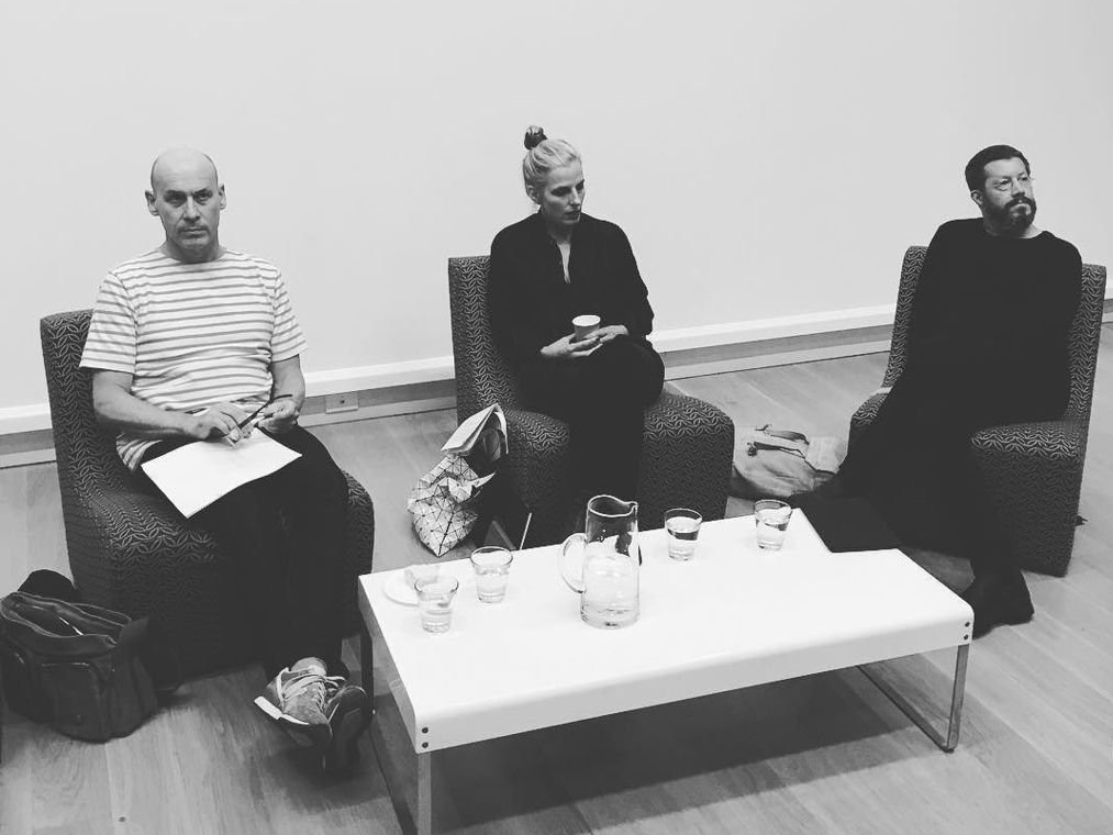
photograph / Ann Shelton
As for the »perfect« book, I have no idea. I figure it’s entirely subjective. By that I mean every part must work. As a whole. All the parts. And be authentic to the tone and voice of the author and their idea. Nothing worse than mutton dressed as lamb.
I looked through our library at home, in search of »perfect« — mostly through Bruce’s extensive collection of photography books, in three-metre high shelves that the house is centred around — art, photography, design, typography, fiction, non-fiction — spilling out onto the floor, and into the studios ... and after looking at what I had pulled out, I found I’d gravitated towards books that mean something to me, whether personal, or just plain exciting. Or, that just feel really right.
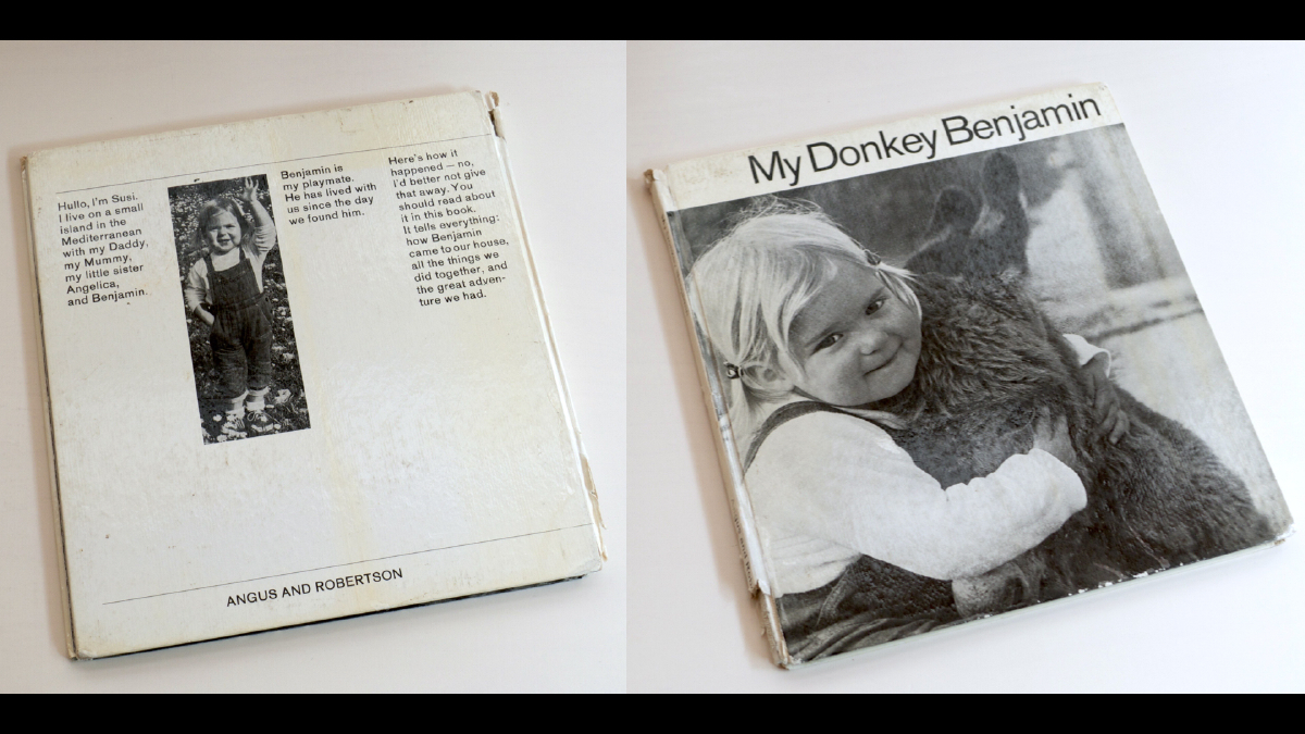
My Donkey Benjamin, 1969
One of several books, along with Grub the Bush Baby, Chi-Chi The Giant Panda, The Red Balloon, that I started out with, when I was small in the 60s.

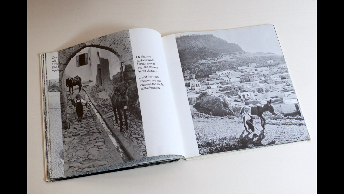
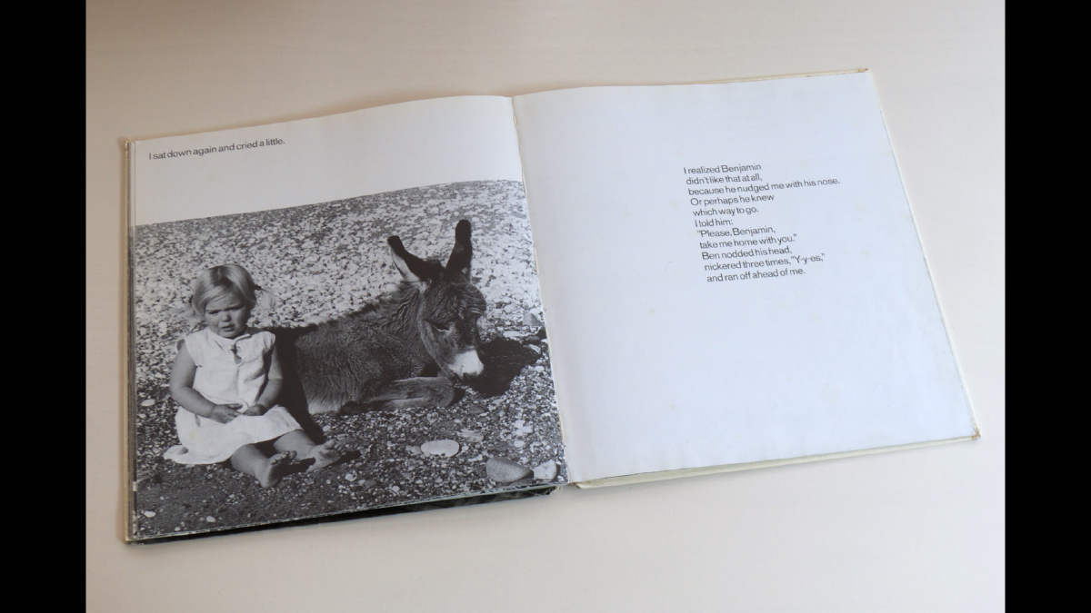
I absolutely LOVED these books. You could say, they helped shape my sense of space, place, and journey. They were my Whakatane [small town Aotearoa New Zealand] window out, into other lives, other worlds.

Josef Sudek, 1956
Ever since I saw this book, I coveted the cover typography. Positive and negative spaces — typography meets architecture. Compositionally, only his name works — a serendipitous combination of letterform, as I discover later ... Inside, a classic volume, complete with silk ribbon, containing Sudek’s broad spectrum, atmospheric images, reproduced using photogravure.
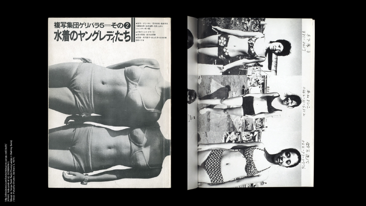
Young Ladies in Bathing Suits, 1971
Geribara 5—collective: ARAKI, Nobuyoshi, TAKASE, Yoshio, YAEHATA, Koji, TABOGAMI, Naohosia, IKEDA, Fukuo, KAMIGUCHI (Miss Geribara), Tomoko, GERIBARA 5
Conceptually this book is provocative. At first glance, the book could be read as somewhat benign, yet in the detail it is controversial: the trio of images per page is accompanied by each girl’s handwritten address and telephone number. According to Araki, around half are authentic ... but irrespective, the book is demanding of the viewer, and raises issues around privacy, and sexual harassment. The layout carries the content without diminishing or overstating: the back cover is a flip of the front, the landscape format images are set vertically, the book reads from right to left ... how the viewer chooses to read — whether crossways or upright, the emphasis and focus shifts.

Telex Iran, 1984 / 1997
Gilles Peress
It was Bruce who introduced me, in the 1990s, to the work and books of French photographer Gilles Peress, and this extraordinary book — a book of its time — and to this day. A large-format book, including an essay, the photographs were made during a five week period from Dec 1979 to Jan 1980 in the days of telex (messages sent via telephone and printed by a teletypewriter) ... back and forth from to the staff at the Magnum office in Paris (including Natasha Chassagne, who Bruce first met in 1985), the messages are printed as if captions to the photographs. Designed by Gilles Peress + Claude Nori, this is a big bold collaboration driven by the photographer, where content is king.
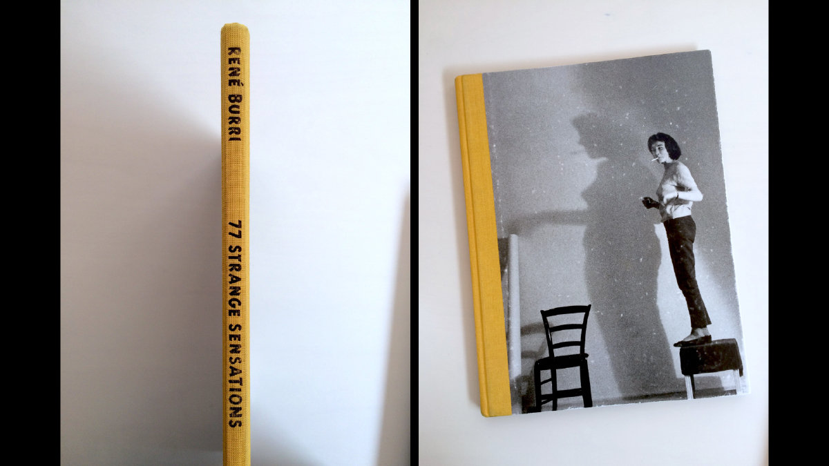
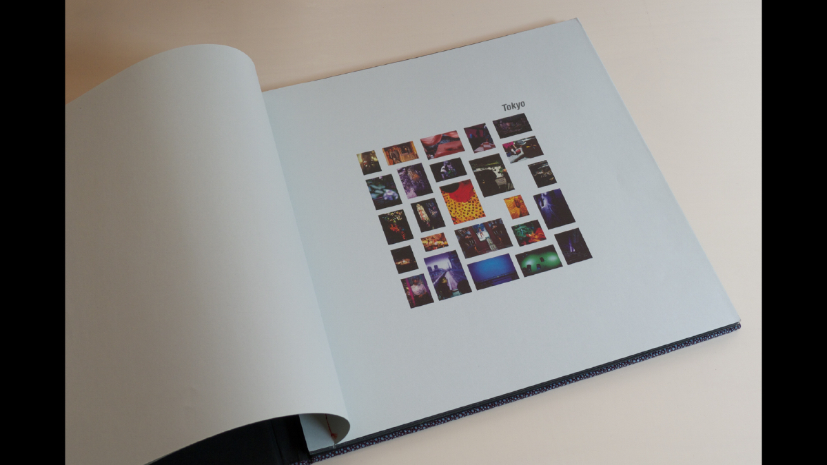
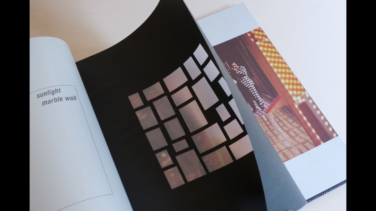
77 Strange Sensations, 1998
René Burri
I found this book in Basel, Switzerland, at the start of a journey to follow in the footsteps of Rebecca West (but that’s a story for another time), where I was visiting influential teacher, graphic designer and typographer, Wolfgang Weingart and his wife Kate Wolff. While staying with them, I witnessed Weingart constructing, what I would say is the closest to »perfect« in graphic design terms, his book — the tiny maquette sat on the dinner table: My Way to Typography. Meanwhile, Bruce was in Kosovo just after NATO had gone in — we’d been apart for weeks already, and when I saw 77 Strange Sensations, it stood out.

Inscribed on the title page — I am reminded — this book was filled with connections, leading us towards each other. In that respect, alone, I regard this as a wholly successful book! But what I love, is the feel, the atmosphere. The whole sensation.

In the colophon it notes: “Conceived, designed, produced, marketed and out on the runaway by Dino Simonett”! There are three books in the series, each one whacko and wonderful ... and years later in Paris, René Burri told us over lunch at his place as he busily inscribed the other two books with watercolour paints, as he was wont to do ... that he never liked the books!
Yet, all of the parts, the random nature of the sequence, the insertion of a story, the un-precious typography, the tone and feel of the paper, the dimensions — the book is alive!
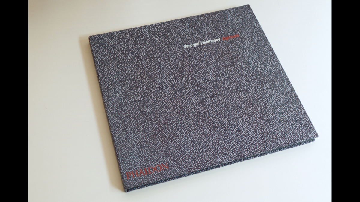
Sightwalk
Georgiou Pinkhassov
To be truthful, I probably love the photographs, the eyes, of Pinkhassov more than the design of this book — square format rarely works comfortably as a book form (not that I am looking for comfort!), but in this case, and in My Donkey Benjamin, it succeeds.


There’s a kind of lavishness, that borders on frivolous and a concept that could be literal, but the designer at Phaidon just got away with it. The materiality of the book is strong — French folds, translucent sheets, stab stitching, textured cover — but the images stay strongest.
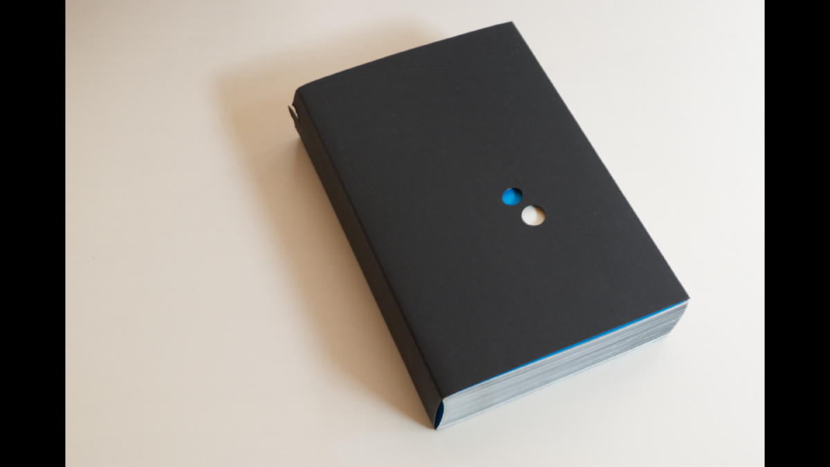
’71—NY
Daido Moriyama
Admiration of Moriyama aside — the concept — revisiting contact sheets 30 years on, from a body of work made back in 1971 is a challenging one to do justice. Back then Moriyama spent a month staying in The Chelsea Hotel with a friend and graphic artist, Tadanori Yokoo, looking at Weegee — and making his own pictures which became the photocopy book Another Country.


’71 — NY is a stunning filmic sequence of full bleed images in another city, wrapped in the weight and smell of ink on paper, accompanied by an excerpt ... from James Baldwin’s Another Country (1963), an interview with Moriyama by Andrew Roth (2001), and an original 2,500 word essay by Neville Wakefield.
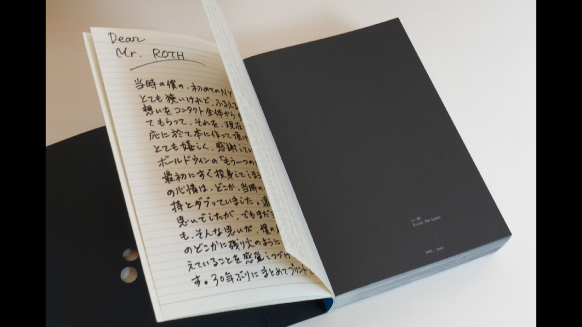
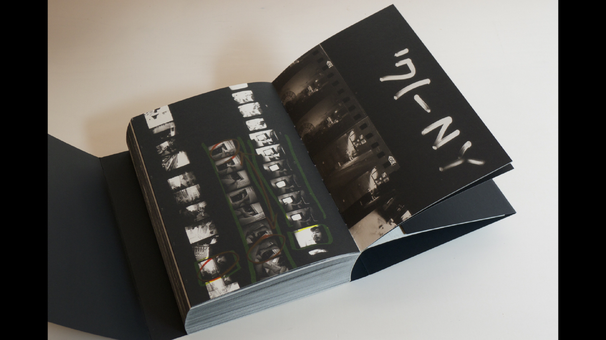
The edition is a collaborative work designed by gallerist and bookseller Andrew Roth, with Alexander Gelman’s Design Machine. It feels good. The up front nature of it, full bleed images, the ease of binding, nothing sticks or is awkward, and if the loose jacket falls, you can catch it with two fingers through the holes!
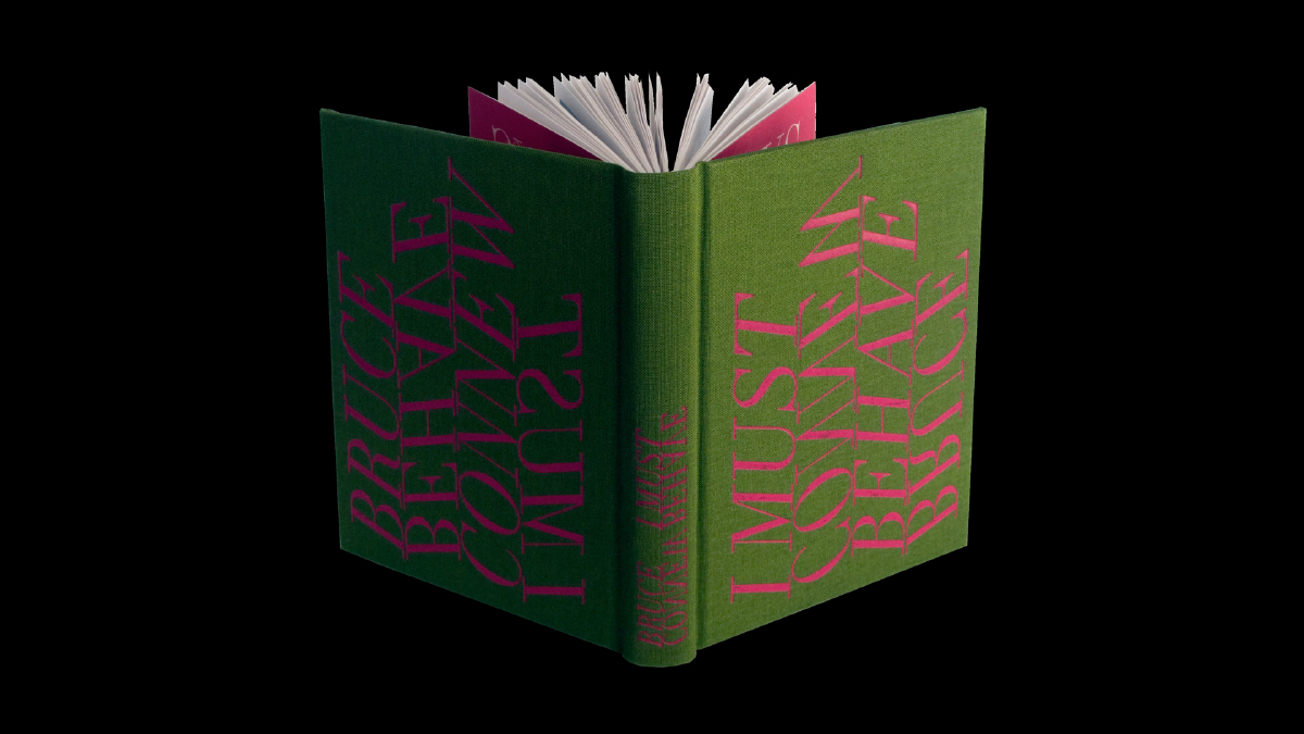
I Must Behave, 2009
Bruce Connew
The second in the ‘I’ trilogy of artist books which explore themes of behaviour and control. In the first, I Saw You, we are voyeurs on private moments in public spaces. In I Must Behave, the typography is a response to the over-arching idea of control, and how it modifies behavior. The third, I Drive You Crazy to the Moon, awaits patiently, unpublished.
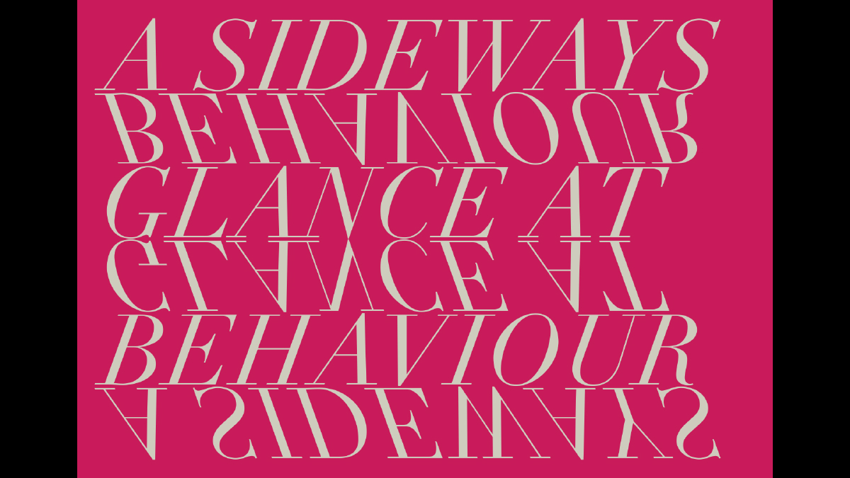


The ambiguities, the tricks played out in the images in I Must Behave — the pairings, the layers of meaning — are conveyed in the typographic titling. Throwing the title up on its side causes a behavioural response, not dissimilar to Young Ladies ... (I now make the connection!) — I watch a reader take the book, they turn it sideways, instead of shifting their gaze or moving their head, as they might with a work out of reach. Inside, the reader is given more of a clue, with the words “A sideways glance at behaviour” where the mirrored text plays again ... Not wanting to force italicise the letters, I flipped each word, and discovered how neatly this conveyed the content — and intention of the artist.
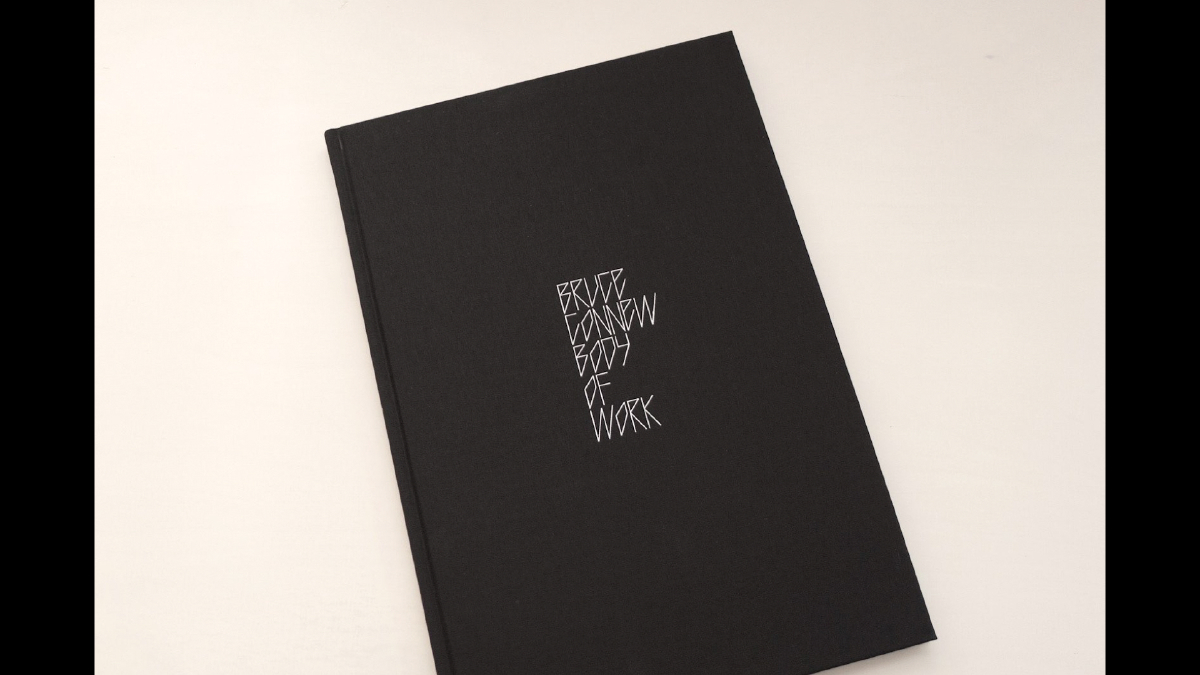
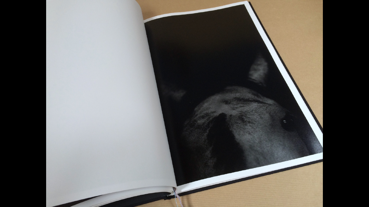
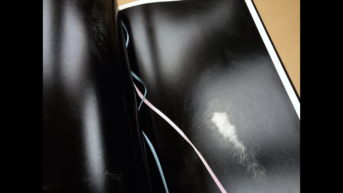
Body of Work, 2015
Bruce Connew
Our latest collaboration on book design, I finish with Bruce’s Body of Work, launched yesterday here in Wellington. Again, as typographer and designer, my response is to the content, the photographs and the concept in concert with Bruce ... minimal intervention ... typography, composition, materiality ...
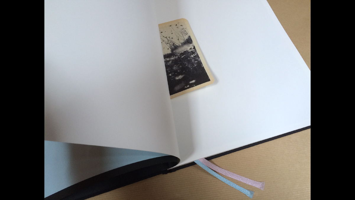
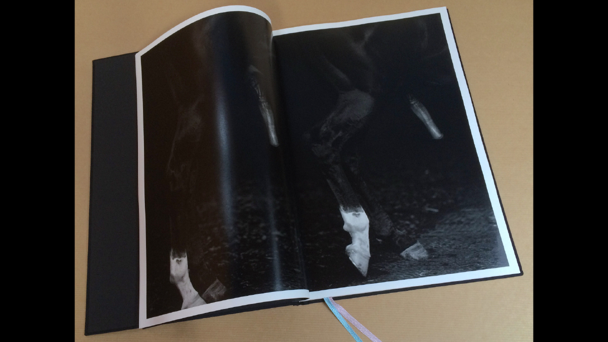

Through the images I see isolated bright white flashes, markings on the forehead or the hoof, the splatter of wet, glistening in the deep black tones. By constructing letterforms out of thin lines, I found a rhythm and rigour that felt really right, not only for the nature of the work, but also for the particular combination of letterforms, words and overall shape.

As friend and type designer Kris Sowersby commented when I showed the title — “Real punk, has good attitude. But it won’t work as a typeface!” And I think maybe, he is right. My intention was not to make a typeface, but rather to find a way to articulate in an authentic manner the intention of Bruce, and his concept as the photographer, the artist.
notes and slides / Catherine Griffiths © 2016
|
|
04 writing & critique
Walk With Me
by Stephen Cleland
curatorial essay, »Catherine Griffiths: Walk With Me«, Te Wai Ngutu Kākā Gallery, Aotearoa NZ, July 2025
Blood lines
by John Warwicker
exhibition review, »Catherine Griffiths: Out of Line«, Eye Blog, UK, June 2025
On the Expanded
by Megan Patty
curatorial essay, »Catherine Griffiths: Out of Line«, The Design Gallery, University of Melbourne, Australia, May 2025
The Shapes of Sound
by Ela Egidy
curatorial essay, »Catherine Griffiths: Out of Line«, The Design Gallery, University of Melbourne, Australia, May 2025
Read this space
by John L. Walters
book review, »catherine griffiths : SOLO IN [ ] SPACE«, Eye, UK, Spring 2023
Notes from a short talk at Photobook NZ, 2016
by Catherine Griffiths
‘Designing the perfect photobook’ 12.15 – 1.15pm
How do designers and photographers work together to make strong photobooks? Three of New Zealand’s leading photobook designers (with enough awards between them to sink a flotilla) discuss the language of the photobook, materiality and the emergent e-book.
Catherine Griffiths – Independent designer and typographer
Neil Pardington – Photographer and Base Two creative director
Jonty Valentine – Graphic designer and co-producer of The National Grid
Chair – Libby Jeffery, Marketing Manager, Momento Pro
related links
PhotoForum Photobook NZ
Making Noise
by Catherine Griffiths
contribution, Alphabettes Soup: 2015–2025, Bikini Books, Portugal, March 2026
Walk With: A Survey Exhibition by Catherine Griffiths
by Catharina van Bohemen
exhibition review, Art New Zealand #196, Aotearoa NZ, November 2025
A paper record
by Catherine Griffiths introduction, Present Tense : Wāhine Toi Aotearoa — a paper record., Aotearoa NZ, May 2023
An installation on an installation on an installation ...
by Catherine Griffiths
artist statement, »catherine griffiths : SOLO IN [ ] SPACE« A documentation, Pocca, China
September 2021
A Paper Vehicle
by Catherine Griffiths and
Bruce Connew
Dwelling in the Margins, Gloria Books, 2020
Figures that don’t add up
by Catherine Griffiths
Eye Blog, UK, March 2019
1997–2017, 43 Black Pins, 40 men, 3 women
by Catherine Griffiths
The Spinoff, Aotearoa NZ, August 2018
Power in the Poster
by Catherine Griffiths
Designers Speak (Up), Aotearoa NZ, August 2018
Peace
by Catherine Griffiths
Word—Form, Australia, 2018
Porto Design Summer School 2017
by Catherine Griffiths
review, looking back on the fifth edition, Portugal, April 2018
Notes from ‘Designing the perfect photobook’
notes from a short talk as part of a panel discussion, PhotobookNZ, Aotearoa NZ, March 2016
A meditation
Sir Ian Athfield, 1940 — 2015
by Catherine Griffiths
Architectural Centre, Aotearoa NZ,
April 2015
The Design Kids interview
interview with The Design Kids, Australia, July 2015
A Playlist : CG >> CG
by Catherine Griffiths
DPAG Late Breakfast Show, Aotearoa NZ, August 2014
Body, Mind, Somehow: The Text Art of Catherine Griffiths
by Gregory O’Brien
Art New Zealand #150, Aotearoa NZ, 2014
Nothing in Mind
by Chloe Geoghegan
typ gr ph c, Aotearoa NZ, August 2014
typ gr ph c in Strips Club
by Catherine Griffiths
Strips Club journal, Aotearoa NZ, March 2014
In the Neighbourhood
by Catherine Griffiths
Desktop #294, Australia, 2013
Interview
by Heath Killen
interview for Desktop #294, Australia, 2013
FF ThreeSix
by Catherine Griffiths
Typographica, March 2013
A note on the D-card
by Catherine Griffiths
Aotearoa NZ, April 2013
She’s Got Legs
by Lee Suckling
Urbis, Aotearoa NZ, January 2013
Truly, No Idea
by Catherine Griffiths
for Flash Forward, Desktop, Australia, November 2012
Look for the purple lining
by Catherine Griffiths
Eye Blog, UK, March 2012
Q&A TBI
interview with The Big Idea, Aotearoa NZ, June 2011
Shots in the air
by Catherine Griffiths
Eye Blog, UK, January 2011
John & Eye
by Catherine Griffiths
ProDesign 110, Aotearoa NZ, January 2011
Quite a Blast
by Catherine Griffiths
ProDesign, Aotearoa NZ, January 2011
Inner-City Modality
by Mercedes Vicente
ProDesign, Aotearoa NZ, August 2010
Beautiful World of Typography
by Catherine Griffiths
excerpt from a talk, Govett-Brewster Gallery, Aotearoa NZ, June 2009
For the record
by Catherine Griffiths
Introduction to For the record, TypeSHED11 11–15/2009, Aotearoa NZ, February 2009
Locating Our Feet
by Catherine Griffiths
Threaded, Aotearoa NZ, October 2008
Notes
on Feijoa
by Catherine Griffiths
ProDesign, Aotearoa NZ, April 2007
Life in Italics
by Helen Walters
Print, New York,
USA, September-October 2006
Writing by
Types
by Justine Clark
Artichoke, Australia, April 2003
|