|

I Must Behave, photobook by Bruce Connew, published by Vapour Momenta Books, 2009
|
interview / The Design Kids
We get the pleasure of chatting to New Zealand typography legend herself, Catherine Griffiths. Catherine splits her time between Auckland and Paris – so so cool! She shares with us three naughty things she did to get ahead in the industry and how she got started in her career.
The Design Kids: If you were going to start your career what would you do differently?
Catherine Griffiths: Now, or back in the 80s? Listen to music. Read. Write. Walk. Record. Take more pictures. I did do those things, but I guess I mean in a more purposeful way.
TDK: Where did you study and what were some of your first jobs?
CG: School of Design, Wellington Polytechnic, New Zealand, 1984–86. I studied Visual Communication Design. One of my first jobs was working weekends on the desk at the City Gallery. I did the catering for openings (I remember being given $100 to spend at the Dixon St Deli, and making blue cheese dip in my flat’s cockroach-visited kitchen!). I designed photocopied flyers for the Gallery’s events under the eye of a can’t-have-been-much-older-than-me G. Burke who arrived as new curator in 1987.

Poster and animated gif for Man-Made, a choreographic work by Oliver Connew, 2015

From the archive: typography exercise: A—Z, 1—10, 1984
TDK: What does a typical working day include for you right now?
CG: Doing much the same as I did back then! Just with more experience. A little love perhaps, a jog, a bathe, freshly-pressed green vegetable juice, a coffee, sometimes a boiled egg. Over to the studio, look at my priorities, respond to email, put others aside for the moment to squeeze in some thinking, and, depending on the project status (of each, there are myriad parts), focus on design — whether concept, developed, or finished artwork (gone are the days of my mac operator!) — troubleshoot if needed (I’m both both tech nerd and therapist), perhaps a Skype meeting, or a tête-à-tête with Bruce, back to interview questions, and onto the next … alternatively, out the door and into the DS to drive 45 minutes into the city for a meeting, which can mean several hours out. It all takes time, my effort is into the evenings, and weekends, and I am my own head and pair of hands. No set rhythm. Twitter, Instagram, Messenger with the children, etc, all get slotted in as and when.
TDK: What three naughty things have you done in your career to get ahead?
CG: None are naughty. All are accidental —
1. I once left a sticky note on my boss's chair with the words “I’m gone”. Interpreted as my resignation, that note propelled me off into a trajectory of independence. A few weeks later, my own practice was born.
2. Fell in love with one of New Zealand’s eminent photographers, Bruce Connew — I was in my late twenties, married, and he was older (still is), with five children. Without Bruce, I don’t think I would be where I am today — he has only ever supported and encouraged the particular way I think and feel, challenged me, helped me navigate difficult paths. What a gift!
3. My refusal to participate in an unpaid tender process to eight design studios for an existing (and wonderful) client of nine years — new broom marketing manager (ugh!) strolled in to make a mark, irrespective of good history — a loss of useful income, but it pushed me to other realms. Two of the staff cried.

Self-portrait in C, cover for Japan’s BRAIN magazine, 2014

From the archive: collage illustration, detail (left), collected riff-raff (right), 1986
TDK: What are the three worst jobs you have done? and how did you apply what you learnt from them to what you do today?
CG: Bullied into executing a boss’s concept for a potential major client, and, under duress, not being able to pull it off to his satisfaction, which only made matters worse. Made my concept. Both his and mine were presented. The client ran with mine. A typed-out list of my transgressions was left on my desk. My respect for him evaporated.
Bullying is unacceptable.
Witnessed an inflexible client be so inflexible to insist his brand dominate a series of music CDs. There was little room to do right by the content. To me, this stood in the way completely of the musician and the work. Philosophically, we were on different planets. We shook hands and parted ways. But not after I had printed his logo in gold on Rubine Red for one of New Zealand’s most well-known contemporary composers. Still the best cover and poster from that series!
Common design sense can walk me away with my principles unsullied.
In the 2000s, I was lucky enough to work with the CEO and her second-in-command at a government ministry. A re-brand over several years, I produced everything from the identity to interior signage, printed matter, to special projects including a film. As the communications department adopted the brand templates, they consistently tendered out the design and print work, and I saw myself edged out by others, my role consequently diminishing to occasional print orders for the next set of business cards. How depressing! I remained as the “special projects” designer until the CEO departed.
I don’t advocate the tender process. To be hired for what I offer with a fee that recognises this, makes for the best relationships. There is always room for negotiation. A great example of this is Australia’s Parlour : women, equity, architecture — who I work with. The relationship is built on trust and respect. They advocate gender and pay equity, and they are making a difference. It’s an honour to be part of that change.
Website catherinegriffiths.co.nz
Twitter @studiocatherine
Instagram @studiocatherine
Facebook /Studio Catherine Griffiths

From the archive: identity and CV: photocopied, with colour Omnicrom transfer, 1987

Detail from The Phone Book, 2013 (left), Club de Conversation Keyhole rug #4, 2012 (right)

From the archive: typography exercise, 1985
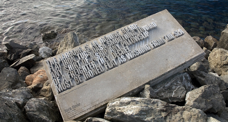
One of 15 large-scale concrete text sculptures, Wellington Writers Walk, 2002 – 2004
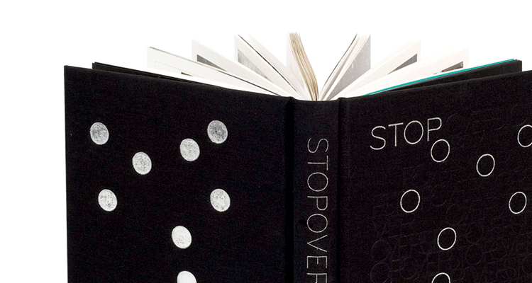
Stopover, by Bruce Connew, published by VUW and UHP, 2007
AEIOU, a typo/sound sculpture, Wellington, NZ, 2009

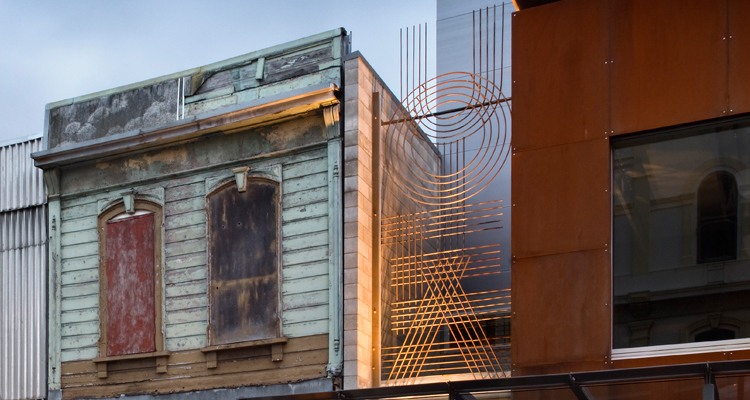
Two letters from A Hillside Intervention, Athfield Architects, 2010
|
|
04 writing & critique
Walk With Me
by Stephen Cleland
curatorial essay, »Catherine Griffiths: Walk With Me«, Te Wai Ngutu Kākā Gallery, Aotearoa NZ, July 2025
Blood lines
by John Warwicker
exhibition review, »Catherine Griffiths: Out of Line«, Eye Blog, UK, June 2025
On the Expanded
by Megan Patty
curatorial essay, »Catherine Griffiths: Out of Line«, The Design Gallery, University of Melbourne, Australia, May 2025
The Shapes of Sound
by Ela Egidy
curatorial essay, »Catherine Griffiths: Out of Line«, The Design Gallery, University of Melbourne, Australia, May 2025
Read this space
by John L. Walters
book review, »catherine griffiths : SOLO IN [ ] SPACE«, Eye, UK, Spring 2023
Interview / Featured typographer / Catherine Griffiths
The Design Kids
related links
The Design Kids
Making Noise
by Catherine Griffiths
contribution, Alphabettes Soup: 2015–2025, Bikini Books, Portugal, March 2026
Walk With: A Survey Exhibition by Catherine Griffiths
by Catharina van Bohemen
exhibition review, Art New Zealand #196, Aotearoa NZ, November 2025
A paper record
by Catherine Griffiths introduction, Present Tense : Wāhine Toi Aotearoa — a paper record., Aotearoa NZ, May 2023
An installation on an installation on an installation ...
by Catherine Griffiths
artist statement, »catherine griffiths : SOLO IN [ ] SPACE« A documentation, Pocca, China
September 2021
A Paper Vehicle
by Catherine Griffiths and
Bruce Connew
Dwelling in the Margins, Gloria Books, 2020
Figures that don’t add up
by Catherine Griffiths
Eye Blog, UK, March 2019
1997–2017, 43 Black Pins, 40 men, 3 women
by Catherine Griffiths
The Spinoff, Aotearoa NZ, August 2018
Power in the Poster
by Catherine Griffiths
Designers Speak (Up), Aotearoa NZ, August 2018
Peace
by Catherine Griffiths
Word—Form, Australia, 2018
Porto Design Summer School 2017
by Catherine Griffiths
review, looking back on the fifth edition, Portugal, April 2018
Notes from ‘Designing the perfect photobook’
notes from a short talk as part of a panel discussion, PhotobookNZ, Aotearoa NZ, March 2016
A meditation
Sir Ian Athfield, 1940 — 2015
by Catherine Griffiths
Architectural Centre, Aotearoa NZ,
April 2015
The Design Kids interview
interview with The Design Kids, Australia, July 2015
A Playlist : CG >> CG
by Catherine Griffiths
DPAG Late Breakfast Show, Aotearoa NZ, August 2014
Body, Mind, Somehow: The Text Art of Catherine Griffiths
by Gregory O’Brien
Art New Zealand #150, Aotearoa NZ, 2014
Nothing in Mind
by Chloe Geoghegan
typ gr ph c, Aotearoa NZ, August 2014
typ gr ph c in Strips Club
by Catherine Griffiths
Strips Club journal, Aotearoa NZ, March 2014
In the Neighbourhood
by Catherine Griffiths
Desktop #294, Australia, 2013
Interview
by Heath Killen
interview for Desktop #294, Australia, 2013
FF ThreeSix
by Catherine Griffiths
Typographica, March 2013
A note on the D-card
by Catherine Griffiths
Aotearoa NZ, April 2013
She’s Got Legs
by Lee Suckling
Urbis, Aotearoa NZ, January 2013
Truly, No Idea
by Catherine Griffiths
for Flash Forward, Desktop, Australia, November 2012
Look for the purple lining
by Catherine Griffiths
Eye Blog, UK, March 2012
Q&A TBI
interview with The Big Idea, Aotearoa NZ, June 2011
Shots in the air
by Catherine Griffiths
Eye Blog, UK, January 2011
John & Eye
by Catherine Griffiths
ProDesign 110, Aotearoa NZ, January 2011
Quite a Blast
by Catherine Griffiths
ProDesign, Aotearoa NZ, January 2011
Inner-City Modality
by Mercedes Vicente
ProDesign, Aotearoa NZ, August 2010
Beautiful World of Typography
by Catherine Griffiths
excerpt from a talk, Govett-Brewster Gallery, Aotearoa NZ, June 2009
For the record
by Catherine Griffiths
Introduction to For the record, TypeSHED11 11–15/2009, Aotearoa NZ, February 2009
Locating Our Feet
by Catherine Griffiths
Threaded, Aotearoa NZ, October 2008
Notes
on Feijoa
by Catherine Griffiths
ProDesign, Aotearoa NZ, April 2007
Life in Italics
by Helen Walters
Print, New York,
USA, September-October 2006
Writing by
Types
by Justine Clark
Artichoke, Australia, April 2003
|