|
|
A note on the D-card
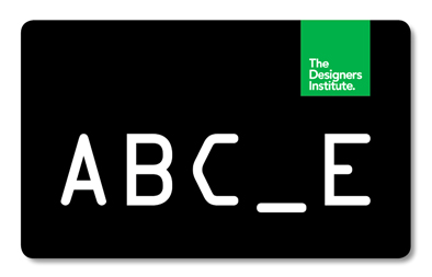
In 2011, Toby Curnow and Arch MacDonnell at Inhouse Design invited me to contribute a ‘D’ for the Designers Institute of New Zealand’s membership card.
The brief was to take a ‘D’ from something I’d done. I looked at recent projects but it turned out they were no help at all, being vowel-based with AEIOU and Sound Tracks.
Because I was building my own studio at the time (this was back in 2011), I searched around the site in the forest for a potential ‘d’ or ‘D’, but only a ‘G’, an ‘O’, a ‘B’, several ‘A’s (always ladders), and an ‘L’ presented themselves. In the end, these problems made the result much more interesting.
While one or two may read my response as a tad provocative, it is so much more than that. It’s about the space created — an imagined space. The missing letter in the known sequence makes us pause for a second: it makes us think.
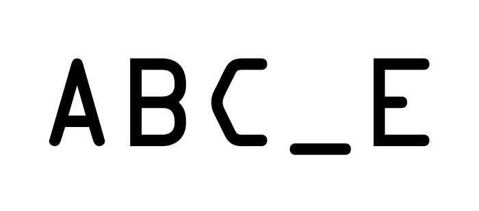
Set in one of the most vernacular of fonts of all time, OCR-A(an optical character recognition font designed by the U.S. Bureau of Standards in 1966), ‘ABC_E’ plays to the language of democracy, and in turn opens the window for interpretation.
If you read the wonderful Wikipedia definition of ‘optical character recognition’, it is described as “the mechanical or electronic conversion of scanned images of handwritten, typewritten or printed text into machine-encoded text ... widely used as a form of data entry from some sort of original paper data source ... a common method of digitizing printed texts so that they can be electronically searched, stored more compactly, displayed on-line, and used in machine processes such as machine translation, text-to-speech and text mining. OCR is a field of research in pattern recognition, artificial intelligence and computer vision.” Wow.
While OCR-A was released by the American Type Founders in 1968, its European counterpart, OCR-B was designed by Adrian Frutiger in collaboration with engineers from the European Computer Manufacturers’ Association. I wonder if without such a font, we would be where we are today?
The intention of the D-card is “to make membership more tangible for people, to attach some real benefits for members.”
Will this work for the Designers Institute? I do hope so. At the very least, ‘ABC_E’ offers up the space to think.
Catherine Griffiths, 2013
|
|
04 writing & critique
Walk With Me
by Stephen Cleland
curatorial essay, »Catherine Griffiths: Walk With Me«, Te Wai Ngutu Kākā Gallery, Aotearoa NZ, July 2025
Blood lines
by John Warwicker
exhibition review, »Catherine Griffiths: Out of Line«, Eye Blog, UK, June 2025
On the Expanded
by Megan Patty
curatorial essay, »Catherine Griffiths: Out of Line«, The Design Gallery, University of Melbourne, Australia, May 2025
The Shapes of Sound
by Ela Egidy
curatorial essay, »Catherine Griffiths: Out of Line«, The Design Gallery, University of Melbourne, Australia, May 2025
Read this space
by John L. Walters
book review, »catherine griffiths : SOLO IN [ ] SPACE«, Eye, UK, Spring 2023
A note on the D-card
by Catherine Griffiths
designed for The Designers Institute of New Zealand
related links
Designers Institute of New Zealand
Making Noise
by Catherine Griffiths
contribution, Alphabettes Soup: 2015–2025, Bikini Books, Portugal, March 2026
Walk With: A Survey Exhibition by Catherine Griffiths
by Catharina van Bohemen
exhibition review, Art New Zealand #196, Aotearoa NZ, November 2025
A paper record
by Catherine Griffiths introduction, Present Tense : Wāhine Toi Aotearoa — a paper record., Aotearoa NZ, May 2023
An installation on an installation on an installation ...
by Catherine Griffiths
artist statement, »catherine griffiths : SOLO IN [ ] SPACE« A documentation, Pocca, China
September 2021
A Paper Vehicle
by Catherine Griffiths and
Bruce Connew
Dwelling in the Margins, Gloria Books, 2020
Figures that don’t add up
by Catherine Griffiths
Eye Blog, UK, March 2019
1997–2017, 43 Black Pins, 40 men, 3 women
by Catherine Griffiths
The Spinoff, Aotearoa NZ, August 2018
Power in the Poster
by Catherine Griffiths
Designers Speak (Up), Aotearoa NZ, August 2018
Peace
by Catherine Griffiths
Word—Form, Australia, 2018
Porto Design Summer School 2017
by Catherine Griffiths
review, looking back on the fifth edition, Portugal, April 2018
Notes from ‘Designing the perfect photobook’
notes from a short talk as part of a panel discussion, PhotobookNZ, Aotearoa NZ, March 2016
A meditation
Sir Ian Athfield, 1940 — 2015
by Catherine Griffiths
Architectural Centre, Aotearoa NZ,
April 2015
The Design Kids interview
interview with The Design Kids, Australia, July 2015
A Playlist : CG >> CG
by Catherine Griffiths
DPAG Late Breakfast Show, Aotearoa NZ, August 2014
Body, Mind, Somehow: The Text Art of Catherine Griffiths
by Gregory O’Brien
Art New Zealand #150, Aotearoa NZ, 2014
Nothing in Mind
by Chloe Geoghegan
typ gr ph c, Aotearoa NZ, August 2014
typ gr ph c in Strips Club
by Catherine Griffiths
Strips Club journal, Aotearoa NZ, March 2014
In the Neighbourhood
by Catherine Griffiths
Desktop #294, Australia, 2013
Interview
by Heath Killen
interview for Desktop #294, Australia, 2013
FF ThreeSix
by Catherine Griffiths
Typographica, March 2013
A note on the D-card
by Catherine Griffiths
Aotearoa NZ, April 2013
She’s Got Legs
by Lee Suckling
Urbis, Aotearoa NZ, January 2013
Truly, No Idea
by Catherine Griffiths
for Flash Forward, Desktop, Australia, November 2012
Look for the purple lining
by Catherine Griffiths
Eye Blog, UK, March 2012
Q&A TBI
interview with The Big Idea, Aotearoa NZ, June 2011
Shots in the air
by Catherine Griffiths
Eye Blog, UK, January 2011
John & Eye
by Catherine Griffiths
ProDesign 110, Aotearoa NZ, January 2011
Quite a Blast
by Catherine Griffiths
ProDesign, Aotearoa NZ, January 2011
Inner-City Modality
by Mercedes Vicente
ProDesign, Aotearoa NZ, August 2010
Beautiful World of Typography
by Catherine Griffiths
excerpt from a talk, Govett-Brewster Gallery, Aotearoa NZ, June 2009
For the record
by Catherine Griffiths
Introduction to For the record, TypeSHED11 11–15/2009, Aotearoa NZ, February 2009
Locating Our Feet
by Catherine Griffiths
Threaded, Aotearoa NZ, October 2008
Notes
on Feijoa
by Catherine Griffiths
ProDesign, Aotearoa NZ, April 2007
Life in Italics
by Helen Walters
Print, New York,
USA, September-October 2006
Writing by
Types
by Justine Clark
Artichoke, Australia, April 2003
|