|

|
Inner-City Modality
by Mercedes Vicente
A vowel-based composition
(hot metal of a different type?) rises up above Wellington’s Cuba
Street. Words: Mercedes Vicente. Photos: Paul McCredie.
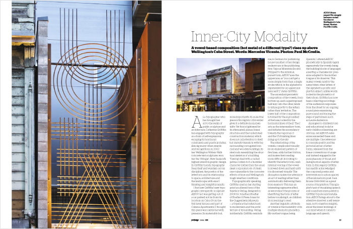
As a typographer who has brought her art to the realm of public
sculpture and architecture, Catherine Griffiths has engaged with
typography as a form of self-expression, escaping its functional
constraints and practical duties. Among many other awards and recognitions,
in 2002 her Wellington Writers Walk concrete text sculptures won
her the ‘Stringer’, New Zealand’s highest award in graphic design.
In Griffiths’ hands, typography frees itself and wanders across
disciplines, the poetics of the letterform and its relationship
to space, architecture and the landscape, with exact thinking and
insightful results.
I first saw Griffiths’ new typographic site-specific
sculpture AEIOU as I was getting out of a car parked not far from
its location on Cuba St (on the first level terrace and part of
Cubana Apartments). I thought this piece was subtle but with presence.
Its materiality but, more importantly, its scale (the piece is
5m high by 2.5m wide) gives it a definite monumentality.
Yet this is lightened by its attenuated, planar,
linear structure and the rusted steel construction material, which
does not call attention to itself but cleverly blends in with the
surrounding corrugated iron clad and wooden buildings, its steel
rods resembling the structural skeleton of a building. ‘Taming’
steel with a rusted patina confers to it a humbler character (rather
than the usual sleek corporate look of steel), one vulnerable to
the corrosive effects of time and Wellington’s tough weather conditions.
Typographically speaking, Griffiths used as
her starting point an altered form of the typeface Verlag, designed
in 2006 by Jonathan Hoefler of Hoefler & Frere-Jones for the
Guggenheim Museum — a typeface that refers back to modernism and
the architecture
of its building. Verlag, incidentally, Griffiths reminds me, is
German for publishing house (another of her design endeavours is
the publishing firm Vapour Momenta Books). Stripped to the minimal,
purest form, AEIOU uses the uppercase, as “you can’t get a more
simple form than a single stroke which, in the alphabet is represented
by an uppercase sans serif I,” states Griffiths.
The ascendant geometric composition of the vowels, from bottom
up, each superimposed half-way onto the other, tends to infuse
gravity to the letters rather than levitation. The lower half of
the composition is formed by the A grounded at the base, locked
by the horizontal lines of the E. The I acts as the intermediary
form, and initiates the ascendancy towards the vaporous O and the
U’s finishing lines rising up to the sky.
The interlocking of the vowels, complicated visually by an exuberant
pattern of five lines, adds further friction, and makes their reading
more difficult. In looking to identify the letter’s form, one’s
internal voicing of the vowel is slowed down and held until it
is discerned visually. The disruption makes the utterance an act
of reading rather than automatically delivering them from memory.
This has an interesting regressive effect, as we re-enact the process
of identifying the form of letter before vocalising it, as children
do in learning to read.
Another linguistic attribute of vowels is the
mutability of its multiple idiomatic phonetics. My mother tongue,
being Spanish, I uttered AEIOU phonetically in Spanish (again regressively,
the vowels being the building blocks of language), asserting a
chameleonic presence adapted to the mother tongue of its observer.
This makes vowels (and by the same token other letters of the alphabet)
a prolific and playful subject, unlike words locked in the phonetics
of their idiom. Griffiths has now been collecting recordings of
the audience’s responses from the street for an ongoing sound piece
examining pure sound and tracing the steps of performers such as
Laurie Anderson.
Analogies to children’s toys and educational
tools for early childhood learning are obvious, yet AEIOU’s references
exceeded these and are multiple. One reference is concrete poetry
and the pictorial layout of letterforms, released from the linear
conventions of usage and instead engaged in the pure pleasure of
visual and metaphorical aspects of letterform.
In this regard, Griffiths has readily acknowledged the corporeal
poems and interventions in urban spaces of Barcelona-born poet
Joan Brossa (1919-1998) as a great source of inspiration. Typography’s
task of visualizing speech and sound becomes patent in Griffiths’
typo/sound installation.
AEIOU brings about to the attentive observer a self-awareness,
not to mention insights, about the inner workings of our mind when
it comes to language and speech.
Mercedes Vicente / ProDesign,
NZ, Aug 2010
Mercedes Vicente (at the time of writing) was Curator of Contemporary
Art, Govett-Brewster Gallery, New Plymouth, New Zealand
|
|
04 writing & critique
Walk With Me
by Stephen Cleland
curatorial essay, »Catherine Griffiths: Walk With Me«, Te Wai Ngutu Kākā Gallery, Aotearoa NZ, July 2025
Blood lines
by John Warwicker
exhibition review, »Catherine Griffiths: Out of Line«, Eye Blog, UK, June 2025
On the Expanded
by Megan Patty
curatorial essay, »Catherine Griffiths: Out of Line«, The Design Gallery, University of Melbourne, Australia, May 2025
The Shapes of Sound
by Ela Egidy
curatorial essay, »Catherine Griffiths: Out of Line«, The Design Gallery, University of Melbourne, Australia, May 2025
Read this space
by John L. Walters
book review, »catherine griffiths : SOLO IN [ ] SPACE«, Eye, UK, Spring 2023
Inner-City
Modality
by Mercedes Vicente
ProDesign,
NZ, Aug 2010
related links
AEIOU — a typo/sound sculpture
Making Noise
by Catherine Griffiths
contribution, Alphabettes Soup: 2015–2025, Bikini Books, Portugal, March 2026
Walk With: A Survey Exhibition by Catherine Griffiths
by Catharina van Bohemen
exhibition review, Art New Zealand #196, Aotearoa NZ, November 2025
A paper record
by Catherine Griffiths introduction, Present Tense : Wāhine Toi Aotearoa — a paper record., Aotearoa NZ, May 2023
An installation on an installation on an installation ...
by Catherine Griffiths
artist statement, »catherine griffiths : SOLO IN [ ] SPACE« A documentation, Pocca, China
September 2021
A Paper Vehicle
by Catherine Griffiths and
Bruce Connew
Dwelling in the Margins, Gloria Books, 2020
Figures that don’t add up
by Catherine Griffiths
Eye Blog, UK, March 2019
1997–2017, 43 Black Pins, 40 men, 3 women
by Catherine Griffiths
The Spinoff, Aotearoa NZ, August 2018
Power in the Poster
by Catherine Griffiths
Designers Speak (Up), Aotearoa NZ, August 2018
Peace
by Catherine Griffiths
Word—Form, Australia, 2018
Porto Design Summer School 2017
by Catherine Griffiths
review, looking back on the fifth edition, Portugal, April 2018
Notes from ‘Designing the perfect photobook’
notes from a short talk as part of a panel discussion, PhotobookNZ, Aotearoa NZ, March 2016
A meditation
Sir Ian Athfield, 1940 — 2015
by Catherine Griffiths
Architectural Centre, Aotearoa NZ,
April 2015
The Design Kids interview
interview with The Design Kids, Australia, July 2015
A Playlist : CG >> CG
by Catherine Griffiths
DPAG Late Breakfast Show, Aotearoa NZ, August 2014
Body, Mind, Somehow: The Text Art of Catherine Griffiths
by Gregory O’Brien
Art New Zealand #150, Aotearoa NZ, 2014
Nothing in Mind
by Chloe Geoghegan
typ gr ph c, Aotearoa NZ, August 2014
typ gr ph c in Strips Club
by Catherine Griffiths
Strips Club journal, Aotearoa NZ, March 2014
In the Neighbourhood
by Catherine Griffiths
Desktop #294, Australia, 2013
Interview
by Heath Killen
interview for Desktop #294, Australia, 2013
FF ThreeSix
by Catherine Griffiths
Typographica, March 2013
A note on the D-card
by Catherine Griffiths
Aotearoa NZ, April 2013
She’s Got Legs
by Lee Suckling
Urbis, Aotearoa NZ, January 2013
Truly, No Idea
by Catherine Griffiths
for Flash Forward, Desktop, Australia, November 2012
Look for the purple lining
by Catherine Griffiths
Eye Blog, UK, March 2012
Q&A TBI
interview with The Big Idea, Aotearoa NZ, June 2011
Shots in the air
by Catherine Griffiths
Eye Blog, UK, January 2011
John & Eye
by Catherine Griffiths
ProDesign 110, Aotearoa NZ, January 2011
Quite a Blast
by Catherine Griffiths
ProDesign, Aotearoa NZ, January 2011
Inner-City Modality
by Mercedes Vicente
ProDesign, Aotearoa NZ, August 2010
Beautiful World of Typography
by Catherine Griffiths
excerpt from a talk, Govett-Brewster Gallery, Aotearoa NZ, June 2009
For the record
by Catherine Griffiths
Introduction to For the record, TypeSHED11 11–15/2009, Aotearoa NZ, February 2009
Locating Our Feet
by Catherine Griffiths
Threaded, Aotearoa NZ, October 2008
Notes
on Feijoa
by Catherine Griffiths
ProDesign, Aotearoa NZ, April 2007
Life in Italics
by Helen Walters
Print, New York,
USA, September-October 2006
Writing by
Types
by Justine Clark
Artichoke, Australia, April 2003
|