|
Catherine Griffiths: an interview conducted by Heath Killen
Desktop, June 2012, issue #294
The term “international style” usually refers to a very specific, modernist approach to design - however it feels like the most appropriate way to describe the work of Catherine Griffiths. A true citizen of the world, Griffiths seems to transcend cultural barriers, and infuses each project with her intelligence, honesty, and humanity. Regardless of whether she’s producing an intimate catalogue or a large scale installation, Griffiths possesses a rare ability to challenge and delight in equal measure. Here she shares some thoughts on culture, community, and the fine art of collaboration.
HK / Your practice is based in New Zealand; however, you’ve spent time living and working in cities such as London and Paris. What attracts you to certain places, and what keeps you coming back home?
CG / I was born in England’s New Forest – with Bambi and a family of squirrels at the bottom of an old oak tree, or so I thought until I was six or seven – to New Zealand parents who were living and working in the UK on their overseas experience. Apparently, I was conceived in France – my mother’s honeymoon queasiness was me, rather than snails or frogs’ legs. I spent my first months raised in a converted cow shed, before touring Europe, sleeping in the French tent my parents use to this day, and being bathed in a bucket. Then it was time to go home, so we flew to Canada and from there boarded a ship and sailed across the Pacific to New Zealand. Before my first year was over, in 1966, I’d come ashore on the other side of the world, where I am right now. Does that explain why I keep going back? Probably not.
It’s certainly a great story though! New Zealand frequently gets packaged together with Australia. What do you think the cultural differences between the two nations are, and how you think these differences manifest in design.
Politically and culturally, we are distinctly different. As individuals, we cross over and mix easily, if more westward than eastward (my maternal great-grandparents were born in Western Australia, my paternal grandfather even further west, in Calcutta). In our two countries, the scale of economics and industry, and the nature of our alliances with others is markedly unalike, as is how we perceive ourselves – a small nation trying to punch above its weight. What I can’t understand is why, at 4.5 million people, we struggle to alter course for the sustainable well-being of our country and people: look at Bhutan’s commitment to becoming organic ... imagine New Zealand, a nation of farms and food production, becoming organic and toxin free in our food production and consumption. We became nuclear-free 25 years ago. The impact of a healthy, productive nation, and the benefits that would follow, would be transformational.
Landing in Sydney, the accent, the screech of galahs, the sweet smell of eucalypts, huge billboards, how buildings meet the ground with intent, only heighten my sense of where I feel I come from. Yet “where we come from” is steadily refocusing or blurring into something else, as we experience our own children spreading their genes about the world. Four of my five stepchildren have settled with partners and children in London, Berlin, Santiago and Sydney. The next one, a dancer and choreographer, is talking China!
In terms of graphic design – visual communications – I see a similar blurring. Both countries produce slick, capable, commercial graphic design, typography that currently courts modernism, ads that tap into the cultural heartland, museums and government departments that present bicultural messages, others multicultural... some cleverly, others badly. I don’t put too much thought into any of this, other than getting on and making or doing: by making work, lending your voice, you add to the fabric of society, no matter how insignificant.
What are your thoughts on the New Zealand design community, and how has it changed over time?
Up until TypeSHED11 in 2009, New Zealand’s first-ever typography symposium (co-organised with Italy-based Simone Wolf, whom I met at ATypI, Helsinki in 2005), the design community here was quietly active, but it wasn’t busy, certainly not in an international way. At the time we had, and still have, the Designers Institute, who run the BEST awards, and Designers Speak, a series of talks I initiated with their support in 2005 with “five designers, five Fridays, five lunchtimes”. Since then, they’ve taken it on in a format of their own as their mainstay. There was the industry-based initiative, Better By Design; Semi-Permanent had been coming out of Sydney; and up until 2011, the graphic design profession shared its national coverage with spatial and product design in Prodesign magazine, which has since closed. Threaded magazine had established itself at graduate level and has since gone from strength to strength with their audience; and The National Grid, a tangential format of thinking and writing on design published by Luke Wood and Jonty Valentine was into its 5th issue by then, which they launched at TypeSHED11.
There was an unfolding of a community of activity. Part of the reason behind organising TypeSHED11 (a small affair, although looking back, hosting 17 international and 17 New Zealand speakers was hardly small) was to share the networks I had formed overseas, back here with fellow practitioners and institutions, students and academics alike:
“TypeSHED11 aims to raise the stakes of typography’s role in New Zealand – socially, politically and culturally. With typography the thread, TypeSHED11 will provide an international and uncompromising framework for content and meaning, leaving ground for practitioners, students, academics and theorists to clutch a rare opportunity, both formally and otherwise, to tease out ideas and critical thought, to participate in rigorous debate and dialogue.
...key figures in world design and typography will be here, along with new and future names. They will intermingle with New Zealanders and those at TypeSHED11 from around the globe, where, beyond the formal presentations, serendipity and the unexpected will play a part in reinforcing a foundation for New Zealand to participate in the global typography debates.
TypeSHED11 is a one-of-a-kind moment for New Zealand to be exposed to fine and informed minds on the subject of typography and its place.”1
Which it did. Since then, the timeliness of social media, and advancements in technology have impacted on the design community, professionally and academically. In and out of such events as Massey University’s BLAST, Design Assembly and Creative Mornings AKL, are smaller and highly focused initiatives such as split/fountain (S/F), Clouds, Index, and Studio Magazine, each making their own mark here and offshore.
Like Australia, New Zealand has a vibrant indigenous culture. Do you think the Māori culture is well-represented in the design industry?
In a sense, yes I do. I’m in awe of the Puketapu-Hetet and Te Kanawa line of Maori women weavers who through the generations brought recognition to the craft, the design, and revitalisation of weaving as an art form. We women share the same great-great-grandfather who was European, an engineer and surveyor. Hetet was a trajectory from the French side, Louis Hetet, a whaler. Thing is, we’re all a mix, and share in the geneology, the whakapapa, one way or another.
Since the 1990s, most New Zealand graphic designers will have worked with Māori (and European, and Pacific, and now Asian) content in some shape or form – and been charged with the responsibility of understanding, acknowledging and representing – or referencing – the cultures appropriately. As with any project, how well that is achieved comes down to who is involved, what the agendas are and the level of trust between those taking part. Not always an easy process, and not always strictly ‘Māori’ or ‘Pacific’. There have been some beautiful outcomes: Ken Chapman’s 1968 Air New Zealand koru (with Tom Elliot’s logotype); the late Joseph Churchward’s ‘suggestions’ for TV2’s logo, 1995, resurrected by David Bennewith’s 2007 silk screen poster; Neil Pardington’s Parihaka, 2001; Shabnam Shiwan’s typeface and design for Black Grace, 2006; Kris Sowersby’s Bula for Fiji Airways; and last year, young designer and artist Johnson Witehira, who promotes himself as ‘specialising in kaupapa Māori graphic design’ had his work projected all over New
York City’s Times Square.
In a much more subtle way, my Trestle Leg Series includes seven excerpts of poetry and prose, and an 1860 korero (an oratory) by Te Waatarauihi, chief of Te Kawerau. How best to render the korero was the challenge, and could have been answered by inserting a sound recording into the space (whose voice then?).
Instead, I chose to render the words, painted application to steel, and couch them in speech marks. The words, set in a bold weight of Hoefler and Frere-Jones’ Verlag, as for all the works, are te reo Māori – you read and pronounce – in Māori.
On to your own work, publishing plays a significant role in your own practice. What is it about the
book that appeals to you so much, and what are
your thoughts on its place in the world at this
point in time?
The book is an object, and within that object is someone’s idea. A sequence of events plays out, there is a rhythm. You move through, page-turning, over and over, page-unfolding – upwards, sideways, inwards – before moving on – or back.
I’m intrigued by the experience of book reading and handling: it’s a physical experience, whether moving eyes to gather in words, images and sense, or holding the object in the hands, the texture, materiality, whether featherweight or heavy, all lending to the meaning.
The place of the book is no less valid than before the mighty digital revolution. In its analogue form, we see
more photo books and zines than ever before; the artist book hasn’t gone away. It’s exploded as a genre; now there’s a plethora of self-publishing, a sort of populist movement going on that might make the Dadaists turn in their graves.
Then you have the ebook (I loathe that term) and iPad/Kindle technology, which has been embraced (with a long way to go), especially by large publishing houses the profit line of which is first and foremost ... remember the truism that the cookbook has kept them in business?
Beyond more “traditional” graphic design applications, much of your work exists within the public space, as environmental graphics and sculptures. What draws you to this type of work?
I’m not sure I am drawn to this work, it is more about the idea, and how best to express that idea, and then observe the aftermath. The large-scale concrete text sculptures I made for the Wellington Writers Walk, my first public work that ventured off the printed page, came about when I realised that the brief for a ‘series of A4-sized bronze plaques set into the city's civic square’ was so far removed from what it was the client was actually trying to express: ‘to celebrate the words of well-known New Zealand writers and poets...’ My first responsibility as a designer was to use my typographic skills and imagination to put into action something that was worthy of those writers and poets.
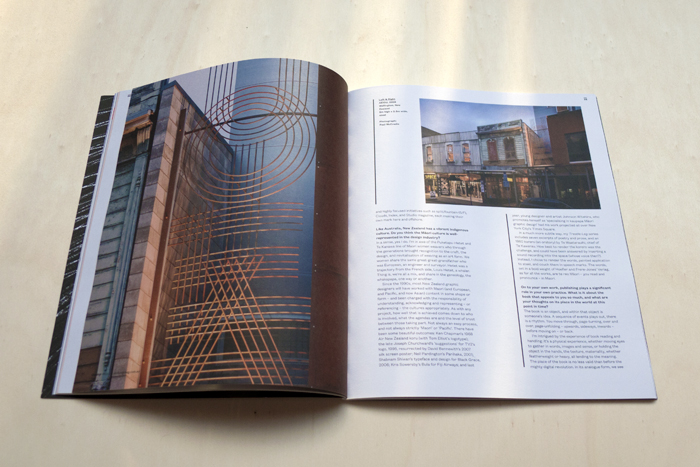
Since then I’ve either been approached, or I’ve made proposals, where I can see possibilities for large-scale objects installed in a space of some kind (I don’t see my work as sculptural – I don’t sculpt). A Hillside Intervention is a series of letterforms or “letter-crumbs”, of varying scale and materials, scattered about a steep hillside – as if the typographic logo, a field of letters, which I’d also designed, had exploded. It forms a system of wayfinding (or losing!) from the road up 300-plus steps to the practice of Athfield Architects. AEIOU is what I call a typo-sound installation in Cuba Street, a stack of steel rods, where the audience provides the sound response, simply by stopping, looking up, making out the letters, and reciting the vowels – or getting as far as I-O-U, or digressing, as did one gallerist with I LOVE U.
These types of projects play a significant role in communities – either providing a catalyst for people to interact in the physical environment, or a way to support or transform the way that people currently interact.
You’re right, the audience response has played a big part in the ultimate realisation and satisfaction of my projects. It’s not my intention to make a certain thing happen. I can shape, but can’t determine, and what the work may elicit can come as a complete surprise. I remember while we were installing one of the larger concrete text sculptures for the Wellington Writers Walk, two young women arrived, stood on the wharf edge, and together recited the work of Patricia Grace at full volume. Later, I noticed someone else video the static object of a text sculpture.
I knew it would be a very physical experience to read The Trestle Leg Series in full – excerpts of poetry and prose wrapped around eight of the eastern trestle legs of the west box girder beneath the Auckland Harbour Bridge – but it was design historian Michael Smythe and his grandchildren who inspired me to take the project a step further: the four of them each took up a side of the pillar, and in sequence read out the part of the line they were faced with. In that atmosphere under the bridge, what a performance! Something I would like to set up and film someday.
What sort of research and development process takes place for these projects?
I want to know about the place, the site, its past ... all depends on the site and project. Usually it involves hanging around the area, getting to know it, and observing what goes on, listening to others. Some of the places I have made works in, I know intimately — we lived around the corner from Cuba Street, the waterfront was everyone’s in Wellington, then there was the hillside at Athfields where we lived for ten months ... I like to feel the place — take on the atmosphere — get to know it by being there.
What about finding and working with particular craftspeople and collaborators?
Like any project, if you need something or someone, you start looking and asking. As a child, it wasn’t in my nature to ask. I would find my own way. Even now I ask for little, although that's changing. I’m tired of not asking!
Usually, I start with a conversation with people I already know. At the moment of writing, I’m trying to find someone who can produce a single, three-metre diameter sheet of mirror glass, and they’re probably not in New Zealand. Or by going elsewhere. It was Eye Magazine that prompted me on a journey to find the poetic works of Joan Brossa and the sculptural typography of Josep Subirachs whose sensibilities helped inform mine. I followed the 1930s train journey of Rebecca West (author of Black Lamb and Grey Falcon) to the door of Croatian designer Boris Ljubičić, where I could “read between the lines” at 100% scale the poster’s small print revealing the genocide at Vukovar in 1991. In Basel I witnessed Wolfgang Weingart making the book of his life. All part of my R&D.
Often, obstacles are placed in the way, so it’s a balance to stay true to a vision, being very clear around the feeling of what it is I am wanting to make, and knowing where I can be flexible without wrecking the project, what’s special about it. The advantage of being outside the craftperson’s discipline, is that I can come in from another angle, and usually we find a way.
You seem to have a strong appreciation for Asian design, particularly Japanese. What is it about design from this region that resonates with you?
I do have a love for the Japanese aesthetic. Their graphic design history is striking. I appreciate their sense of materiality, of light and dark in architecture, book- and film- making, and photography, their best is extraordinary.
Bruce’s artist book, Muttonbirds, part of a story, is a series of 30 photographs preceded by an oral history text with a Maori muttonbirder, which talks about social-political issues through his life-story. The soft-covered wirobound book (when opened, spreads like the wings of a bird) is hand-titled in brush lettering, referencing the birds’ long-haul flight from southern New Zealand, through Japan, to the Arctic Circle. On the back cover the brushwork is displayed in the opposite direction — a surprisingly Japanese calligraphic hand reveals itself. Somehow these things just happen. Over the years, I have come to know the work of Masayoshi Kodaira. I was on the judging panel for the 2007 D&AD awards, where his work for Fukutake House earned him a silver. Ever since, we have maintained a good connection. A couple of years ago, Masayoshi invited me to participate in a public art project in Tokyo, working with stone. I found myself paying homage to my grandmother in a deeply personal way, channelled through the surnames of Japanese, names that belong to the photographers whose work I admire. The objects were memorial-like and, as I was working on them at the time, the catastrophic earthquake struck Christchurch, the whole process became quite cathartic. But the design was too complicated to cut out of stone, so they remain on paper.
So much wonderful work. It’s strange to me that there don’t seem to be strong ties within the Asia-Pacific design communities.
I’m not surprised, given that our education, historically, has referenced mostly Western models. Perhaps we turned our backs on some of those Asian nations, figuring politically and economically that our future lay elsewhere… that has changed recently of course, and we increasingly see ourselves as part of Asia. By 2050, anecdotally, New Zealand’s population demographic is predicted: 25 percent European, 25 percent Maori, 25 percent Pacific and 25 percent Asian ... that's a game changer. We are building strong relationships around the Pacific Rim and, of course, economically, you ignore China at your peril. Our future is in our region, Asia and the Pacific, and our design will reflect that. As well, Asia and the Pacific have come to New Zealand, through education and migration ... we can’t help but notice each other, to take an interest, and to be excited by the possibilities.
Back to your own practice, one of your more recent and significant branding projects was for Parlour, which aims to be a forum for “exchange and discussion” on “women, equity and architecture in Australia”. Could you tell me a little more about this project, and do you think it’s something that is lacking within graphic design?
Parlour is the brainchild of editor Justine Clark, developed with Dr Naomi Stead and Dr Karen Burns as part of a larger research project with others, Equity and Diversity in the Australian Architecture Profession: Women, work and leadership. Led by Dr Stead, Parlour is the public face of the Australia Research Council funded project, and has been highly successful partly because it is appropriate, and partly because of acute intelligence, energy and determination – there’s no pussy-footing around. They’re “out there”, and I completely admire that. They’re unafraid. There’s a strong commitment among women in architecture towards making change within their discipline, and this forum, along with the New Zealand version of Architecture + Women, has a momentum. Yet in graphic design in New Zealand, I don’t sense this same strength of desire for a collective female voice. It exists in pockets, but not in an organised way. I have enormous respect for women such as Ellen Lupton and Sheila Levrant de Bretteville (both US). Even at a distance, what they stand for is relevant here too. I have developed strong friendships with women designers, and artists and architects – although most are overseas, and are part of the reason why Paris tugs, and has become another base. When there, Bruce and I and work on our elderly grande-dame, a Dutch peniche (barge) – a converted milk-tanker that once navigated the narrow farm canals in Friesland collecting milk – where we are closer to the connections we’ve both been responding to in our respective disciplines over the years.
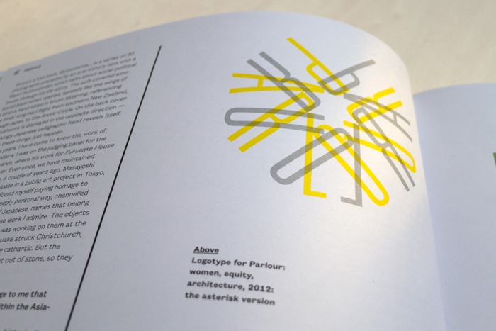
There’s such a unique energy in that logotype too.
I was surprised to discover how geometric the sequence of letterforms P-A-R-L-O-U-R are in this circular formation. The ‘R’s are head to head; the ‘A’ is megaphone-like; the ‘L’ is a strong and noble nose, and
anchors the composition; the ‘U’ is perhaps a magnet; you could tap the ‘P’ and the whole thing could start up in motion! Parlour/Parler, an asterisk, a colon, a full-point (period, full-stop) – the conversation is already underway! The logotype and brand helps give them the visual graphic mechanism with which to communicate and grab the attention of women – and men. At the moment we’re developing guidelines and fact sheets, and preparing the program/poster for a one-day event at the Material conference called Transform: Altering the Future of Architecture.
Earlier you mentioned photographer Bruce Connew, who happens to be your husband. Could you talk a little about your collaborations with him?
A couple of years ago, DINZ (Designers Institute New Zealand) invited us to speak on our collaboration. We agreed, but in preparing for the series, we decided not to divulge what the other was writing on how we saw our “collaboration”. The title of our talk was Together, Alone. In preparing, I wasn't sure where to start on this whole thing, probably because I couldn’t see how we, Bruce and I, fit into the idea of collaboration as might be expected by others or as I might have collaborated with other people on other projects. As I tried to pin down an example of our work that is truly collaborative, I found this definition: ‘Collaboration is positive except in wartime (working with the enemy).’
That was in the context of “cooperation”, which is always positive, and “collusion”, which is always negative (‘working together in secret for a dishonest purpose’). I figured that collaboration being positive except in wartime wasn’t far off the mark – because wartime can and does happen! I read also, that collaboration is to ‘work together, especially in a joint intellectual effort’. This interested me, because this is where we strike common territory. Until now, we’ve never done a truly collaborative project. We’re two individuals, we’re not “a studio”. We’re not even in the same business. We live and work together – for four years until now, we we worked across one table – we share ideas, thoughts and pose questions, we put up the challenge and find solutions, sometimes independently, other times together. Wartime happens. But peacetime comes quickly!
We scheme and plan, we have ideas of where we want to go or be and, mostly, we make them happen. We take risks and put ourselves on the line. We often seem to operate on the outskirts, and that’s OK with us. We’re able to do this together because we share a sensibility towards the things that we want in our lives.
Our collaboration is not so much project-based, it's much wider – and perhaps harder to define. Yet we do have “incidents” of collaboration inside our projects. I see Bruce’s artist books as his own projects, his own works of art – these are not collaborative works. I just become deeply involved. I contribute by being part of the dialogue that occurs around the work. I assist, by providing a service of design and typography, alongside his design ideas (he shies off typographic input!) and, sometimes, I might be in the project. But even that doesn’t count as collaboration. Collusion perhaps. Or, is that cooperation?
My point is, I’m hoping to shift the perception of what appears to be collaborative between us by refocusing the project’s roots back to the artist, the maker, the owner of the idea. With the understanding that within that space, and around it, we demand of each other a certain involvement of rigour and honesty that can then be applied to our own thinking and expression.
Finally, what are some of the significant issues that are facing our industry today, that we need to be actively engaged in addressing?
I consider myself more observational and contemplative, looking in from the edges maybe, while getting on and doing my thing. Design has become more democratic in many ways. The challenge to our industry is to continue a conversation within the design community about the relevance of design beyond mere profit, and to continue to connect with the issues of the day ... design and typography are tools for expression.
END
1. Extracted from For the record, TypeSHED11, 2009
|
